Continuing my research in colour, I decided to move onto neutral colours. Below I have
again, coloured a roof-less room with colours I feel are neutral in aesthetic. To make the colours stand out I have used metallic barrels downloaded from creativecrash.com.
 |
| Barrel prop & textures downloaded from: https://www.box.com/s/opepo3bhaeh18b6ljdxt |
 |
| Barrel prop & textures downloaded from: https://www.box.com/s/opepo3bhaeh18b6ljdxt |
 |
| Barrel prop & textures downloaded from: https://www.box.com/s/opepo3bhaeh18b6ljdxt |
White
White, to me is the centre of all neutrality. It evokes feelings of insecurity me whenever I wear this colour, always making me wonder if there is a stain on it that I can't see. White is the colour I see when people get into arguments and I am caught in the middle, which puts me in a frustrated mood. This colour also puts me in a lazy mood as white is also a colour of cleanliness; cleaning the bathroom, mopping the floor and doing the dishes.
 |
| http://commonsenseatheism.com/wp-content/uploads/2009/05/calvin_arguing.png |
 |
| http://sales.surplussales.co.uk/116-160-large/ted-baker-plain-white-t-shirt.jpg |
 |
| http://easytipsandtricks.com/wp-content/uploads/2012/10/cleaning-bathroom1.jpg |
Beige
This colour makes me feel bored and sometimes depressed. It is a colour that when sometimes gazed at makes me feel sleepy. Above all it puts me in a judgemental mood as I like to use this colour to describe people that bore me or don't want to take part in sociable activities thus, making them boring or 'beige people'. This also inspires feelings of humour as it reminds me of one of Billy Connolly's jokes during a live stand-up performance.
 |
| http://www.chiltonhealth.org/images/Medical%20Services/Sleep%20Health/Sleeping%20at%20Desk.jpg |
 |
| http://beingsakin.files.wordpress.com/2011/07/fightclub.jpg |
 |
| http://i3.ytimg.com/vi/fycDDG0QyQ0/mqdefault.jpg |
Grey
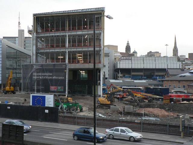
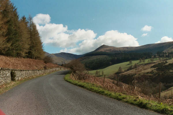
This colour inspires dull thoughts. It makes me think of everyday things such as roads, pavements, brick and mortar and stairs. Whenever I see this colour it puts me in a more rational frame of mind, encouraging me to rationalise my stresses, my worries and my thoughts. It also evokes thoughts of an industrial nature such as factories and building sites.
 |
| http://s0.geograph.org.uk/photos/79/05/790582_f7b6b79f.jpg |
 |
| http://www.rural-roads.co.uk/minor_road.jpg |
 |
| http://images.wikia.com/powerlisting/images/d/d7/Factory.jpg |
- What relevance does this have for the development of my project and horror?
Neutral colours can be used to promote darker colours and in turn, depict horror. Horror uses colours such as grey and white for setting choice therefore, a greater understanding of these colours can help me promote a more atmospheric 3D environment.


No comments:
Post a Comment