Tuesday 30 April 2013

Personal horror interpretation - 2D (design no.8)

This is my second of a two part piece and the last digital painting for my personal horror interpretation. To recap, using the night and day transitions (designs five and six) I have tried to create a visual story in efforts to project the atmosphere of Japanese directed horror, alongside my regular methodology in which I highlight the design process, make a formal analysis and build conclusive results based on my findings. Again, to avoid repeating myself, any factors that remain unchanged within the summary will be labelled 'see design five'.

What story are you trying to tell in this first piece?
In attempts to capture the atmosphere of Japanese directed horror, I have inserted a supernatural being into this scene, continuing the visual story from design seven which follows the struggle and brutal murder of a young girl in this cabin and now her spirit lingers inside the cabin, unleashing vengeance upon those whom enter it. For further information on this vengeful and culture-based Japanese spirit/ghost, refer to my case study on Ringu (1998).

Design process
To create a before and after, I duplicated the blood patterns from design seven.

I placed the outline for the supernatural being in the centre of the scene, using blurry brush strokes to make the being appear more faded. 

To make the atmosphere more more mysterious, I moved the supernatural being to the left and added some clouds to the night sky.

To ensure realism is captured successfully, I created a projected shadow on the floor for the supernatural being.

Acknowledging the reflective and bouncing nature of the projected light source, I realised the supernatural being required a dull back shadow. To make sure the scaling was correct, I made the supernatural being taller.

Finally, I put a light fade on the supernatural being and inserted a reflective back shadow behind the ghost/spirit. I also made sure the scenes matched in terms of background content by adding in the grass layers from design number six.

Formal analysis:

Summary:
Monochromatic colours - see design five

Depth of field - see design five

The lighting is directional and is clearly seen on the floor, side of the window and cracks in the walls & door frame. Three point lighting is displayed using key, fill and back lights.

Camera - see design five

Low and high value colours are present within the greens of the grass, browns on the walls, floor, window and door as well as the dark blue of the night sky, the grey of the clouds and finally, the black and white of the supernatural being.


Lines - see design five

Shape - see design five


The scale of this piece is realistic because there are no disproportionate areas and the supernatural being is of appropriate height and width.

Analysis:
The dark blue sky and dark green grass in the background are used to bring out the foreground via contrasting colours. The monochromatic colour patterns on the walls, door, floor and window are used to represent the time of day and the moonlight projections. An isolated atmosphere is captured using a supernatural and cultural folklore based entity. Darkness is also highlighted through the use of dark shades of grey for clouds in the night sky.

Interpretation:
The aim of this piece is to capture the unique characteristics of Japanese directed horror. The state of the cabin promotes themes of abandonment, deterioration and laziness. Feelings of anxiety and fear are evoked through the supernatural presence on the left hand side of this piece. Themes of despair and horror are evoked via the projected shadows coming from the supernatural being because it is not alive yet it casts a shadow as if it were alive, leading one to believe that there is little or no chance of survival.

Judgement:
The criteria I will be using to judge this piece are colour, lighting and composition. Low value colours are captured by browns on the walls, door, floor and window, as well as the dark blue of the night sky and the deep black of the supernatural being's hair, thus, adhering to the unique characteristics of Japanese directed horror. Saturated and monochromatic colours are clear in this piece, favouring a heightened grey-scale and low value colour patterns, therefore, following the unique characteristics of Japanese directed horror.

A non-fixed mixture of lines (angular and straight), realistic scaling, non-conflicting shapes, a lower camera height, set at a side angle and placed at a close distance are present in this scene, therefore, the compositional values in this piece follow the unique characteristics of Japanese directed horror.

The lighting in this scene displays three point lighting because the monochromatic colours highlight the key, fill and back lights, therefore, adhering to one of the preferred lighting techniques captured within the already identified unique characteristics of Japanese directed horror.

In conclusion, this piece is by far my best 2D personal horror interpretation piece because the lighting, colours and composition follow the unique characteristics of Japanese directed horror more than any of my other designs, as well as capturing a clear visual story based on Japanese cultural folklore. As this is my last design, I must now take what I have learned from making these digital paintings and apply them to my final 3D personal horror interpretation.

Personal horror interpretation - 2D (design no.7)

This is the first part of two designs and the final digital paintings for my personal horror interpretation. Using the night and day transitions (designs five and six) I have tried to create a visual story in efforts to project the atmosphere of Japanese directed horror, alongside my regular methodology in which I highlight the design process, make a formal analysis and build conclusive results based on my findings. Again, to avoid repeating myself, any factors that remain unchanged within the summary will be labelled 'see design six'.

What story are you trying to tell in this first piece?
In attempts to capture the atmosphere of Japanese directed horror, I have inserted signs/indication of a violent struggle into the scene, highlighting the fact that whomever previously lived in this cabin was brutally murdered and the body has been buried beneath the floor boards.

Design process
 Using design six, I added signs of violence by indicating a struggle and the death of someone via the blood patterns on the wall.

 To further develop realism as well as a sense of atmosphere I painted some clouds in the sky.

Finally, I realised that over time the blood on the walls would drip down and pool, therefore, I painted some puddle-like shapes on the floor below the spatter patterns on the walls.


Formal analysis:

Summary:
Monochromatic colours - see design six

Depth of field - see design six

Lighting - see design six

Camera - see design six 

 Low and high value colours are present within the browns on the walls, floor, window and door as well as the blue gradient of the sky, the blood on the door, walls and floor and finally, the green grass in the background.

Lines - see design six

Shapes - see design six
 
Scale - see design six

Analysis:
The monochromatic colour patterns on the floor, walls, door and window are used to capture the time daytime the light projected from the sun. The blue sky and green in the background are used to bring out the foreground through contrasting colours. Realism is promoted via the colour gradient used for the sky because the high and low value blues were extracted from real life examples/pictures. An isolated atmosphere is captured using lack of human presence and blood spatter patterns on the walls and floor. Violence is captured using monochromatic tones of red on the walls and floor.

Interpretation:
The aim of this piece is to capture the unique characteristics of Japanese directed horror. Themes of deterioration, laziness and abandonment are captured via the horrible conditions of the cabin and the lack of human presence. Summer/spring is projected using sunlight and high value colours. Feelings of safety and warmth are evoked by the high value colours and bright atmosphere, however, feelings of anxiety and fear are evoked through the blood on the walls and floor and the unknown location of this cabin. Themes of hope are evoked through the bright projections of light beaming through the window and cracks in the wall, however, themes of hopelessness are projected by means of contrast because of the blood on the floor and walls.

Judgement:
The criteria I will be using to judge this piece are lighting, colour and composition. The composition in this piece follows the unique characteristics of Japanese horror very well by using realistic scaling, non-conflicting shapes, a non-fixed mixture of lines (angular and straight), a lower camera height, set at a side angle and placed at a close distance.

These low value colours are captured by browns on the walls and door. There are monochromatic and saturated tones as well as low value colours present in this piece alongside the addition of monochromatic red blood spatter patterns, however, high value colours remain superior in this scene, although they do not fully subtract themes of isolation from the atmosphere, therefore, this piece somewhat follows unique characteristics of Japanese directed horror better than that of design six.

The lighting in this scene displays some indication of three point lighting because the monochromatic browns for the wood of the cabin and projected lighting on the floor show key, fill and back lighting, therefore, adhering to one of the preferred lighting techniques captured within the already identified characteristics of Japanese directed horror

In conclusion, this piece is a marginal improvement from design six because one of the preferred lighting techniques of Japanese directed horror is identified, a visual story is drawn form the blood spatter patterns on the walls and blood pools on the floor, the clouds in the sky add realism to this scene and finally, the addition of blood on the walls and floor evokes feelings of fear to a certain degree. The second and final piece (design eight) should further capture a Japanese directed horror atmosphere by adding some reference to Japanese folklore/culture.

Next steps
  • Visual activity/story in night-time setting
  • Further Japanese horror reference(s)
  • Japanese folklore/culture


Personal horror interpretation - 2D (design no.6)

This is the sixth 2D design for my personal horror interpretation. This is the second of my two part drawing piece focusing on light and dark settings using the same drawing. Below, I will be outlining the design process, formally analysing the finished piece, looking for any errors and finally setting myself some relevant and productive next steps. As this piece contains similar visual elements as the original night-time design, I will be labelling these stages in the summary as 'see design five' to avoid repeating myself.

Design process
Using design number five, I removed the saturation in order to alter the colours and the brightness.

To start the daytime version, I changed the colour gradient in the background using both values of blue from a real life image of the sky.

In order to adapt to the daylight, I changed the monochromatic values of the cabin walls, floor, window and door.

Ensuring that the projected light (the sun) was bouncing off the surfaces, I made sure all the 3D outlines in the wall cracks and the door/window frames were of a higher value..

Finally, I changed the shadows to a higher value of brown to display the projected light from the sun and added some grass in the background to give the piece a sense of atmosphere and location.


Formal analysis:

Summary:
Monochromatic colour patterns are present in this scene on the doors, walls, grass, sky (background), floor and window.

Depth of field - see design five

Lighting - see design five

Camera - see design five

Low and high value colours are present within the browns on the walls, floor, window and door as well as the blue gradient of the sky and the green grass in the background.

Lines - see design five

 Shapes - see design five

Scale - see design five

Analysis:
The green grass and the blue sky in the background are used to compliment the foreground by means of colour contrast. The monochromatic colour patterns on the walls, floor, window and door are used to capture the time of day and the light projected from the sun (light source). An isolated atmosphere is highlighted by the lack of characters or human presence. Realism is captured in the colour gradient of the sky because the higher and lower values of blue are extracted from real life examples.

Interpretation:
The aim of this piece is to capture the unique characteristics of Japanese directed horror. A summer/spring atmosphere is projected by the sunlight and high value colours. Feelings of warmth and happiness are evoked by the high value colours and bright atmosphere, however, feelings of uncertainty and anxiety are evoked through the unknown location of this cabin. Themes of abandonment, laziness and isolation are captured by the terrible conditioning of the cabin and the lack of human presence. Themes of hope are evoked through the bright projections of light beaming through the window and cracks in the wall
Judgement:
The criteria I will be using to judge this piece are setting, composition and colour. There are saturated monochromatic tones as well as low value colours, however, the primary flow of colour in this piece consists of high value colours but does not fully detract from the isolated atmosphere, therefore, this piece somewhat follows the unique characteristics of Japanese directed horror. These low value colours are captured by browns on the walls and door.

The composition in this piece follows the unique characteristics of Japanese horror to a successful degree with a non-fixed mixture of lines (angular and straight), realistic scaling, non-conflicting shapes, a lower camera height, set at a side angle and placed at a close distance.

The setting in this piece conveys an isolated atmosphere, however, the intended setting and atmosphere found in Japanese directed horror is only somewhat present here because the high value colours and lack of activity removes any scary or fear evoked feelings/themes from this piece

In conclusion, this piece is a large improvement from design five (the night-time version) because it adds more to the atmosphere, the monochromatic colour patterns are more accurate and the colour gradient of the sky in the background is more accurate, therefore, adding more realism to this piece. The negative here is lack of activity; no blood, lack of darkened/low value colour patterns, no supernatural presence and no feelings of fear evoked or highlighted. The night-time piece (design five) did not feature some of the corrected or additional elements in design six.

Next steps
  • Visual activity/story
  • Design elements in design six to be featured in designs 7 & 8
  • Japanese horror reference

Thursday 25 April 2013

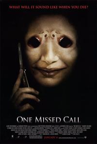
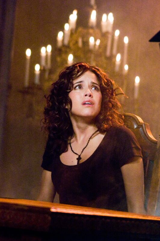
Horror film remakes/interpretations - One Missed Call (2008)

http://images.moviepostershop.com/one-missed-call-movie-poster-2008-1010403639.jpg
This is the second of four Japanese horror film remakes/interpretations. As mentioned in my previous post that I have already reviewed and researched four critically acclaimed Japanese directed horror films; Ringu (1998), Chakushin Ari (a.k.a One Missed Call) (2003), Ju-on The Grudge (2002) and Dark Water (2002), all of which have remakes/interpretations, therefore, I have decided to watch and review these remakes/interpretations and draw comparison-based results, highlighting (if any) identified Japanese horror characteristics. In order to thoroughly research this interpretation/remake I will first be summarising the plot, noting relevant differences (if any), after that I will be looking for any characteristics I have previously identified in my honours project thus far, then I will discover whether this remake/interpretation is higher in critical acclaim than the original and finally, I will be drawing conclusive results based on my findings.

Plot Summary:
http://pegasusnews.com/media/img/photos/2008/01/05/thumbs/one_missed_call_02.jpg.728x520_q85.jpg
After several of her friends die in a mysterious manner which seem to link together, Leann Cole receives a missed call along with a voice mail recording in which she can hear herself die, however the voice mail is dated several days ahead giving Leann the exact date and time in which she will meet her fate. Once Leann as well as two other friends meet their predicted fates, a mutual friend Beth Raymond receives a voice mail, date and time outlining her soon to be time of death. Teaming up with police detective Jack Andrew, Beth must now race against time to discover how this phone-based cursed originally manifested and how she can prevent her inevitable fate from occurring. 

This remake/interpretation followed the basic structure of Takashi Miike's 2003 original, however, there were significant differences and alterations in this version which led this title to rather disappointing.
  • Predictability - Japanese directed horror is rather unpredictable, however, almost every death in this film (despite the plot) was predictable, be it the audio or the camera perspectives, there was not a single character death I could not point out in advance.
  • Stale - the acting in this remake/interpretation was worse than that of the 2003 original. Performances seemed forced, the actors did nothing but demote the horror atmosphere and make the film just drag on until the credits finally appeared on the screen.
  • CGI - visual effects were used constantly in this remake/interpretation for things such as explosions, supernatural beings/characters, glass smashing, fire, vehicles and insects. It made the entire piece look somewhat cheap and lazy.
  • Introduction - the opening sequence to this remake/interpretation was one of its greatest let downs because it was sudden, unexplained and unnecessary. It may have been explained later in this version (much later), however, it evoked feelings of frustrations because it was far too early in the film to have the audience asking questions already, thus, ruining the visual experience to a certain degree. 

Japanese Characteristics:
http://cps-static.rovicorp.com/2/Open/Warner%20Brothers%20Distribution/Movies/One%20Missed%20Call/_derived_jpg_q90_600x800_m0/OneMissedCall-Still5.jpg?partner=allmovie_soap
  • Setting - This version of  Miike's 2003 original struggles to follow the preferred setting preferences of Japanese directed horror because this film is set both indoors and outdoors, barely projecting an isolated atmosphere because there are lots of people around most of time.
  • Colour - this remake/interpretation fell short on colour depiction because the majority of colours used were high value in comparison to the low value colour patterns of Japanese directed horror. Saturation was also barely evident in this remake/interpretation, failing to capture the heightened grey-scale of Japanese directed horror.
  • Lighting  - Deep shadows and three point lighting are the favoured lighting techniques of Japanese directed horror, however, in this remake/interpretation, neither of these were present. In this version of the 2003 original, the central lighting choice was high key lighting, almost every section of the film was well lit, even the abandoned and burned down hospital somehow managed to still generate power.
  • Composition - The depth of field in this film/remake changed constantly in this film, therefore, failing to adhere to the characteristics of Japanese directed horror which favours an infinite depth of field. Despite the flaws of this remake/interpretation, the Scaling in this film is realistic, lines are both angular and straight. The camera-work in this interpretation/remake failed to follow the characteristics of Japanese directed horror because the camera was rarely set at at higher or lower height and the side angle was barely used either. Shapes in this film are non-conflicting and do not draw or steal any focus from the performance at hand, therefore, successfully following the characteristics of Japanese directed horror.
Critical Acclaim:
http://i2.listal.com/image/4208254/600full-one-missed-call-screenshot.jpg
Like most American directed remakes/interpretations, this film was much less positively acclaimed by reviewers and horror fans in comparison to the original, "William Castle would have found a way to make all the cell phones in the theater vibrate with each kill. Despite some enjoyably loony overacting, the onscreen executions are dull, with some rather surprising lapses in photographic consistency. (One chase appears shot by two competing cameramen.) As the culprit shifts from the supernatural realm to that of evil caretakers, evil kids and—brace yourself—an evil teddy bear, the urge to leave the screening to take a call becomes irresistible." (Rothkopth, 2008)

Lisa Schwarzbaum (2008) of Entertainment Weekly also highlights the lack of success in this remake/interpretation, "you've got to deliver a lot more than a customized ringtone to impress the iPhone generation, or to scare anyone familiar with the old glimpsed-human-who-morphs-into-ghoul routine — a demand that defeats French director Eric Valette. (This is his first American production.) Shannyn Sossamon plays the Pretty Girl Who Survives with a minimum of particularity; Ed Burns offers even less as the Cop Who Believes Her. As the cop who doesn't, the comic Margaret Cho shows up for a line or two — and her on-set experience should make for another good monologue someday, considering the riffs she's done about answering-machine messages from her own very unghostly mother." (Schwarzbaum, 2008)

Neil Bastian (2008) of the BBC sheds some light on this unsuccessful title as well, "at least the reason for the haunting is one the script hadn't necessarily led you to expect, and the ghostly effects are well done. But the blurry, sped-up, head-shaking hallucination-style apparition which startled us two decades ago in Jacob's Ladder and Twin Peaks is starting to look like a cliche now, as is the arrival of spectral children accompanied by twinkly mechanical toy music. Those coming to One Missed Call in search of ground-breaking horror have definitely dialed the wrong number." (Bastian, 2008)


Conclusion:
http://www.awn.com/files/imagepicker/1/peszko05_OneMissedCall-baby.jpg
This film was in all honesty, a complete flop. It struggled from beginning to end to follow the narrative from the 2003 original, altering several major plot points, meeting little or none of the characteristics of Japanese directed horror and failing to achieve positive critical acclaim. The 2003 original was not met with world-class feedback and personally, I didn't think the world of it myself, however, this interpretation/remake was embarrassing and has got to be the worst film remake I have seen to date.


References:
http://www.timeout.com/us/film/one-missed-call
http://www.ew.com/ew/article/0,,20170207,00.html
http://www.bbc.co.uk/films/2008/03/31/one_missed_call_2008_review.shtml

Wednesday 24 April 2013

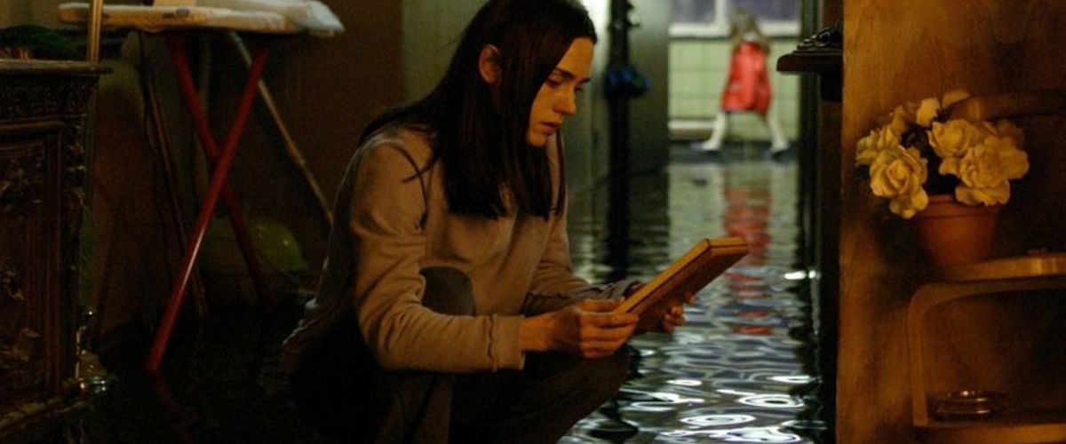
Horror film remakes/interpretations - Dark Water (2005)

http://1.fwcdn.pl/po/41/24/124124/7537696.3.jpg
As the deadline draws closer, I will be continuing to make digital paintings for my personal horror interpretation and designing my 3D horror scene, however, the only element within my objectives that still remains to be completed are the remakes/interpretations of Japanese directed horror films. I had already constructed my first post and left it as a draft, yet somehow it has vanished, so this is my second attempt. I have already reviewed and researched four critically acclaimed Japanese directed horror films; Ringu (1998), Chakushin Ari (a.k.a One Missed Call) (2003), Ju-on The Grudge (2002) and Dark Water (2002), all of which have remakes/interpretations, therefore, I have decided to watch and review these remakes/interpretations and draw comparison-based results, highlighting (if any) identified Japanese horror characteristics. In order to thoroughly research this interpretation/remake I will first be summarising the plot, noting relevant differences (if any), after that I will be looking for any characteristics I have previously identified in my honours project thus far, then I will discover whether this remake/interpretation is higher in critical acclaim than the original and finally, I will be drawing conclusive results based on my findings.

Plot Summary:
https://blogger.googleusercontent.com/img/b/R29vZ2xl/AVvXsEgyxwRzH4k7wma6TRiz-41nVN4jYPuTswHtJoD-fAywTwEuE6RI3lDN6zl9Z4seC4GOjFmNC_QH1AwubhdPw5iEdiWeYmCgRBNGYICI1dy5GSyyRil07gmwczMA4Cat2ihWp63WnTLYMNE/s1600/Dark+Water+2.jpg
Going through divorce arrangements with her neglectful husband, Dahlia Williams and her daughter Cecilia move into a poorly condition apartment on Roosevelt Island. As soon as Mrs Williams and her daughter get settled into their new home, strange events begin to unfold, particularly a continuous leaking patch on the bedroom ceiling, problems with the buildings equipment and a backpack appearing mysteriously on the rooftop. Noises are continuously heard from the apartment above, suggesting that it is already occupied/rented by others, however, when the apartment on the floor above is discovered to be deserted and flooded, these paranormal events persist to occur suggesting that there may be a supernatural presence in the apartment building and is somehow linked to the history of the previous tenants from the apartment above.

Although this remake/interpretation followed the plot of Hideo Nakata's 2002 original very well, there are a few notable differences:

  • Acting - the acting is much more professional than the Japanese standard, characters help the story evolve more effectively with their dialogue and their actions.
  • Black water - in the original and in this remake/interpretation, there is constant dripping water and rainy weather and towards the end of the original, black water started to run from various water sources, however, appearing from about twenty minutes into the remake/interpretation, almost all the water leaking in or around the apartment is black.
  • Involvement - several minor characters such as the receptionist and the landlord of the apartment building are much more involved in the development of the narrative.
  • Imaginary - in the 2002 original, the paranormal presence appeared randomly to stalk the central protagonists, however, in this remake/interpretation the paranormal presence appears as a imaginary friend of the daughter character.
  • Interaction - the paranormal presence physically appeared in the original only a few times to interact physically with the central protagonists, mostly towards the end of the film, however, in this remake/interpretation the paranormal being appears continuously, interacting physically and verbally with the central protagonists. 
  • Shocks vs scares - this film, like many American directed horror films before it prefers a shocking the audience with sudden frightening moments, rather than using scary images/sequences.
  • Ending - this remake/interpretation took several detours along the way, however, it still reached the same conclusive point as the 200 original, the mother sacrificed herself so that her daughter could live.
Japanese Characteristics:

http://i500.listal.com/image/2584791/500full.jpg
  • Setting - This film follows the preferred setting preferences of Japanese directed horror as most of this film is set indoors, the props were arranged appropriately and an isolated atmosphere was projected successfully.
  • Colour - surprisingly, this remake/interpretation did very well to depict the colours used in Japanese directed horror. The colours were primarily low in value with increased saturation, displaying a heightened grey-scale.
  • Lighting  - Deep shadows and three point lighting are used in this remake/interpretation which are favoured elements of Japanese directed horror, however, the aesthetic of these lighting choices are somewhat ruined by the predictable build up of audio.
  • Composition - Scaling in this film is realistic and the lines are both angular as well as straight. The cameras in Japanese directed horror focus on being set at higher and/or lower height, with the preferred camera angle being set at a side or top down perspective. In this remake/interpretation, the camera work does adhere to the preferred angle(s), however, they do not follow the notable camera height(s) of Japanese directed horror. The shapes in this film are non-conflicting and do not steal or draw any focus, following the characteristics of Japanese directed horror. The depth of field changes constantly in this film, unlike Japanese directed horror which prefers an infinite depth of field.


Critical Acclaim:
http://static.rogerebert.com/uploads/review/primary_image/reviews/dark-water-2005/hero_EB20050707REVIEWS50607003AR.jpg
The film had a mixture of reviews and feedback, primarily negative and not as critically acclaimed as the 2002 original, "director and star appear happier re-creating divorce weepie Kramer Vs Kramer than The Exorcist. They may even look down on the idea of a pure and simple shocker. So if you're looking for jump-a-minute scenes, this is not for you. Others should appreciate Connelly's powerful performance and John C Reilly's funny cameo as a smooth-talking landlord, neither of which are still quite enough to make Dark Water worth splashing out for." (Pierce, 2005)

This analysis is further reinforced by Claudia Puig (2005) of USA Today, "what does work well is the film's drab look and evocative score by Angelo Badalamenti. The setting is Roosevelt Island, a mere tram ride from New York City. But it's a grim place that has a remote feel to it, like a location that might harbor ghosts. The movie resembles The Ring, perhaps most in the way that mother and child seem alone in the world. It also has a scary bathtub scene that recalls Ring 2, also directed by Nakata. Connelly's performance at times feels one-dimensional. Even when terrorized, she's remarkably low-key. Perhaps that's preferable to uncontrolled screaming, but it takes away from the film's sense of realism. Dark Water has more substance and a more interesting look than many horror films, but the familiar elements of the story disappoint." (Puig, 2005)

It would seem this American directed remake/interpretation, like many others of its time, fell short in comparison to the Japanese directed original.

Conclusion:
http://img440.imageshack.us/img440/7905/img00007.png
This remake/interpretation did very well in categories such as character performance, colour, lighting and setting, however, due to the various alterations to the plot and persistent compositional imbalance, this remake/interpretation did not fully project the atmosphere of Japanese directed horror and failed to meet such positive critical acclaim as Hideo Nakata's 2002 original.

References:
http://www.bbc.co.uk/films/2005/07/12/dark_water_2005_review.shtml
http://usatoday30.usatoday.com/life/movies/reviews/2005-07-07-dark-water_x.htm

Exposition research (part II) - McManus galleries [part 4]

What?
This is the forth and final part of my research piece focusing on the layouts and display of the works on exhibition at the McManus galleries in the centre of Dundee.
Why?
To gather a greater understanding how one displays a variety of works, using different materials, colours, labelling and arrangements/layouts.

Below, I have uploaded some of the images I took on my visit to the McManus, focusing on layouts which have been used for the exhibited pieces, highlighting any positives or negatives and building conclusive results relevant towards the development of showcasing my work at the end of the semester.

Exhibits
I loved this exhibited piece because of the simplicity of the layout is just wonderful. There are not too many pictures/paintings featured, therefore, the presence of this piece is not overwhelming to visitors. The sizes of the featured paintings/pictures differ, however, they all seem to link together even though they are not intended to. The lower picture/painting draws a negative towards this exhibited piece as a whole because it does not blend with the other pictures, however, it does not detract from the simple nature of the layout.

This vertically dominant exhibited piece caught my attention because the manor in which the pictures and text were arranged were extremely neatly presented. The text was not placed too high and did not interrupt the pictures on the right. The shapes do not conflict, however, there is no particular sizing pattern/scheme which makes this exhibited piece look somewhat disorganised.

This exhibited piece (including many others just like it which continued all the way along a wide back wall) was one of my favourites because the layout made it look like an encyclopaedia piece, placing pictures of roughly the same size in a unique fashion alongside their appropriate labels. The piece looks balanced and organised, it made me want to pay attention as my mind and attention usually go astray from time to time. The down side here is the text, personally, I would have made it slightly bigger for those with visual difficulties.

Conclusion:
This research piece was very helpful towards my expositional studies because it now allows me to understand what might be considered too much, that simpler arrangements of my completed works may be somewhat off putting and reminding me once again (an over-heard saying) that less is more, making me step back and focus on selecting my best or most relevant pieces only, thus ensuring my exhibited works appear professional, organised and appealing to the eye.