Thursday 20 December 2012

Environment research - Left 4 Dead & Left 4 Dead 2 - smaller details

When designing a 3D environment, one must consider the smaller details. The important factor here is to pay attention to what has been overused and what has been left unexplored. Some overused smaller details do work, as well as contribute to the theme and/or storyline of the game. In Left 4 Dead (2008)& Left 4 Dead 2 (2009) there are dozens of messages scattered throughout the game in various locations, some are references to other games, popular culture, literature and finally there others such as messages to loved ones or warnings to other survivors also trapped in the horror of the zombie apocalypse. These are effective examples of smaller details because it is original, it allows the player to feel more involved in the game and it creates a more effective horror atmosphere because it makes the player feel like there has been so many people like the characters they control, that have written these messages on the wall and failed to survive, evoking feelings of anxiety and fear in the player.

http://images2.wikia.nocookie.net/__cb20100422190610/left4dead/images/e/e9/FrankWestThePassing.JPG
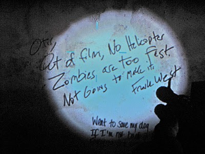
These scribblings on the wall are a reference to the Capcom title Dead Rising (2006), another zombie apocalypse-themed game highlighting two central characters Frank West - a bold photojournalist investigating the government activity surrounding the outbreak stricken Colorado town of Willamette, and Otis - the janitor whom informs you of other survivors and various findings on the security cameras via radio contact. The text reads, 'Otis, Out of film, No Helicopter. Zombies are too fast. Not Going to make it. Frank West.'


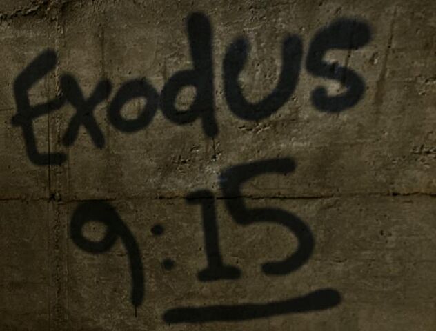
http://images1.wikia.nocookie.net/__cb20081124141238/left4dead/images/thumb/7/7f/Exodus915.jpg/632px-Exodus915.jpg
A bible verse marked on the wall in order to highlight as well as link the religious perspective with the zombie outbreak of the storyline which reads, 'For by now I could have stretched out my hand and struck you and your people with a plague that would have wiped you off the earth.'


Print screen and cropped from: http://www.youtube.com/watch?v=mGFhyIW2gQE
The text directly in the light of the players flash-light reads, 'John I'm safe I got out and I am travelling with good people. They are immune too we are going to find a super market and fortify it. We will hide until the army comes. I love you. XOXO Sharon'
This could be a possible reference to Stephen King's book The Mist (1980) in which a number of survivors are lost in a never ending mist-like fog covering everything around them, leading them to find shelter in the local supermarket to try and remain hidden from the various creatures/monsters that appear out of the never ending cloud.


What relevance does this research serve towards the development of my project and horror?
The relevance of this research is to understand the importance of smaller details in environments and how this can be used to provoke human reactions. The relevance this has to horror is understanding that the addition of smaller details creates a greater sense of realism to the environment and therefore, a more effective horror atmosphere. When developing my 3D environment this will help me focus more time and attention on smaller details to ensure more realism and a greater horror driven atmosphere.

Wednesday 19 December 2012

Environment research - Batman: Arkham City - themes and shapes

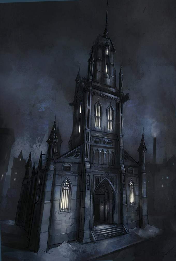
In order to pave a developing road for my final project, I must first take into account the variety of designs for buildings, focusing on shape and the style in which they are constructed. Here I have elected Batman: Arkham City (2011) as my first example. This game is not classed as horror, nor is it scary however, the building designs and atmosphere of the game are something to be recognised. Some of the buildings in this game use a medieval style of design, focusing on spires, spiked fences, gargoyle perches and tall windows. This blends with the atmosphere surrounding the character of Batman, inspiring terror and fear in the hearts of his enemies - what better way to do this than link the fear created by the presence of Gotham City's dark knight with the environmental aesthetics.

http://conceptartworld.com/wp-content/uploads/2011/06/Batman_Arkham_City_Art_04a.jpg
http://i.neoseeker.com/ca/batman_arkham_city_conceptart_vconX.jpg
http://i.neoseeker.com/ca/batman_arkham_city_conceptart_dRTbv.jpg
http://i.neoseeker.com/ca/batman_arkham_city_conceptart_AflEc.jpg
http://i.neoseeker.com/ca/batman_arkham_city_conceptart_VPv2y.jpg
http://i.neoseeker.com/ca/batman_arkham_city_conceptart_fi0DO.jpg
http://i.neoseeker.com/ca/batman_arkham_city_conceptart_s3a68.jpg
http://i.neoseeker.com/ca/batman_arkham_city_conceptart_QtNAM.jpg
http://i.neoseeker.com/ca/batman_arkham_city_conceptart_o5VsQ.jpg


Other areas of Arkham City continue to promote this old fashioned and/or historical theme. This is achieved by using three-dimensional shapes and linking them together, creating an industrial and rustic aesthetic. A large number of the buildings in Arkham City appear badly constructed or modified, suggesting that the criminal inhabitants of the city have tried to transform the city into a vision of their own. Three gangs rule the streets of Arkham City, controlling and guarding their own territory or 'turf'. With each gang comes a different theme for example, Oswald Cobblepot (a.k.a Penguin) takes control of the museum and transforms it into a winter palace of doom; frozen museum exhibits, hostages transformed into ice cubes and even a shark in the now flooded central hall, stalking the player below a sheet of thin ice. This compliments the initial aesthetic and design of  Arkham City because it takes a large selection of buildings with a clearly outdated/old-fashioned design style and adds a more modern/up-to-date style of design on top.

http://media.pcgamer.com/files/2011/08/Batman-Arkham-City-6.jpg

http://leagueofcomicgeeks.com/media/library/images/games/batman-arkham-city-gamescom-1.jpg

What relevance does this research have towards the development of my project and horror?
The relevance of this research is to gain more knowledge on two areas, the shape in which buildings are constructed to create a more effective atmosphere and to develop an understanding of themes because I have not yet decided a theme for my 3D environment thus, research on this topic will help me narrow down my decision and encourage me to look for examples in other genres, not just in horror. If I research themes in only horror titles, my finished 3D environment will not look very original or imaginative.

Monday 17 December 2012

Update - setting choice

I have decided that my 3D horror environment will be an interior setting. I have not yet decided on the country to base my horror environment in however, I feel choosing a setting will help make the decision for the location easier. I have an initial idea for the interior setting - a prison

Why the change?
This choice has been made because I feel that my technical skills are much more benefited within an interior setting. I have had little or no experience on exterior settings and in hindsight, my work would be of a lesser quality based on time scaling and technical skills. I have worked on interior settings in previous years and feel much more confident in my quality in my deliverables based on this change. This new direction is also because I feel my project would benefit from a more creative approach that would also help boost the direction and initial aim of my project.

Why a prison?
The idea was random but I liked the concept of a location deemed inescapable, secure and loaded with dangerous prisoners. The idea that nobody is safe, not even the prisoners seemed like a great premise therefore, I thought it would be a great start towards visually developing an idea of what I want my interior setting to be and what I want it to look like. I don't know if this will definitely be the interior setting for my project, but I feel I have to try some ideas out in order to narrow down what I'm comfortable with designing, what I think is best for my project and how I will make the setting work within the genre of horror.


Saturday 15 December 2012

Supervisor meeting 2

Following the feedback from my proposal I arranged another meeting with Brian Robinson. Brian had already gone over my feedback before our meeting so getting him up to speed was not needed. The main problems with my first draft was the misunderstanding of structure, the absence of research questions and the misinterpretation of each section of the proposal as a whole.

To help me understand the structure of my proposal more efficiently, he suggested I question my area of study to a greater degree, leaving no stone unturned and to challenge every topic; why was lighting important in horror, how does colour inspire emotions and moods or what examples in film and video games are relevant to my area of study?
The next step was to take these questions and choose which ones would help break down the aims and objectives of my project, focusing on topic relevance and resources that would highlight these research questions. At first I was struggling to understand Brian's direction, telling him that I needed examples. Brian took out a blank piece of paper and asked me to choose an area of study relevant to my project. At random I chose lighting, to which he then he asked me to think of a research question, to which I responded, why is lighting relevant in promoting horror? Brian then asked me is there something I can add onto this question to reach an appropriate or definitive point, to which I added, why is lighting relevant in promoting horror and does the addition of colour make said lighting more effective?

Brian was happy that I was understanding his direction, to question the initial research questions themselves. The next step was to link these research questions to topic related resources in order to boost the effectiveness of these research questions, as well as to ensure that I was not straying off point at random tangents and instead, just answering the questions, plain and simple. With the structure and absence of research questions sorted, understanding each section of the project proposal was all that remained. The introduction was easier to understand now that the research questions were to be included in my next draft. Brian said that I should set a starting point for my literature review by highlighting the research questions and the relevance of these research questions, followed by the literature review itself which was to simply tackle each research question, link said questions to necessary resources and move onto the next research question, the key being trying to get each question to link, to flow together.

Moving onto the methodology, Brian noted that instead of detailing every step in which I would carry out my project, that I should highlight only the key steps, detailing the relevance of each method and how I would carry these out. This was not a problem as it was only a matter of separating important methods from the lesser-important. The conclusion was simplified in my mind instantly when Brian said that I just needed to sum up what I had done in almost bullet point form, I have done this, I have done that and then finally summing this paragraph up with the relevance of this research piece and any impacts or effects it may have economically, academically, scientifically, etc.
The abstract was tricky as I had too many theories and methodologies thus, confusing me to a great degree. Brian suggested I think of the abstract as a means to setting the scene, a summary, a short description and use this to almost sell or promote my proposal from an outside perspective.

This meeting was very helpful to me because it helped me tackle my second draft with greater ease and gave me a much needed confidence boost as I felt a little disheartened by the amount of feedback I received highlighting all of my careless errors. To take a step forward, I told myself to use my first draft of the proposal as a guide to understand where I had gone wrong and to take what I had learned from my meeting with Brian and use it as a means to correct my mistakes.

Wednesday 5 December 2012

Proposal feedback (first draft)

The initial feedback I received for the first draft of my research proposal was vast and very detailed. Lynn Parker was very helpful in highlighting my errors as well as give me direction and/or suggestion to rectify certain errors. In all honesty I was very confident in my first draft however, upon reading all the feedback I received, I then realised my over-confidence was greatly misplaced. Here I have bullet pointed the most commonly mentioned errors within my proposal feedback:

  • Opinion-based comments - no evidence to support claims
  • Loose ends - topic related questions and points not fully answered or supported
  • Grammar - constant incorrect use of the semi-colon
  • Structure - misunderstanding the sections of the proposal

These problems were overwhelming at first glance, thankfully Lynn told me to not freak out, to read over my feedback and arrange a meeting with Brian Robinson so that he could help me understand where I had gone wrong and what I had to do in order to fix these errors.

Saturday 1 December 2012

Supervisor meeting 1

Before I started the first draft of my project proposal I needed to get things in perspective. I contacted Brian Robinson and arranged a meeting as soon as possible in order to halt my worries and eliminate my problems/concerns for the project proposal. I started off by explaining the direction of my proposal, my aims and objectives and finally the literature I had already referenced. I then went onto explain my worries which were; what does each section of the proposal require (a blunt and more simple translation), were there any areas of my study that I had neglected and what (if any) tips could he give me for the proposal as a whole?

Tackling the first issue, Brian broke down each section of the proposal in words I could understand both vocally and physically. With the sections of the project proposal more clear, we then moved onto the areas of my particular field of study that I had not yet explored or neglected. Brian took into account that I had already referenced important areas of study relevant to my project such as notorious directors of the horror genre, lighting techniques in television and the sub genre of science-fiction horror. Brian suggested I look into film theory and cinematography in order to break down and truly understand the medium of cinema, as well as to help rationalise and highlight the key elements within the genre of horror.

I then made my way to the library, picked up eight new books and started compiling more references for my project proposal.
Brian was very helpful during this meeting, however due to others in the same seat as me panicking about the project proposal, I only got so much of Brian's time as he had a laundry list of others to see.

Saturday 10 November 2012

Critique week - personal reflection

For critique week I presented my developed project and ideas to Lynn Parker, Ryan Locke and Brian Robinson. The points of personal development were made clear to the lecturers; new aims and objectives, literature research, blog development, mood boards for project location, understanding of colour terminology, film and game research (in relation to horror), 3D drawings and animated lighting tests. My development was met with great praise, primarily on my choice of Brazil for the location of my project for my 3D environment. All three lecturers made the point that as I had chosen Brazil, that I should research the country extensively; colour, culture, tradition, folklore and horror films from Brazil. Secondly, Lynn pointed out that in the past four weeks, yes it was good that I had started my 3D drawings, but due to my mass amount of research, the practical side has been somewhat neglected and that I should try and balance all tasks at once in order to get the best possible results out of my project. Finally it was made very clear to me by both Ryan and Lynn that when presenting my work it should be professional and recommend avoid using personal expressive pictures in the future. I thought it went really well as I now have another point of development for my project - In terms of development, balance is my primary concern - it is clear that I have been neglecting the practical side of things and hope to be more constructive in my day-by-day productivity. I hope to learn everything I can on the country before I start anything practical in order to ensure my work is accurate and top quality. In the future I now know that I should try to be more professional than expressive in my presentations and make sure that is reflected in my next one.

Thursday 25 October 2012

Colour in horror - blood and atmosphere

In horror, we can can usually count on one component - blood. Violence and gore is not featured in every horror themed video game or film, but it can be used to create a successful horror atmosphere. Dead Space (2008) shows several examples of how to create a successful horror atmosphere using blood. I have played two thirds of the game so I can provide my own thoughts and feelings as feedback and evaluation. Below I have selected sections of the game where I noticed effective uses of blood to create atmosphere.

http://www.gogaminggiant.com/wp-content/uploads/2009/10/16.jpg
Having just encountered the unknown alien race known as the necromorph and ran to a safe location to avoid a very gruesome death, I was presented with my first weapon. Having a rough visual idea of what the necromorph look like, I noticed a message on the board in front of me reading 'cut off their limbs'. The first time I saw this message, feelings of anxiety and fear began to manifest themselves because I was now worried what I was coming up against, can the enemy re-grow their limbs and is that eventually going to be my blood on the wall?
The dark shade of red used for the blood suggests decay, which means whoever wrote this message has been dead for quite some time, making me think the necromorph race has probably taken over the ship by now, which again raised feelings of fear and anxiety.

http://metavideogame.files.wordpress.com/2008/12/concept_desolate_hallway_download_021208.jpg
Moving through the corridors of the Ishimura, I came across this doorway. Moving from a darker shade of red to a brighter tonal red, the decay rate flows from old to new, telling me that whatever or whomever has died, it was not that long ago. This evokes feelings of uncertainty and puts me in a hesitant mood because my mind is telling me there is something through that doorway and it is not friendly again, inspiring feelings of fear and anxiety.

http://memberfiles.freewebs.com/01/26/63792601/photos/Dead-space-/dead_space4.jpg
Continuing along the hallways there were dead bodies everywhere, blood splashed all over the floor and walls, guts spilled out on the stairs and limbs on the corpses missing. With the blood everywhere my feelings of anxiety and fear were raising every second. The effective use of blood here was the quantity, the more blood I saw the more worried I became. This use of blood creates atmosphere successfully here because the colour red evokes the most passionate of our emotions and feelings rage, love and stress however, here it promotes fear. Fear, like rage and love are some of our most unsteady feelings and emotions, the slightest harassment of these can tip us over the edge and can sometimes be hard to steady out our reactions and thoughts. For example, If I was to watch three or four paranormal-based horror films late I night, I will be constantly looking over my shoulder because the more that I watch, the more fearful I become which  in turn, carries on until I head to bed for the evening or go to the toilet, the feeling of fear is still there because the images of blood, scary moments and horror characters are still in my head and will not vanish until at least the next morning.


Using these sources as inspiration, I decided to depict my own horror scene using blood to depict a successful horror atmosphere.

The Design Process

 I started by creating a square shaped door, using the sci-fi theme of Dead Space for the design style of my door. Next, I extruded a 't' shape in the door to depict the blue neon lights. After that I divided the door up into sections so I could later create a pattern in the door. Finally, extruded one of the squares on the left hand side to depict a password access screen.
 
 Next I corrected the 't' shape of the door light so that it was one whole shape. After this I started to search for a screen-shot of a password screen online. Through trial and error, I kept searching until I found an image that blended with the rest of the colours on my door.

To complete my door I created grooves in the door by doubling the sectioned lines of my door and shaped them accordingly. Finally, I unwrapped the door and performed the texturing in Adobe Photoshop.


Using my previously learned skills in shadowless lighting, I manipulated the incandescence for the lighting on the door, ensuring the tone of blue stood out from the primary colour of the door. I then moved onto the most important factor - the blood. Using a downloaded brush pack from an online source (it was free!), I created blood spatter patters on the door using the pre-set brush shapes and using a transparent eraser to manipulate and create my own patterns of blood. This scene depicts a kill at close range in front of the door therefore, it was important to maintain a sense of realism by making sure my blood patterns were not repeated and that there was not a ridiculous quantity of blood used.

A final touch was needed, so I placed a hand print on the screen. To avoid a common portrayal of blood on surfaces, I decided not to smear the hand print in a particular direction as I have seen far too many times before in films and video games and did not want to create that which has been done already to maintain a sense of originality in my works. I decided not to add any environmental lighting as I feel it would draw focus away from the lights on the door, making the contrasting effects of the colour selections much less effective.


What relevance does this test have towards the development of my project and horror?
The relevance of this test is to develop my understanding of the effectiveness of blood in a horror scene and how it creates a successful atmosphere. The red of the blood evokes certain feelings/moods/emotions therefore, studying other colours used in horror will help me understand how other feelings/emotions/moods are inspire and thus, use these colours to depict a more successful horror atmosphere within my 3D environment. This test also helped me develop my texturing skills, as I have never experimented with blood before.
Lighting in horror (continued) - sunrise and coloured lighting

In order to continue my research of horror in daylight, I have constructed my own sunrise. Before I continue with this post I regret to inform that I have lost the files for this scene therefore, I cannot show each developing stage of this lighting test. I did however, manage to recover the screen-shots I took of the finished scene and have provided them below to support my research.


To start, I had to create a scene for my lighting test. Using a series of duplicated rectangles and a roof using the create tool, I made a basic hallway. Next I needed some props. Using creativecrash.com I located a wooden barrel prop and placed them in my scene accordingly so that any placed lights would effectively project shadows. After that, I started placing my lights in the scene to portray a sunrise. Firstly, I created a series of spotlights set in dark tones of red and magenta, setting them at ground level facing/aiming towards the rear of the barrel props. I then went onto slightly adjust the ambient colour of each light in order to add a light tone to the projected colours. The final step was the shadows. Using dark blues for the magenta coloured spotlights to add a degree of depth, I then added harmonising dark tones of yellow to the dark red spotlights in order to create a slight transparency in the shadows projected by the barrel props.

Barrel prop downloaded from: http://3dmodel.domawe.com/2012/03/wooden-barrel-free-3d-model-1.html

Barrel prop downloaded from: http://3dmodel.domawe.com/2012/03/wooden-barrel-free-3d-model-1.html

Barrel prop downloaded from: http://3dmodel.domawe.com/2012/03/wooden-barrel-free-3d-model-1.html

What relevance does this lighting test have towards the development of my project and horror?
The relevance of this lighting test is to experiment with coloured lighting in a daytime setting in order to successfully portray horror in both contrasting times of day as I have not yet decided if my 3D environment will be set in the daytime or night-time. This has significant relevance to the development of my project because it helps improve my technical skills, and knowledge in colour selections and shadow depth.

Lighting in horror - daylight

Continuing my study in the horror genre, I thought, yes I've touched on horror in darkened settings, but have I tried to depict the atmosphere of horror in the daytime?
When thinking of horror in the light of day two titles from the horror genre came to mind. The first example that sprang to mind was Paranormal Activity 3 (2011) - an invisible demon stalks a family of 4, and unlike its predecessors which focused on promoting a horror atmosphere in the evening, this one is shot in both day-time and night-time.


As the character in this title (Toby) is invisible it already creates a sense of mystery for the audience, adding feelings of anticipation, keeping the viewers in a constant anxious state, wondering when the invisible demon will strike next. Running upstairs chasing her younger sibling, the eldest daughter Katie bumps into thin air. Looking up in terror, the audience cannot see what she has bumped into. The only indication of a supernatural presence is a dark shadow on the floor. Suddenly, she is lifted off the floor by her hair, evoking feelings of fear as well as a physical reaction in the audience.


The second example that came to mind when I thought of horror in daylight was Left 4 Dead 2 (2009)

http://ohitsblog.com/wp-content/uploads/2009/06/left-4-dead-2-the-parish-new-characters.jpg


http://www.co-optimus.com/images/upload/image/2009/left4dead2%202009-10-28%2022-20-53-54.jpg
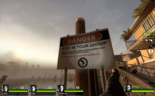
Using subtle hints of red, orange and yellow for the sun mixed with dark shades of blue in the background and grey and brown for the lighting on the buildings in the foreground, this evokes feelings of warmth and happiness as the nightmare is almost over. The lower tones of white for the flash-light create minor shadows, thus maintaining the element of darkness even in the daytime.


http://images.bit-tech.net/content_images/2009/07/left-4-dead-2-hands-on-preview/left_4_dead_2_3.jpg
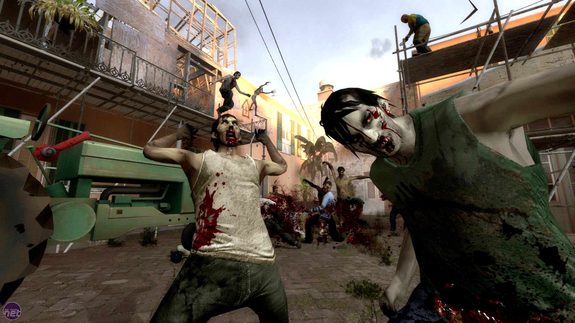
During the stand-off against the horde in the third chapter of the level, I saw a great deal of colour value; the sunlight reflecting the bright colours of some surrounding buildings giving a higher value, whilst the scaffolding and construction equipment seemed to absorb the light and create lower colour value. Again, this creates a visual sense of darkness within the light of day which maintains the atmosphere of horror.


What relevance does this research provide for the development of my project and horror?
The relevance of this research is so I can identify and elaborate on the lighting, colours and shadows in a daylight setting. This will help expand options for my project as I have not yet decided whether I will be doing my 3D environment in a day-time or night-time setting. This research will also help me with any future colour tests because the recognition of colours and how they evoke moods, feelings and emotions will be very important for the successful portrayal of horror in my 3D environment.


Wednesday 24 October 2012

Choosing a setting - Japan


Using images from numerous sites, I have designed the final of my three mood boards in order to narrow down my decision for the location of my 3D environment.

  • Why this country?
Initially, I selected this country because I love the design of Japanese homes as they have not significantly changed over time; slide-doors, rice fields and triangular roofs with rectangular bases. This maybe different in city environments, however the adaptation to modern designs seems to be slower in the lesser populated areas.

  • Are there any examples of horror in media that influenced this decision?   
Resident Evil: Afterlife (2010) helped influence this decision;  ruined cities, darkened streets, occupied only by the undead - this film truly sets the scene for the 'what-if' scenario of a zombie apocalypse in Japan. This is only a minor part of the film but it effectively creates an effective horror atmosphere from a design perspective

  • Is there anything unique to this setting in terms of lighting, shadows and colour?
 The night-life in Japan is full of brightly coloured neon-lighting and colourful advertisements. I love working with props and creating lighting effects such as this. Selecting this location would allow me to experiment with lighting and colour selections to promote a more effective and realistic atmosphere for my 3D environment.

  • Are there any technical issues that can generate for this choice of setting? 
The same problem with the choice of Japan is similar to that of Switzerland and Brazil - I have no experience in forming or organic-based surfaces or props.


Tuesday 23 October 2012

Lighting test - flashing lights

Flashing lights are used in horror to create tension and anxiety, which makes a horror atmosphere more effective. Using Dead Space (2008) as a means of inspiration I have created a lighting test demonstrating a single flashing light in a dark room.

At the beginning of Dead Space the player has a moment of panic as the main character Isaac and his team are suddenly attacked and the player must run through a series of hallways to evade these unknown hostile creatures (necromorphs). I found a video walkthrough online to visually display this section of the game in order to highlight this test. The moment in which this happens is at 07:24. Beware that this video contains some strong language.


After seeing this video I decided to make my own flashing light test. I started by creating a mesh in the shape of an everyday rectangular light. The next step was to add a touch of transparency to depict the plastic frame of the light and so that the light could be more visibly clear. This was when I ran into a very frustrating technical problem. Originally, I key framed an number of volume lights in three places within the mesh at different intensities, but nothing was happening. The key frames were there but the light remained at the same intensity and was not flashing at all.

After hours and hours of searching online for answers to this dilemma, it became clear the solution to my problem involved nothing more than a right click. It was a very simple fix but I felt like I had just wasted a lot of time for such an easy solution. The solution was to right click on the intensity of each light and hit 'set key' instead of using the manual keyboard short-cut. With this technical error solved, I then continued keying the intensity of each volume light to a specific pattern until I had the lighting effect I desired. Once this was finished I conducted a batch render so that I could load the complete piece into Adobe Premiere Pro. With the completed piece rendered and loaded into the necessary video editing software, I brought all the rendered frames into one full piece and exported it. Below is the finished lighting test.


What relevance does this test have to the development of my project and horror?
This lighting test helps me understand how to promote horror with animated lighting because flashing lights evoke feelings of uncertainty, panic and anxiety thus, creating a more effective atmosphere. In Dead Space this lighting technique made me feel like there was something watching me or something bad was about to happen, creating a very high tensioned atmosphere, successfully inspiring feelings of fear and terror which is the central aim of the horror genre.

Choosing a setting - Brazil


Like the other mood-boards I started by resourcing several photos from different sites in order to capture inspiration as one of three possible locations for my 3D environment to be located. Here, I have selected Brazil as the second of my three selected locations because I feel this country is bursting with colours and has great potential for conversion to horror.

  • Why this country?
This country is full of unique colours, lush rainforests, enriched culture and bright sunny skies. Brazil depicts a bright atmosphere, adding horror to this would be a unique twist; spreading darkness amongst the light. The cultural factor may also come in handy as cultural events and traditions could be a very good premise for my 3D environment

  • Are there any examples of horror in media that influenced this decision? 

I have put some research into the Brazilian horror scene and was unable to recognise any major titles, except from a 2006 title called Turistas a.k.a Paradise Lost. This film tells the tale of a group of travellers who end up stranded in a small Brazilian village due to a traffic incident eliminating their source of transportation. This title influenced my decision because it helped aid in displaying a horror setting in an isolated small, isolated location.

  • Is there anything unique to this setting in terms of lighting, shadows and colour?
Lighting and shadows in Brazil will be both challenging and fun to work with if selected because it will be a great chance to experiment with coloured lighting as well as gaining a deeper understanding of the importance of shadow colour.

  • Are there any technical issues that can generate for this choice of setting?
The negative of this country is the same as Switzerland - lack of organic modelling skills.

Shadowless lighting

In order to gain a greater understanding of lighting, I researched lighting methods online. One lighting method that caught my attention was shadowless lighting. The first thing that came to mind when finding examples of shadowless lighting as inspiration was Crash Bandicoot (1996). Running through Dr. Neo Cortex's science labs avoiding barrels, electrocution and in this case toxic waste, I thought I would try to reinterpret these memories from one of my childhood favourites.


http://images4.wikia.nocookie.net/__cb20120821183258/crashban/images/f/fa/CortexPower.png


http://images1.wikia.nocookie.net/__cb20120118164229/crashban/images/7/72/Toxic_waste.PNG


The design process:


 To start, I downloaded a simple metallic barrel prop from creativecrash.com and placed them accordingly to create the impression of a spillage, callously abandoned and forgotten


Next, I placed a very thing rectangular mesh underneath the barrels to get a sense of scale for the size of the spillage and also to position it so that the spill itself looked as realistic as possible. 


 After that, I moulded the mesh into the circular-like shape of a spillage and bevelled the outline of the mesh to remove any flat or sharp edges.


Finally, I used a large number of volume lights in the form of sphere's at different settings of intensity in order to depict the glowing effect of the toxic waste spillage, paying careful attention to realism where the light would reflect and where it would be absent. In order to create the bright and glowing neon effect of the toxic waste, it was a simple matter of increasing the mesh's incandescence to an appropriate level, ensuring that it blended and did not conflict with the lighting.


  •  Why is this relevant to horror and the development of my 3D environment?
I feel that shadowless lighting makes an atmosphere more alluring, mysterious and somewhat eerie because it stands out and has no shadows. In terms of project development, the relevance of this is to broaden my technical skills and understanding of lighting techniques such as this which in turn, will help me analyse examples of lighting in horror more critically, aiding in the development of my final piece.


Barrel prop & textures downloaded from: https://www.box.com/s/opepo3bhaeh18b6ljdxt

Barrel prop & textures downloaded from: https://www.box.com/s/opepo3bhaeh18b6ljdxt


Barrel prop & textures downloaded from: https://www.box.com/s/opepo3bhaeh18b6ljdxt

Monday 22 October 2012

Project aim and objectives

  
Here I have outlined my project aims and objectives based on the feedback from my pitch 
presentation. I have decided to research the influence that lighting, shadows and colour have on 
the horror genre and how this is depicted via these three factors. My final piece will be a 3D  
horror environment, visualised clearly and effectively through the use of lighting, shadows and 
colour.


Project aim; Investigate what lighting and shadows, as well as colour do to influence the genre of horror in video games and film.

1.0. Research horror in films and games, highlighting the methodologies and key factors that influence and create the element of horror.

2.0. Conduct practise-based research displaying the genre of horror in a variety of 3D environments and drawings; utilising developed knowledge in colour, lighting and shadows.  

3.0. Design a 3D environment that clearly displays the genre of horror; highlighted with relevant and appropriate lighting, shadows and colour.

Choosing a setting - Switzerland


Using photos from various sites I have constructed one of three mood boards to determine the atmosphere in which I would like my environment to be located (country-wise). However, these locations are not set in stone as I may change the location to suit the development of my project.
The first mood board I have constructed is for rural Switzerland. I have constructed four questions that explain my choice for each country and their relevance to the development of my project

  • Why this country?
I feel that this country is a great possible location for my horror environment because it's rural areas are visually alluring, snow-topped mountains and beautiful countrysides. Another thing that interests me about this country is the unique shape of the buildings. As some of the buildings are constructed with wood in the rural areas, along with their unique shape (in relation to what we have here in Scotland) and covered with windows that do not seem to adhere to a specific pattern or layout, designing buildings based on this country (if chosen) would be a great learning experience. I have little experience in creating and texturing natural materials so this would also be a great opportunity to develop my technical skills.

  • Are there any examples of horror in media that influenced this decision?
 John Carpenter's 'The Thing' (1982) was a great source of inspiration as it helped determine the atmosphere created by horror in a setting which is in the middle of nowhere. Isolated in a research base in the middle of nowhere with an alien that can copy its victims and hide in plain sight is a brilliant premise for a horror film and equally the surrounding environment.

  • Is there anything unique to this setting in terms of lighting, shadows and colour?
Visually, Switzerland has some very nice surrounding colour mixtures. The colours of the landscape are what interest me the most, with a very bright mixture of the green grass to the greys and whites of the mountaintops. The backgrounds are always interesting as a result of this which in turn, will make any objects in the foreground stand out, highlighting building detail to a greater degree.


  • Are there any technical issues that can generate for this choice of setting?
The problem with the possible choice of Switzerland relates to a flaw in my technical skills. I have no experience in forming or designing mountains, trees, hills, meadows or any other organic-based surfaces.

Friday 12 October 2012

Pitch week - personal reflection

I presented the direction and aim of my project to Ian Donald and Ryan Locke . The initial idea I had developed was to research the genre of horror in film and video games, and thus define how lighting, colour and shadows create the element of horror and how the addition of interactivity would influence this. I listed all the films, games and books I had researched into the project aim, why they were relevant to my project and my suggestive plans for the final piece.

The project aim was seen as progressive by both lecturers however, it was strongly noted that I was putting far too much work in front of me to handle and was advised to eliminate the interactive element of the project. The study of horror in film and video games was not but encouraged by both lecturers as they knew it was something I was strongly interested in and encouraged me to pursue this path, but not to make it overly-complicated or convoluted.

The practical examples I had designed were met with great feedback and again, encouraged to keep doing what I was doing. All in all I thought it went very well and found it very constructive, particularly the encouragement to eliminate the interactivity in my project as my levels of uncertainty were very high. From here I will be pursuing the genre of horror by making more practical examples, trying to choose a setting for my 3D environment and solidify the aims and objectives for my honours project. 

Thursday 4 October 2012

Interactivity in computer and video games - puzzles


Continuing to develop my understanding and research of interactivity in computer and video games, it became apparent I had missed a very important area of interactivity within many genres that I have not yet mentioned - puzzles. Puzzles have been a great feature in computer and video games both modern and old, in which interactivity takes many shapes and forms. To promote this research I have chosen Uncharted 2: Among Thieves (2009). As Nathan Drake, a treasure hunter and descendant of historical explorer Sir Francis Drake, the players goal is to uncover the path into Shambhala before Serbian war criminal Lazarevic in order to prevent him from reaching the 'Tree of life' and drinking from its waters of eternal life. Throughout game-play the player must solve puzzles in order to progress forward in the story. 

During game-play, the player will eventually find their way to this temple in which they must manipulate the arms of a statue to progress. This highlights a unique feature of puzzle solving in which the player must use Drake's journal, full of historic findings and clues relevant to solving the puzzle at hand. I think this a great interactive feature because it makes the player use their head instead of just handing them answers. With the journal at hand, flicking the pages based on the players commands adds a realistic human touch to the experience, making the player feel more involved in what they are doing. Using both intuition and clues provided by Drake's journal, the player must navigate around the surrounding environment and when prompted, enter the necessary on-screen commands to interact and/or manipulate the statues arms in order to solve the puzzle.

This example is relevant to the develop a greater understanding of interactive features in computer and video games because it challenges me to think outside the norm and try to link realism to any interactive features that are implemented.

Interactivity in computer and video games - interactive cut-scenes


This post continues from my previous blog update in order to further develop my understanding of interactive features in computer and video games. Here I have selected Resident Evil 4 (2005) as my next example. The player assumes control of Leon S. Kennedy, a government operative in search of Ashley Graham, the presidents daughter. As Leon, the player must battle his/her way through the eastern European infected populous, confronted by infected followers of the games central villain, as well as many other mutated and infected creatures. The game has many interactive moments throughout game-play. On-screen commands are prompted to the player and the resulting outcome(s) are based on the players' reactions and input.

Here I have selected an interactive cut-scene/FMV (full motion video) in which Leon S. Kennedy takes on his old military comrade Jack Krauser in a knife fight. The player must hit the indicated on-screen commands or will be displayed the game over or 'You Died' screen as a result of Leon's death. The cut-scene will finish only if all commands are timed and entered correctly, encouraging the player to be ready to anticipate each on-screen command in order to stay alive and progress further in the game. The commands are unpredictable in nature, never repeating the same on-screen command, making the player more anxious. There are moments when commands are required to be hit multiple times or 'mashed' to depict a struggle or a fight for survival thus, adding realism to the interactivity within game-play. Finally there are times when more two simultaneous commands are required, both must be input correctly or again, this will result in a game over. These interactive features help me recognise that it is important to not be repetitious or constant when inputting (if any) interactive features in my 3D environment furthermore, encouraging further research towards the varieties of input methods in computer and video games.

Interactivity in computer and video games - variety


As I hope to make interactivity part of my project in some way, I have decided to do some research following interactivity in video games. Here I have selected Duke Nukem Forever (2011) as my first example as the game is bursting with interactive features, which I feel will be a very useful source of inspiration, despite all the negative feedback it has received.

Duke Nukem Forever uses an 'ego boost' system instead of a common health bar, in which the player must interact with certain objects to increase maximum ego (increase maximum health). I like the interactive features in this game because they vary from strange, to common, to original and even to downright silly. I feel this will be useful in the development of my project (should I choose interactivity as a feature) because it will help me distinguish what interactive features are relevant to the theme and the surrounding atmosphere of my 3D environment, ensuring I do not stray from my project aims and objectives.

This video shows all maximum ego boost objects in Duke Nukem Forever, displaying an extensive variety of interactivity and sets a good standard and general direction when it comes to both the concept and implementation stages of my project. Be warned that this game is an 18+ certificate; some of the interactive objects may contain adult content.

Thursday 27 September 2012

Lighting theory

When creating a 3D environment one has to consider lighting. Lighting can be used to visually depict certain emotions, atmospheres, genres and moods. Before placement in 3D environment one must also understand the technical boundaries and factors of lighting in order to display maximum realism and accuracy of the desired outcome.
With this understanding, I have located some useful pointers from John Boud's Lighting Design in Buildings (1973); split up into multiple categories for a greater understanding of lighting in the televisual industry. 

Illumination

Chapter 2 (P. 5)

But the spontaneous first question about most lighting schemes is 'How much light do we want?' The answer depends on a number of factors, the most important being acuity and amenity

Visual acuity, or sharpness of vision, depends on how much light there is. We recognise this almost without a second thought; we acknowledge this every time we take something with small detail or subtle contrast to the window or the desk lamp to examine it.


Glare

Chapter 3 (P. 11, 12, 13)

Glare is difficult to define, partly because the word is used for a wider range of effects.
We are concerned with the discomfort caused by brightness and the ways of confining it within acceptable limits-which means, of course, that we must understand what those limits are.

The glare caused by an area of brightness increases very rapidly with that brightness (or, strictly objectively, its luminance)
Indirect or reflected glare is not easily subject to analysis, and is due as much to the finish of room surfaces and furnishing as to the lighting arrangement.

Over glare, in general, there are few absolutes; what would be intolerable in an office could be exciting in a fairground.


Brightness balance

Chapter 4 (P. 14)

Looking at the brightest part of a field of view is a basic animal reaction.
Making the visual task the brightest area one can see brings together conscious motivation and subconscious inclination.

It used to be said that working in a room lit by a desk lamp alone was 'bad for the eyes', or in some other way unsatisfactory, because the contrast between the work and the surroundings was excessive.

The region where brightnesses are too high is obviously associated with glare, the conclusion, however, is that glare is more difficult to avoid as general levels rise, it certainly seems to be borne out in practise.

Colour

Chapter 5 (P. 19)

The subject of colour embraces physics, physiology and psychology; colour is an important part of man's culture generally and it is expressed in art, taste and fashion.

The apparent colour of a surface is to some extent in the eye of the beholder.

We make a major advance in understanding the relationship of colour and lighting when we recognise the fact that sources with very different spectral compositions may all produce effects we accept as 'natural'-while we realise, of course, that there are others which do not.


Wednesday 26 September 2012

Neon lighting

As I would like to pursue a project that investigates lighting in some way, I realised I should take some examples from current media. Star Wars: The Old Republic (2011) captures a series of futuristic environments in a variety of settings including; the ice and snow ridden plains of Belsavis, to the green and lush atmosphere of Corellia and even to the busy city streets of Coruscant. One planet in particular that grasped my interest - Nar Shaddaa. The streets and buildings are littered with bright neon coloured lights and advertisements. Neon lights are a particular interest of mine as I feel they are one of the best techniques in terms of lighting because it both compliments and highlights the surrounding environment and objects. Bright neon colours can also be used to promote moods and emotions, with neon lighting, these moods and emotions are amplified through brightness and illumination. Another use of neon lighting is to create bold visual elements such as locks, holograms and screens - anything that is considered not to be fixed to a structure.

http://www.swtor.com/info/media/concepts/nar-shaddaa
http://images.wikia.com/swtor/images/d/d4/SS_20100730_NarShaddaa04_full.jpg
http://images.wikia.com/swtor/images/d/de/CA_20100730_NarShaddaa04_full.jpg
http://images.wikia.com/swtor/images/6/6b/CA_20100730_NarShaddaa03_full.jpg