Monday 13 May 2013

Personal horror interpretation (3D) - Japanese directed horror characteristic identification

What?
Below I have placed some renders of my completed 3D personal horror interpretation.

Why?
The central aim of this project was to identify the unique characteristics of Japanese directed horror and the third objective of this project is was to visually convey these characteristics. Looking for these characteristics and elaborating on my discoveries, I will then draw conclusive results on whether or not I have achieved in successfully portraying the unique characteristics of Japanese directed horror.

Characteristic identification

  • Setting - the setting of this horror environment follows those which are found within Japanese directed horror films, which are primarily interior-based. Like Japanese directed horror, an isolation atmosphere is projected by carefully planning the position and location of props, as well as a lack of human presence and character involvement. 
  •  Colour - saturating the materials to present a heightened grey-scale, this horror environment follows the appropriate colour selections depicted in Japanese directed horror, specifically low value, monochromatic colour patterns. These colours are depicted in the wood on the walls, the boarded up entrances, the framed paintings and the metallic objects such as the table in the killing room and the cooker in the kitchen.

  •  Lighting - this horror environment portrays the preferred lighting techniques of Japanese directed horror very successfully, using volume lights to create three point lighting and spotlights to create effective high contrasting lighting. The acceptance of realism in this environment allows the lighting to show reflectivity by bouncing off of surrounding surfaces and/or props. The atmosphere of the living room is somewhat lessened with more than one light source, creating a little too much illumination, removing dark areas of the room and conflicting the intended lighting technique.

  • Composition -  props within this environment are scaled to realistic standard, taking human proportions into consideration as well as space. and straightforward. Ambiguous changes in proportions are not present and seemingly unused. The lines used in these renders are angular in nature, as well as placing the camera at a raised or lowered height and set at a side angle, thus, strongly displaying the compositional values of Japanese directed horror. Shapes in this horror environment are non-conflicting in nature, highlighting the infinite depth of field which displays no blurring or lack of focus, therefore, further adhering to the compositional values of Japanese directed horror.
 Conclusion
This horror environment has followed the unique characteristics of Japanese directed horror very well, using preferred lighting techniques, effective and realistic compositional values, appropriate colour selections and patterns and finally an atmosphere which successfully conveys a visual story as well as project an isolated atmosphere. If I had more time on this environment I may have tweaked a few of the texture choices such as the floor panelling and the kitchen cupboards, however, I feel that I this does not detract from what I have accomplished, not to mention that this, personally, has to be the best piece of 3D work I have created.

Personal horror interpretation (3D) - lighting

What?
Below I have outlined the lights I have placed in my 3D personal horror interpretation and the reason(s) for my lighting choices.

Why?
Portraying certain lighting techniques allows me to round off my visual story, capture the intended horror atmosphere and adhere to the lighting choices depicted within Japanese directed horror.

Hanging light bulbs:
Focusing on the light bulb props, I surrounded the bulb with low level volume lights to convey lighting bouncing off of the surrounding surfaces and the projected illumination. Using a singular large volume light, I scaled it to the size of the room, leaving enough surfaces with different levels of lighting intensity to convey the first of Japanese directed horror lighting - three point lighting. Initially, I was going to use multiple spotlights, however, this created a glare and removed a lot of projected shadows.


Lamps:
Conveying high contrasting lighting using the lamps was easier than I thought. After applying depth map shadows, it was a simple matter of placing two separate spotlights pointing up and down, using a fairly high intensities and widely spread cone angles. The lampshade did not appear illuminated, therefore, I used a few low intensity volume lights and placed them around the lamp shade mesh.


Reflective lighting
A small touch of detail I made sure not to overlook was the manor in which lights reflect and/or bounce off surrounding surfaces. I placed widely spread, low intensity volume lights towards the doorways of each section/room of the cabin to ensure light was appropriately and realistically bouncing off the surrounding surfaces and floor.

Personal horror interpretation (3D) - textures

What?
Below I have outlined the texture choices I have made for my 3D personal horror interpretation and the reason(s) for my texture choices.

Why?
Selecting relevant textures allows me to paint a visual story, capture realism, eliminate unnecessary props/objects and help arrange where I shall be placing the lights.

Textures
First of all, I textured the walls, the floors and the windows. Initially the floors were darker, however, I realised that this would make the smaller details less visible when I added the lights. The windows did nothing to provide a visual story, therefore I boarded them up using a texture which displays large planks of wood, suggesting that this cabin has been abandoned and is supposedly abandoned, thus, enhancing the visual story. I also did this to both entrances as it would not make sense if I just boarded up the windows and made the doors accessible. Adhering to the theme of deterioration, I marked/manipulated the textures for the walls, window, desk and stool to make it look that they had been treated badly and have been in use for a very extensive period of time.

Using a simple cotton texture I created the rug on the floor, showing signs of wear to blend/match the rest of the furniture. To make this room seem less cluttered, I removed the couch. The portraits on the walls were enhanced using bump maps to portray realistic materials.

The cabinet was textured using a mixture of wooden materials, complimented by the coloured lampshade and framed photograph sitting on top of it. To further convey a sense of age and deterioration within these props. I added a black and white photo to the small frame on top of the cabinet, making one ask, who is this person, how long has he/she been here and why are they here?

The kitchen, as I planned, conveys a sense of rust and abandonment with the horribly conditioned wooden cabinets and the rusty, old metallic cooker which has not been cleaned or replaced. The fridge was harder to show signs of deterioration because appropriate textures were difficult to find. I used a bump mapped pvc texture to convey the materials of the fridge as I did not want to steal the intended focus away from the cooker.

The bedroom was one of my favourite rooms to texture because I prefer working on a variety of materials instead of one specific type. The bed frame was textured using the same materials for the desk in the living room. The mattress was textured using an old linen mattress texture, on top of which I added some stains and signs of wear and tear. The pillow was textured using an old cotton sequence, patched with blotchy stains and mouldy-like spots. The chest of drawers was textured using an altered version of the materials used for the kitchen cabinets.

Finally, to properly depict the appropriately entitled 'killing room', I used my talented and passion fuelled abilities to create blood spatter patterns. On the table I wanted to make it thick and heavy so I used a custom brush to make splotches and puddles of blood. To visually depict the graphic nature of this room and the deeds performed within, I splashed the blood onto the walls surrounding the table as well as on the table legs to depict the dripping of blood from the table top.

Personal horror interpretation (3D) - props

What?
Below I have outlined the props I have selected for my 3D personal horror interpretation and the reason(s) for my design choices.

Why?
Selecting appropriately themed and quantified props will enable me to enhance the horror atmosphere and the visual story I am am trying to portray in my 3D personal horror interpretation.

Prop selection

To prevent confusion, I will be using this picture from my previous 3D sketchbook post to clarify which room is which.

After analysing the referenced images in my previous 3D sketchbook post, focusing specifically on examples from Evil Dead 2 (1987), I was now ready to start designing and arranging my props. In the living room I wanted to create the impression that the owner of this cabin does not have a lot of possessions, that he/she is a person of little means, adhering to the my intended projection of deterioration and neglect. I placed a lamp, a desk, a stool, a couch and a number of framed artworks on the walls. I will most likely be removing the couch as I feel it does not blend with the rest of the objects in the room. To create a sense of scale and space, I placed a flat plane in the centre of the room which, when textured, will be a rug.

The study has been transformed into a 'killing room' to enhance and produce a more clear visual story from this horror scene. I have placed a table in the killing room which victims are tied to and murdered, with a small side table for implements used to perform the killings. I really want to make this room as simple and well planned as can be, therefore, I will be removing the small table in the corner to keep the focus on the table in the centre of the room.

I wanted the kitchen to be simple, dark and rusty, therefore, I made the props visually depict this. A fridge, a cooker and a set of cabinets, this room screams simplicity, which I intend to convey further when texturing, showing deteriorated wood and rusty metal. This room was already full hence why I did not add any paintings to the walls.

I wanted to make the owner of this shed to appear like a vagrant, with few, badly conditioned possessions and materials. A wooden bed frame, a thin uncomfortable looking mattress and a single pillow makes this setting appear more lonely, evoking feelings of isolation and abandonment. Again, to add more background detail, I threw in a another framed painting on the wall.

Finally, I added some character to the hallway by placing a cabinet with a lamp and framed family photograph to further paint a visual story and heighten the intended themes of abandonment and isolation. I have placed only four lights in this scene, however, I may alter this when I come to lighting the scene.


Sunday 12 May 2013

Personal development portfolio (summary) - submission piece


Personal Development Portfolio
Murray MacNab
1002839

Semester one
To create a context, I will be reporting on each of my individual actions/pieces which contributed to overcoming each skill/knowledge gap. The initial aim of my honours project was to investigate the influence of lighting, shadows and colour had towards the genre of horror in video games and film. I set out an appropriate and thorough plan in order to produce results. My plan was to gather a collective understanding of lighting in professional practices, atmospheric design and projection, colour research and selection and finally, location/setting research. 

Commencing the first phase of my plan, I looked towards John Boud's 'Lighting Design In Buildings' (1973) wherein I learned about lighting theory and lighting terminology. With the necessary props from creativecrash.com, I created a scene and experimented with new technical lighting elements I had never used before in order to overcome the skill gap of conveying shadowless lighting. Using examples from the introduction level in Dead Space (2008), I created and animated a light fixture to produce flickering/flashing effects. This was the first time I had ever animated lighting before and developing this skill was a tremendous personal step forward in terms of my technical capabilities. 

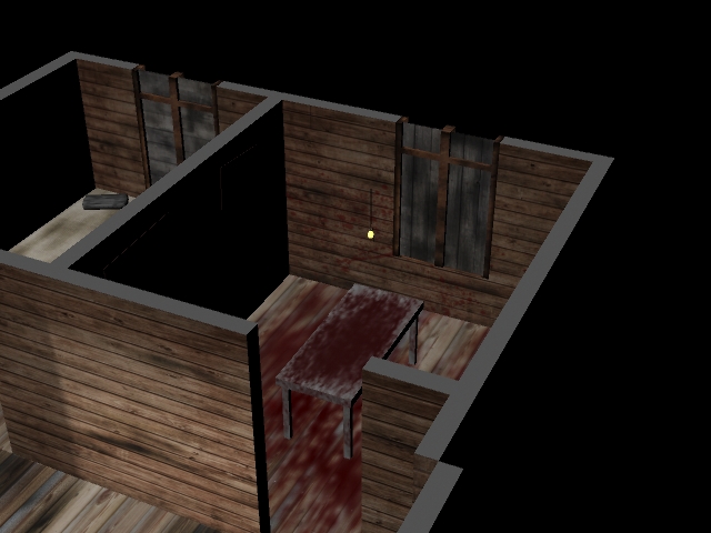
Focusing on coloured lighting, I began experimenting with multiple coloured spotlights and projected shadows. From this, I enhanced my knowledge and skills within coloured lighting, shadow colouring, lighting placement, colour selections and shadow depth. Using Dead Space again, I looked at blood patterns to develop my knowledge in colour depiction and selection, as well as the placement of interior elements (specifically blood) to create or influence the depiction/projection of a horror atmosphere. Creating a horror scene using and focusing on these elements, I further developed skill and knowledge gaps on how to depict/create incandescent lighting, blood spatter patterns and most importantly, how colours can be used to evoke particular feelings, thoughts and emotions. When looking at interior settings, I thought it relevant to study decay and deterioration as recommended by course lecturer Lynn Parker. Doing so, I produced a 3D scene which portrayed rust, thus, improving knowledge and skill gaps including; bump mapping, colour patterns, monochromatic tones and realism.

Breaking down multiple referenced images of modern-day prison interiors, I further enhanced my knowledge of atmospheric projection, themes and the use of colour to evoke specific emotions, feelings and thoughts. Using the examples provided at buildinternet.com, I looked at promotional movie posters of horror movies throughout history to gain a better understanding of how particular themes and the genre of horror are projected through colour palette selections. Freddy vs Jason (2003) was the next example I used to develop my knowledge on how colour influences moods. I felt that I needed to learn more about lighting in professional practices, therefore, I detoured from my plan for a moment to investigate mise-en-scène. Looking at  'Film Art: An Introduction' (2012) by Bordwell & Thompson, I learned about three-point lighting, low-key lighting and high-key lighting.

I chose three countries at random, one of which would be used for my final piece; Japan, Switzerland and Brazil. I did not know a lot about these countries, specifically their influences on the world of horror and cultural traditions. For each possible setting/location I researched the influence and existence of horror, specifically in films and video games, as well as cultural events/traditions. I needed to display advanced knowledge and understanding of evocative lighting, as well as secondary elements which contribute towards the horror atmosphere. Influenced by one of the late sequences featured in Aliens (1986) I created a horror scene, learning how to evoke horror and panic by using rotating lights and atmospheric fog which I had learned how to create from multiple tutorial videos on youtube.com.

Semester two:
My project plan was not set in stone from the beginning of this semester, it did however, progress and develop as my project evolved. Using examples from a mixture of horror films, I created a personal horror film criteria which helped me understand how I, personally, break down horror films. Doing so enabled me to simplify my project aim by focusing specifically on Japanese directed horror films. I realised I had to analyse my own works as well as others to a professional standard, therefore, a formal analysis structure was needed. Using a structure recommended to me by my supervisor Brian Robinson, I overcame my lack of knowledge into the formal analysis process which I learned was highly necessary to make appropriate and professional judgement on any works I might be analysing.

After the pitch presentation it was recommended that I outline a specific target audience for my honours project, an area of knowledge which was empty. Outlining a target audience I learned about relevant influential factors such as gender, age and recreational activities. By creating a scene for my personal horror interpretation I got to practice the formal analysis process which pushed me towards further identification of the unique characteristics of Japanese directed horror such as; colour, lighting, composition and setting. Planning this also pushed my organizational and documentation skills, focusing on important elements such as my design process for practical examples and critical abilities/focuses when analysing my own works. I was still struggling to understand the requirements of the end of year showcase, therefore, I looked towards examples of exhibited works in other universities, focusing on colour selection and layout. After reading the feedback I had received from semester one, I realised I had to be more thorough and critical in both design and analysis, using as much inspirational sources for my works to further better and develop my knowledge and skills.

Comparing examples of Japanese and American horror films, I came to an understanding of the differences between characteristics and codes & conventions by learning about symbolic codes, technical codes and conventions. To gain a better understanding of the unique characteristics of Japanese directed horror, I looked at several critically acclaimed Japanese directed horror titles, gaining a developed understanding of the relevance of critical acclaim, cultural differences and visual elements relevant towards projecting a successful horror atmosphere. Still confused about some of the characteristic differences, I compared several stills form American & Japanese directed horror, identifying new lighting techniques, colour selections and compositional factors, thus, eliminating the knowledge gap. Looking up case study templates online for my second objective helped me understand how to construct a professional case study and how to build conclusive results based on my findings which can be used to develop my project. My sketching skills were dull and in need of tuning, therefore, to develop my personal horror interpretation, I decided to develop my digital painting skills.

Using feedback from others and purchased software tutorials, I constructed a series of designs for my personal horror interpretation which has dramatically evolved and improved my technical capabilities within photoshop. The showcase demanded a professional standard of presentation, therefore, I needed to understand how one may achieve this. I went to the McManus galleries in Dundee wherein I learned about materials, colour choices, monochromatic tones, layouts and labelling. I wanted to heighten my knowledge on visual components in Japanese directed horror, therefore, I investigated four remakes/interpretations of Japanese directed horror films to better understand American directing styles, visual components and Japanese characteristic adherence. I still needed to know more about the end of year showcase, primarily how to present my expositional work, therefore, I acquired some examples of previous years' showcase layouts, enabling me to develop my own space, create my own business cards, posters and personal statement.

I feel that I have followed my development plan successfully, although straying from the intended path from time to time, every knowledge and skill gap I felt that I needed to overcome or fulfil has been met and used to further better and develop my honours project.

Friday 10 May 2013

Exposition research (part IX) - three stages of development

This is another brief post in which I will be discussing the three stages of development which I will be displaying in my allocated space at the honours showcase.

The three stages of development will be placed below my project poster, detailing the steps I have taken towards completing my honours project. The concept art and finished pieces will be displayed in the digital interface and in my sketchbooks which will be placed on a small table below the three stages of development.

Stage 1:
Research will be outlined in this A3 poster using a series of images from the earlier stages of my project which focused on the identification of the unique characteristics of Japanese directed horror. Text will also be included to summarise this stage of development.

Stage 2:
Concept design will be detailed in this A3 poster using a number of images displaying the process in which my 2D artworks undertook to visually depict my personal horror interpretation using the identified characteristics from stage one. Text will also be included to summarise this stage of development.
 
Stage 3:
The third A3 poster and final stage will be 3D production in which I will be showing a collection of images that follow the stages of my 3D personal horror interpretation, from the initial stages to the completed environment. This will capture the inspiration and transformation from the concept work in stage two, as well as the unique characteristics of Japanese directed horror researched and identified in stage one. Text will also be included to summarise this stage of development.

I am considering changing design to results in order to draw conclusive outcomes from my honours project, however, this will be decided during the design of these posters next week.

Thursday 9 May 2013

Exposition research (part VIII) - digital interface

In this post I will be outlining what I hope to select and display in the shared digital interface for the honours showcase at the end of the semester.

Main menu/student selection screen

Main menu/student selection
The main menu will be my initial concern for advertising the digital side to my honours project. I am certain that my poster at the top of my allocated space of the showcase will be used to advertise my project. I will be resizing the image and text to meet the required dimensions of the main menu/student selection image. I may or may not be altering the colours I used for my project poster, however, in order to blend and/or fit with the background template selected for this years digital interface, I will most likely remove the saturation from my poster and add some colour to the text.


Image selection

Image selection
I am going to submit roughly sixteen pieces on the image selection screen, displaying four of my best digital paintings (concept designs) and four stills of my finished 3D environment (personal horror interpretation). All eight of these finished pieces will be led by the development path they took, for example, I will show all of the collected stages of progress one of my digital paintings took in one single image, then the completed image will be displayed afterwards, focusing on a before and after style of display. I will be selecting my best and/or most favoured pieces sometime early next week before the dissertation is submitted so that I have enough time to adjust, resize and code my work into the digital interface.

Wednesday 8 May 2013

Exposition research (part VII) - personal statement

This a quick blog post to outline my personal statement for my layout at the honours project showcase.

I asked my supervisor, Brian Robinson, about how I should construct my personal statement, to which he gave me a bullet pointed outline.

  • Less than two hundred words
  • My name
  • My academic interests 
  • The area of research I am exploring for my project
  • How my honours project has developed me personally.

This is not the final version as I am seeking guidance and correction from a previous honours project student, however, I thought I would outline what I have thus far:


“We make up horrors to help us cope with the real ones.” - Stephen King
 

Hello there, my name is Murray MacNab, forth year computer artist.

3D and 2D environmental design are my key areas of expertise, as well as my most favoured of interests. I take great enthusiasm in conceptual research and the formal analytical process, particularly observing and adapting to the works of professional digital painters and environmental designers (2D or 3D).


The area of research which I have selected to explore is that of the horror genre in the medium of film, specifically Japanese directed horror. I selected this area of research because I have always favoured horror cinema above all other film genres/categories. The specified focus of my project is aimed towards Japanese directed horror because I have always felt that Eastern horror titles are much more successful in portraying a memorable and cultural-based horror atmosphere instead of recycling the same predictable characteristics found in Western directed horror titles.


Creating this honours project has helped develop me personally on so many levels because I feel my technical, observational and analytical skills have been enhanced tenfold to that of any previous academic period and has opened my eyes to several new design techniques, styles and research methods.


Please enjoy my works displayed around you and do not hesitate to ask me about my honours project or anything else.


Enjoy,


Murray Alan MacNab
BA (Hons) Computer Arts

Sunday 5 May 2013

Exposition research (part VI) - project poster

What?
This post will highlight the favoured aesthetic for my project poster which is to be featured in my layout for the honours project showcase at the end of the semester.

Why?
To display how I will be advertising the entirety of my showcase layout and my honours project.

Design
http://www.avcesar.com/source/software/tmdb/2156/extrait_ringu_1.jpg
I felt that the main poster for my showcase layout had to capture what I am trying to achieve with my honours project, which is to identify the unique characteristics of Japanese directed horror. Using a large close-up of a scene from Hideo Nakata's Ringu (1998), I felt this image would be most appropriate for my project poster because it is a Japanese directed horror film, one of my case studies was directed towards the investigation of this film and finally, because I thought it would blend with the rest of my selected showcase pieces once the image was saturated.

After adding some saturation and lowering the brightness of the image, I placed a suitable font at the base of the image to advertise the title of my project. I love the font used in notepad, however, I did not want it too look so outdated or pixelated, therefore, I selected a slightly neater version of the same font and sized it out accordingly. As my name will be displayed at the top of my allocated space, I did not want to further clutter the poster up by putting my name in with the project title. This is not the final draft but this is the aesthetic I would like to use for my project poster because the image selection looks terrific within my chosen colour/tonal range, it looks simple and professional and it highlights/follows existing elements within my honours project.

Next steps:
  • Select final pieces for showcase
  • 3 x stages of project development

Exposition research (part V) - business cards

What?
In this post I will be outlining the design of my business cards for the honours project showcase at the end of the semester.

Why?
To display how the design and colour selections are to blend in with the rest of my showcase layout.

Front
front
The front of my business card is simple, basic and blends in with the colour range I have selected for the rest of my showcase layout. My intended design style, similar to that of my layout, is simple and functional or less-is-more because I feel that it is unnecessary to overdo or overfill one's identification with shapes or images. As I would like to maintain a professional standard within my works, I felt that my business cards should be treated no differently.

Back
back
I made sure that the back of the business card followed the colour/tonal range I am using for my showcase layout and the front of the card by making the background colour grey, with black and white text and a neat font selection. This design choice is to further my less-is-more aesthetic displayed in my showcase layout. The BA (Hons) Computer Arts text in the top right corner is only temporary for now because I am still uncertain whether to just put 3D environment artist or 2D/3D environment artist (as I am now skilful in both fields). I would like to seek a career in 3D environment design, however, I feel that I should check with the course lecturers first to ensure I am not selling myself too short.

Next steps
  • Project poster
  • Select final pieces for showcase
  • 3 x stages of project development (A3)

Exposition research (part IV) - layout

What?
In this post I will be outlining my showcase layout, focusing specifically on materials, layout and colour.

Why?
To give a rough understanding of how I will be presenting my selected works, what colours I will be selecting and what materials I will be using.

Layouts
Below I have highlighted my original design/layout presented in the infrastructure form as well as a rough idea of my layout for the showcase.

***NOTE***
I use the word materials to describe actual materials, as in glass, card, paper, etc. I realise that the honours handbook uses 'materials' in a different context, therefore, I would just like to clear this up.

Original layout
This was the original design for my showcase layout, admittedly, it was very off but the principal design is still something I wish to follow. Initially, I thought that each student was allocated both walls, however, I was corrected by the lecturers and was soon back on track. I still want to include a table in order to present my sketchbooks, however, the rest of it needs adjusting.

Final layout (1st draft)
This is the layout I would prefer to use because it is both functional and professional. I wanted to show off the stages of my honours project. therefore, I placed three A3 sheets below the main project poster. I initially tried to set the poster as A1 in size, however, it did not leave much room for the rest of my arranged setup. The personal statement will lie to the right hand side of the A3 project development sheets and my business cards will be underneath it. In the bottom right corner I will have a small table set up with my sketchbooks on top of it to further display the development of my project. I feel a less-is-more approach makes this arrangement more professional and tidy in appearance.

Materials 
The materials I will be using will most likely consist of printing paper for my selected works & project poster and card will be used to frame all of my selected pieces, including the personal statement and the project poster. The holder I will be using will most likely be plastic or metallic, depending on where I can find one. I have selected card as my choice of framing material because it is basic, presents a tidy aesthetic and maintains a professional standard within my showcase layout.

Colours 
My colour selections will be primarily consist of greys, blacks and white in order to highlight my identified knowledge of saturation and a heightened grey-scale in Japanese directed horror films. 
Using Adobe's Kuler, I have identified a full tonal range which I would like to use for my materials, font colour and project poster. This colour selection also matches the colours used for my business cards which features a white to black tonal range. Despite the fact that some of my research, concept and final work feature different saturated colour values/patterns, I feel this tonal range will help maintain a professional aesthetic within my showcase layout.

Next steps
  • Business cards
  • Project poster
  • Select final pieces for showcase
  • 3 x stages of project development (A3)

Thursday 2 May 2013

Exposition research (part III) - previous years

What?
In this blog post I will be detailing the works of various student's from last years' honours project showcase.

Why?
To understand the limitations of my design possibilities based on; colour, layout, space and materials, ensuring that my displayed works are of the highest professional standard.

This is an example of a simple layout for exhibiting ones' favoured works. Although this is simple and considered stylish in the art world, I feel this layout is very lazy. The hanging piece in the centre does blend with the rest of the blank space, however, it does not display any materials, colours or completed works, making this piece somewhat boring overall. On a positive note, the designer of this showcase exhibit was considerate enough to provide leaflets and business cards for those whom took interest in his/her works.

 This layout is very well done because it shows a developed work process. Listing the three central stages of development, this layout shows progress as well as a means of structure towards achieving the main objective/aim of this project. Although sticking to the same tone (white), this exhibit blends the displayed pieces of work together in both a neat and professional manor. Personally, the lack of colour would be the only flaw to this showcase layout because colour is a really effective method/tool in making displayed objects more approachable and alluring to any passers-by. There is plenty of information for those whom approach this showcase as everything is very well detailed and labelled as well as business cards and leaflets for those whom wish to learn more about the creator/designer.

This image shows the complete shared space allocated to each participating student in the honours project showcase. Both students whom have displayed their works in this piece have made very good use of  their allocated space, providing various materials, using different and attractive colour selections as well as leaving behind necessary contact information such as leaflets and business cards. The student on the left has used a much more colourful and functional layout than the student on the right because the orientation of the items on the right do not follow a specific pattern, making his/her works look somewhat disorganised.

Conclusion:
  • Space - I have to be wary of how I will be presenting my completed works, how many of my completed pieces I will be displaying and most importantly, how will my allocated space appear to those exhibiting/visiting.
  • Colour - the manor in which my works are displayed will also be influenced by that of colour, therefore, I must ensure my colour selections/patterns are not overwhelming to the eye, but instead, visually inviting/welcoming to those attending the end of year showcase.
  • Materials - adding background mounting or framing would definitely make my selected pieces appear more professional and neat, as well as making them stand out in a much more alluring fashion, however, I must make sure my material selections do not detract or interrupt the flow of my desired layout, otherwise my works will appear disorganised and somewhat careless. 
  • Layout - the most important factor of my layout is orientation. If I present a display pattern that shows compete disorganisation in terms of orientation, my works will look messy and also somewhat lazy. There is nothing wrong with having more than one orientation, however, the manor in which these various orientated works are displayed can make my allocated space appear less or more professional.