Colours can be suggestive as well as well as symbolic. Below I have provided a colour test using two props textured with bright colours in order to highlight what moods, feeling or emotions these colours personally evoke in me.
 |
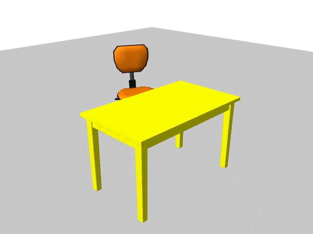
| Rig locations - Chair - http://www.creativecrash.com/maya/downloads/character-rigs/c/office-chair-rig. Table - Old Table - http://www.creativecrash.com/downloads/3d-models/furnishing/furniture/table/c/old-table | |
|
 |
| Rig locations - Chair - http://www.creativecrash.com/maya/downloads/character-rigs/c/office-chair-rig. Table - Old Table - http://www.creativecrash.com/downloads/3d-models/furnishing/furniture/table/c/old-table |
 |
| Rig locations - Chair - http://www.creativecrash.com/maya/downloads/character-rigs/c/office-chair-rig. Table - Old Table - http://www.creativecrash.com/downloads/3d-models/furnishing/furniture/table/c/old-table |
In this scene I have downloaded two furniture rigs from creativecrash.com, and applied bright colours. Here I will elaborate on the colour choices, explaining evoked emotions, feelings or moods.
Yellow
Personally, this colour inspires feelings of happiness, warmth and a sense of brightness in my day. I feel that yellow is more alluring as well as bright. I base this on the fact that yellow is used for the background colour of signs in everyday life to catch our attention such as traffic lights,
product advertisements and hazardous warnings. This colour is used because it is very alluring and contrasts with dark colours thus, making it easier for the human eye to notice.
 |
| https://blogger.googleusercontent.com/img/b/R29vZ2xl/AVvXsEj1sCPXN3e49W6DtEGZMvWJoRNcMVnF81o01nKV4OnMyYSo2JVImxL6z2Y1s4dtvrYYAEpBQ3x2s5h-LZ4oABpZ3v0IKITtwMaQyx-g6wJLKwGS5nT6L7lwIwR2OsXmPJLi8td-ZoHzzT4R/s1600/warning_symbols.jpg |
 |
| http://www.shahrulazmi.com/blog/wp-content/uploads/Yellow-pages-Billboard-advertisements.jpg |
Orange
When looking at this colour, I have feelings of warmth and security and at the same time happiness. This colour also inspires energetic and bubbly moods, giving me the urge to go faster if I'm working or go for a run when I'm bored. When I'm alone, this colour makes me think of home, a place of safety, security and warmth. Finally, I think this colour is effective for advertisements and products because whenever I see orange used in advertisements or products it tempts me to pursue it further, perhaps even buy said product because of that warmth I feel inside.
 |
| http://grafisia.com/assets/inspiration/hejz/fanta-orange.jpg | | |
 |
| http://files.coloribus.com/files/adsarchive/part_1527/15277855/file/orangina-drink-icon-bottle-drop-600-38870.jpg |
 |
| https://blogger.googleusercontent.com/img/b/R29vZ2xl/AVvXsEg-UIa5XnzBAvTlEG_9DrfLxXRKFmabNWHzAolXyigrkc682AsRo65Z-QHN3-RcFEL_8VAxVlOnDy0yrAZeJH2QBAU7sIW22A8xia0o6_VP7w7z7dnLtCRQ6Eo1zCpSZqZHC8jKZ73vkzc/s1600/Cheetos_Ad_1.jpg |
What relevance does this research have towards the development of my project and horror?
The relevance of this research is to discover what feelings, emotions or moods are evoked by certain colours so that I can use these learnings in order to
break down what colours are used to evoke certain moods, emotions and feelings in horror. Horror uses colours that inspire negative emotions therefore, it is a matter of researching colours that contrast with those used in this test and then developing an understanding of how to portray them successfully in my 3D environment.


No comments:
Post a Comment