The next stage of my colour research is calming colours.Below I have coloured a roof-less room in with colours I think promote calmness, using barrels downloaded from creativecrash.com to help the colours stand out.
 |
| Barrel prop downloaded from: http://3dmodel.domawe.com/2012/03/wooden-barrel-free-3d-model-1.html |
 |
| Barrel prop downloaded from: http://3dmodel.domawe.com/2012/03/wooden-barrel-free-3d-model-1.html |
 |
| Barrel prop downloaded from: http://3dmodel.domawe.com/2012/03/wooden-barrel-free-3d-model-1.html |
Blue
Blue helps promotes a relaxed mood, when I think of blue I think of cool flowing waters, having a shower, going swimming, all of which I enjoy. It also makes me think about the weather, and happy thoughts about maybe travelling to other countries where the skies and the waters are both a purest blue. I have been known to react emotionally to blue, if I'm feeling bad it sort of makes me feel worse.
 |
| http://f0.bcbits.com/z/15/19/151981035-1.jpg |
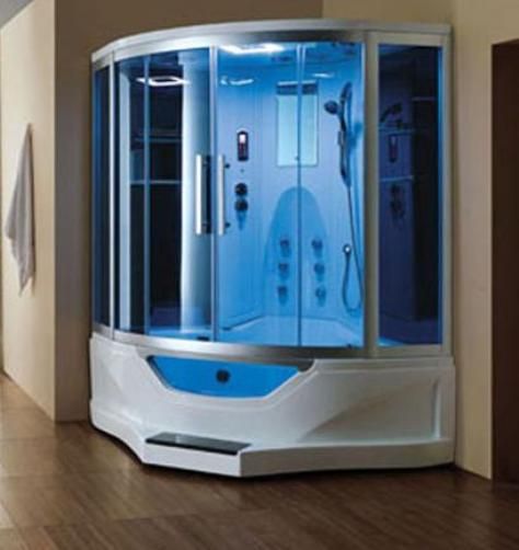 |
| http://salestores.com/stores/images/images_747/ARIEL702.jpg |
 |
| http://www.safety4sea.com/images/media/test/Fiji_islands.jpg |
Green
Green, to me suggests four things. First of all, green makes me think of nature; trees, plant-life and the green lawns of suburban homes. Green also inspires feelings of fear as it is a very common colour for reptiles. Reptiles are not at the top of my list of fears but thinking of lizards, snakes and poisonous frogs makes my skin crawl. The next thought inspired by the colour green is the sudden impulsive urge and desire for chewing gum. Green has always been associated with spearmint gum in my mind, the colour promotes a craving for this product. Feelings of anxiety are evoked in the last last example as green also makes me think of going to the doctors or the dentists, any place of health, which makes me feel nervous as I will most likely have caught a bug and about to be told some bad news or have someone jamming a needle into my gums.
 |
| http://www.salemdental.net/editor/assets/Salem%20Dental%2006.jpg |
 |
| https://blogger.googleusercontent.com/img/b/R29vZ2xl/AVvXsEhrx27qmW6oliIU25ViZjRMwsED1y6T-oW5kIY_L0_UykqY_huc_MUIaqH65j1Fpq5YuljFw7-eeiGSs8W7C7RnqH6nbOmyHZFM7UhgQQSEAQbAEQaPm2wHcx3gwkEptzy1drIrwl0P9Vg/s1600/Red-eyed+Tree+Frog.jpg |
 |
| http://www.whitegadget.com/attachments/pc-wallpapers/16215d1222951905-nature-photos-wallpapers-images-beautiful-pictures-nature-444-photos.jpg |
 |
| http://images.mysupermarket.co.uk/Products_1000/62/016062.jpg |
What relevance does this have to the development of my project and horror?
The relevance of this colour research is to be able to take these relaxing/calming colours and again, find what colours contrast with these emotions/feelings/moods such as panic, fear and anxiety, to gain a greater understanding of how colours used in horror evoke such contrasting emotions/feelings/moods.After this it will be a matter of practising how to portray this in my 3D environment in order to develop a more successful horror atmosphere.


No comments:
Post a Comment