This is the last of my three possible locations for my 3D horror environment. Like the previous two posts I will be looking for notable horror tiles in film and computer and video games, as well as any cultural events or traditions to which I might be able to create a theme for my final piece.
After some online research I have discovered that Brazilian horror cinema has a descent selection of examples to use as research for a more effective understanding of horror although, there are is not a lot to work with here. Most of the titles I found are set before the 1980's and only two titles from 2006 onwards. Most of my study would be focusing on older works which does not provide a very secure or detailed time line of the progression of horror in Brazil.
Games
Similar to Switzerland, Brazil is not known for any major horror titles in the gaming industry. I could only find one soild Brazilian games developer named Hoplon Infotainment, known for its 2008 title 'Taikodom', an online multiplayer. Other than that I could not find much which makes me less interested in selecting this country because it does not appear to be a great inspirational source in the development of horror.
Cultural events or traditions
Looking for cultural events or traditions in Brazil was proving to be difficult as most sites were not up-to-date however, I did come across a website that gives travellers advice to having a stress free time which listed a number of events by month, letting anyone planning to make a trip to Brazil know what is worth seeing and what to avoid. I have posted the link to the page at the bottom of this post as the piece is rather long.
What could this country provide towards the development of my project and horror?
In terms of project development and horror Brazil has not got a particularly large amount to offer. The horror films of Brazil would be good to develop a greater understanding of older horror productions, allowing for new studies in lighting, shadows and colour, as well as understanding how horror was depicted at an earlier age in Brazil. Horror games, like Switzerland are next to none in terms of aiding in the development of my project or horror, as I have nothing to research or study. Cultural events are very inspiring for Brazil as they are enriched with bright tasteful colours, which would have great potential for inspiring a horror scene amidst the glamour and festivities of the evening, which in turn could also help me develop practise in both daylight and nigh time settings.
Nightlife in Brazil: http://www.travelnostress.com/eventbrazil.htm
Continuing my research on my three settings for my 3D horror environment, I will now be doing Switzerland, looking for any examples of Swiss made films and computer and video games.
The horror film scene was very thin for Switzerland as these were the only titles I could find in the genre that were as close as possible to Swiss. There were a few others however, upon reading their descriptions they sounded more like sexploitation films or comedy films which can't really be used or deemed suitable for my research. Some of the film titles I found had too much contradictory information and so I decided to list the ones that were either based in Switzerland or directed by a Swiss person.
Games
The Swiss gaming industry is not as dead as I thought it was however, the vast majority of projects or games made by companies such as Crown ADAM, EverdreamSoft and Gbanga are mobile, educational, pervasive location-based or online/social games. I could not recognise any major works in horror therefore, Switzerland is very unhelpful for researching the genre or sources of inspiration for the development of my project.
Cultural events or traditions
Despite being few in horror on films and nil on games, the swiss culture outweighs those of Japan. As the source of information for cultural events or traditions in Japan were mainly tourism websites, I started there. Eventually, I found a guide site for Switzerland that lists all the cultural events and traditions for this year, and the list is absolutely massive. Instead of listing every event and making this the world's longest blog post, I have posted the link to the website at the bottom of the page.
What could this country provide towards the development of my project and horror?
Overall, Switzerland has a very large number of yearly traditions which would serve as a large sources for a theme in my 3D environment however, as horror titles are few and gaming titles are nil, this country would be very poor in terms of inspirational or useful resources, which would not be productive to the development of my project and creating a horror atmosphere.
Cultural events and traditions link: http://www.swiss-switzerland.com/fairs-and-festivals-in-switzerland.html#January-Festivals
In this post I will be researching horror in computer and video games for my three possible locations to see which country can provide the most resources and references. I will then be researching cultural events or traditions in each country for a possible theme for my 3D environment. After compiling lists on the these components for each country, I will then make a final decision based on my findings mixed with my original research at the beginning of my project.
Films
Researching this did not take me as long as I thought it would. Luckily, I stumbled across a website called Asian-Horror-Movies.com which lists all Japanese horror productions since the year 1950. The list is incredibly long therefore, I have posted the link to this site at the bottom of this post. There were lots of other sites that provided information on Japanese horror cinema which makes me feel confident that Japan will have a lot to offer on my other two research components/categories.
Computer and video games
Japan is also notorious for computer and video game titles in the horror genre. Unlike the examples I have provided for horror films in Japan, I will be listing games companies that are commonly known for developing horror games along with a few nameable titles
Cultural events or traditions
The Japanese culture is rich, full of ancient and modern traditions. After some scouring online, primarily on history websites and travel agents, I have found a Japanese tourism website that details all of the country's traditions, making it apparent that the Japanese people have a lot more traditions and cultural events than I first anticipated. Like the list of Japanese horror films, the list of events is also vast in size therefore, I have put a link to the site at the bottom of this post.
What could this country provide towards the development of my project and horror?
It is safe to say that Japan is very enthusiastic about horror in film. When looking for inspiration in horror film if I choose Japan, resources will not be a problem. This will also benefit the development of my project because the titles date back to the 1950's therefore, I will be able to see how lighting, shadows and colour have evolved over time to depict horror. The production of horror in computer and video games in Japan is as enthusiastic as the development of film. Again, when looking for examples of lighting, shadows and colour in Japanese designed computer and video games, resources will not be short. The Japanese culture is enriched with dozens of traditions and cultural events, which if chosen, could be very helpful in deciding a theme or location-based setting because it gives me many options to research and use as inspiration for horror.
Japanese films website: http://www.asian-horror-movies.com/indexm.html
Tourism website: http://www.jnto.go.jp/eng/attractions/event/traditionalevents/
This is an update to my previous post about confliction I have been having about my interior setting. I bumped into Brian Robinson before I started my work today, asking him if he had read my email. Brian told me he had not yet read it and asked me to tell him what issues I was having. I told him I wanted to keep the work I had done for my prison setting and keep it to show development in my project and instead, choose the interior setting over semester 2 and focus more on researching my three original locations; Brazil, Switzerland and Japan. Brian said this was fine so long as I critically justified my reasons for doing so.
Reasons for change
Horror-less - A prison setting would be hard promote without characters as a prisons are usually filled with criminals and guards.
References - I can think of little or no examples in film or video games that I can use as research or inspiration for the development of my project.
Neglect - I feel I may have been to rash as I have failed to do any research on the three original locations I looked into at the start of my project.
Research - I would like to make a decision on my interior setting by researching at the beginning of semester 2. I realise this will add to my already stacked workload however, as I said in my previous post, I would rather enjoy what I'm doing and be happy with my decision rather than just sticking to a bad decision and following through for the sake of it.
Mise-en-scène is used to provoke feelings and feelings in an audience throughout an entire movie, not just individual scenes. Using references from Film Art: An Introduction (2012) by David Bordwell & Kristin Thompson, I will be investigating how Mise-en-scène is depicted and what components relevant to the development of my project are used to achieve this.
Film Art: An Introduction (Bordwell & Thompson, 2012)
(P.125)
'In artistic filmmaking, lighting is more than just illumination that permits us to see the action. Lighter and darker areas within the frame help create the overall composition of each shot and guide our attention to certain objects and actions. A brightly illuminated patch may draw our eye to a key gesture, while a shadow may conceal a detail or build up suspense about what may be present. Lighting can also articulate textures: the curve of a face, the grain of a piece of wood, the tracery of a spider’s web, the sparkle of a gem.'
Three-point lighting
A technique called three-point lighting is used in the development of Mise-en-scène which consists of three components; key light, fill light and back light. To give an object a sense of depth, the back light is used to remove the object from the background, followed by the key light on either the left or right hand side to highlight the object and the finally the fill light on the opposite side of the key light to ensure the shadows projected from the key light are not to bright or dark.
Here I have referenced a few example in horror which use this technique.
The back-light here is used to remove Ghost-face's hooded figure from the background, followed by the key light on the left which highlights the white of the mask and finally, the fill light on the right is less bright than the left, creating faint shadows on the right which makes the mask stand out more.
Seed of Chucky (2004) - http://lauad.files.wordpress.com/2011/01/chucky-childs-play-7026737-1400-931.jpg
The back light removes Chucky's upper frame and head from the background, drawing more focus on his character. The key light is on the left makes Chucky's scars and deformities more audience whilst the fill light on the right highlights them with dull outlining shadows.
There are two types of key lighting; low-key lighting and high-key lighting. According to Bordwell & Thompson (2012) high-key lighting is the combination of the back light and key light, which is used to create a fairly low contrast between areas that are brighter and areas that are darker. The light quality that is produced by this technique is soft, enabling shadowed areas to be slightly transparent.
Low-key lighting on the other hand, creates a much higher contrast as well as more sharp and dark shadows. The lighting is usually hard with the fill light being lessened or removed completely. The resulting effect is what's called chiaroscuro, or in clearer terms extreme light and dark areas within an image or scene.
Below I have made a few more examples into low-key and high-key lighting in horror.
Low-key lighting
Friday the 13th (2009) - https://blogger.googleusercontent.com/img/b/R29vZ2xl/AVvXsEiwnZjCC-aFWXi0iETK4U7hA4ZQV1cE7MRMnxQju20Bwvv9c0FRNRIspxHIvf8I-I6a1VazNlvUd9Nk7AHeetR73ACevoEWidefqJZffqFbzfo7Xs153QWgZX8fXwm9mVHB5VUJ5r1VmIGc/s1600/FT13+pic.jpg
With the extremely low fill light, the brightness of the key-light on the lower left part of Jason's mask contrasts with the darkness of the background. This draws attention away from the soon-to-be victims face in the foreground and instead directs focus onto Jason's mask. This also adds a touch of transparency to Jason's shadow, as the darkness of his shadow on the wall behind him is not as dark as the outline of his body.
High-Key lighting
Freddy vs Jason (2003) http://4.bp.blogspot.com/-kJP1EbhW5Yk/T8_JvwvASEI/AAAAAAAADnY/7hzLBf-Y3JI/s640/fvsj1.jpg
With the fill-light almost equal in volume to the key-light, surrounding shadows are practically eliminated. In turn, the high-key lighting steers/directs the audiences focus towards the confrontation between Freddy Krueger and Kia Waterson thus, complimenting the character performances.
How is this relevant to the development of my project and the horror genre?
The relevance of this research is to develop a greater understanding of lighting placement and effectiveness in a horror scene. This will also help me to evoke the horror genre within my 3D environment more effectively by looking at examples in films and video game titles in the horror genre to see how it was achieved and how I can portray this in my own works.
To continue my research following the influence of colour in horror, I have decided to study mood and colour selection. I will be using Freddy vs Jason (2003) to research if colour selections can inspire or influence different moods.
Two iconic horror characters, Jason Voorhees (Friday the 13th, 1980) and Freddy Krueger (A Nightmare on Elm Street, 1984) come together in a battle of the serial killers. Freddy Krueger cannot use his supernatural powers to kill without fear, without people (mainly teenagers) remembering him, if nobody remembers him or thinks about him, they cannot be harmed by him. To retain his powers and go back to what he does best, Freddy needs the habitants of Elm Street to remember, starting dreaming about him and then he can strike. Portraying himself as Jason's deceased mother, Freddy commands him to go to Elm Street and 'punish the bad children'.
Jason raises from the dead and carries out these orders from what he thinks is his mother, but once he starts killing he wont stop, until the point in which Freddy has to stop the monster he has put in motion before he kills everyone on Elm Street. Since Freddy is more powerful in peoples dreams, he drugs Jason in order to lock him in a prolonged state of sleep and take him down. The fight between the two takes place in an industrial basement, a classic setting that Freddy chooses for his victims to inspire fear, reminding them that there is no escape. The colour of the room changes twice but this is more than enough to create an atmosphere for this scene. Below is the video of this fight to support my research.
Red
Moods portrayed by this colour are commonly used to inspire romance or love however, in this scene it inspires moods of anger, determination and frustration.
Anger
Freddy had regained his power and was ready to start killing all over again now that Jason had made the locals think it was him who had been committing all the murders. About to deal the killing blow to one of his victims, Jason takes it away from him by killing the girl in the real world thus, removing her from the dream would. Red is a very passionate colour, and with passion comes anger. I think the use of red here made Freddy's anger more passionate because he has gone from pure concentration to pure anger.
Jason was deceived. He eventually figures it out that Freddy took the form of his deceased mother and tricked him into doing what he did, as well as the fact that he had strong feelings for his mother and didn't like the idea that someone had used these feelings against him in order to trick him and manipulate his actions. Despite the fact that Jason wears a mask and the audience cannot see his face, I feel the colour red helps visualise his anger to a greater degree because with each swing of his machete, Jason is showing more authority and passion in his actions.
Frustration
Moods of frustration arise from Freddy in this scene. Despite his best actions and imaginative killing methods, Jason is still alive. I feel that the red amplifies his vocal frustrations because his tone is more firm, leaning down at a presumably crushed Jason, pointing at him with conviction and exclaiming 'Why won't you DIE?!'
Determination
Freddy is determined to finish Jason however, he treats it more like a joke rather than a challenge because this is his world, he can manipulate it as he sees fit and is so confident in himself, he feels like Jason is not much of a threat. The Determination lies in Jason, who has been thrown around the room, had multiple sharp objects penetrate his frame and made a fool of by Freddy. Despite all the hits and injuries Jason sustains, that would be considered over-kill for the average human body, he does not and will not give up until Freddy is defeated. Personally, I think the red highlights his determination because he begins to fight back with great tenacity and with great passion, throwing Freddy across the room into a series of pipes, causing water to burst out and the room to change colour.
Green
This colour usually promotes moods of relaxation or calmness, in this scene however, it inspires moods of a surprised, pleased and mischievous nature
Surprise
On his feet again, Jason stamps up the stairs to where he had thrown Freddy. Both characters were now going to collide up close and personal but suddenly, Jason hesitates, glancing at the leaking water from pipes. Freddy takes a second to understand why Jason hesitated, and suddenly it hits him; Jason is afraid of water. I feel that the green helps highlight his surprise because his body language, changing from attack to defence blends with the colour change, from a bursting passionate red to a suddenly darker, slower paced green - the scene slows down and takes a rest from the action.
Pleased
Realising Jason is afraid of his water, Freddy is now very pleased with himself, seeing that his presumably fearless and invincible adversary has a weakness. The green highlights Freddy's now more relaxed mood because his mouth goes from a wide open gasped expression to a great big cheesy grin on his face thus, going from panic to calm much like the colour change, angry red to relaxed green.
Mischievous
Fully aware of Jason's fear of water, Freddy sees this as an opportunity to use his abilities in order to inspire more fear in Jason. Water bursts from the pipes above Jason whilst Freddy cackles at his opponent, proud of his actions. Freddy erupts into a cloud of evil laughter, contrasting with the raw and intense emotions of red, to a more laid back, mischievous mood inspired by the colour green.
Summary
What have I learned?
I have learned that colour selection can inspire different moods beyond their common depictions. I have also learned that moods can help improve the effectiveness of a scene as well as character performance.
How will this help in the development of my project?
As I am still developing a more solid understanding of colours in horror, I can safely say this research has enabled me to think outside the box, to look beyond the common depiction of certain mood colours and try to find other lesser-common moods inspired by these colours. When adding colour to my 3D environment, I shall be looking for ways to inspire moods by experimenting with colours and asking myself:
What mood does this put me in?
Does this colour make me feel other moods?
What mood do I hope to capture with this colour?
How will I highlight this mood with colour?
What relevance does this have to horror?
With a more solid understanding of the importance of colour selection and moods, I will be able to develop an understanding of what colours inspire moods and emotions used in the genre of horror. It will also help me think what moods are relevant to horror, so that I can convey these moods appropriately with the correct colour selections.
I am having doubts about making the interior setting for my 3D environment a prison. Initially I thought it would be a great idea but now, I'm very uncertain. This was mainly because a prison is usually filled with prisoners, and my project is environment and aesthetic-based, not character-driven. How can I depict a prison horror scene without people, it would be senseless and a waste of time.
I have emailed my supervisor Brian Robinson on this issue, but have not yet heard back from him. Personally, I would like to keep the works I have submitted in developing the prison concept as a means to display how my project has developed and progressed however, I would prefer to make a decision on the interior setting during the design phase of my project over semester 2. I realise this will most likely add more work, but I would rather be happy with what I was doing rather than continuing to design a project I have no interest or faith in.
In light of my research proposal feedback, I arranged a meeting with Brian Robinson to go over it. Once we started, I wanted to ask a few quick questions about my blog before we went over my research proposal feedback. The entire meeting was then hooked on discussing my blog as Brian had noted that the addition of a futuristic theme on top of the development of my 3D environment was both going off at an unnecessary tangent and adding a lot more to my work load in terms of research, testing and design. We discussed the issue that I have not shown any progression towards the three original locations for my 3D environment since their creation in November. Brian recommended I try and put some further research into these locations (Switzerland, Brazil and Japan), explaining their relevance to my project and the genre of horror. Next Brian recommended I delete anything futuristic from my blog as he knew that I was heading off-topic and leaving it on my blog would only cause problems and confusion for me.
Before we finished and I got back to work, Brian gave me a few pointers on how I should proceed before the submission on Friday:
Fix my blog - remove all futuristic-related posts
Relevance - go over blog posts, underlining what blog posts and practical examples have to do with genre of horror
Horror characteristics - research into what makes horror (film theory)
Mis en scene - linking my concept drawings to horror and encouraging further research into this design technique.
Setting - why would any of the three settings work in a horror atmosphere?
As I am only 3 days away from submission, I will try my hardest to rectify these errors, conduct more research into neglected areas, investigate mis en scene and hopefully, make a final decision for my location for my 3D environment. I cannot guarantee that I will be able to make all these changes and fix all these errors but I will give it my all.
I came across this website when researching colour in horror films. This website outlines the colour palette selections for various horror movie posters. Below, I have picked out my favourite of these movie posters, its matching colour palette and my own analysis detailing why I have chosen this example, what relevance this example has to the development of my project and why I think this colour palette is effective in promoting the title.
Jaws was a personal childhood favourite, my first aquatic themed horror film which like everyone else who saw it at a young age, made a sacred vow NEVER to go into the ocean without an oxygen tank and a rifle. This film used a first person camera perspective and was suspense driven, inspiring future works of horror such as Halloween (1978), Blair Witch Project (1999), [REC] (2007) and Grave Encounters (2011).
Why is this colour palette effective in promoting this title?
The light toned cyan is used for the colour of the ocean which blends with the dark shaded silver of the sharks skin, depicting the metaphorical imagery that the monster is one with the ocean, invisible as a shadow amongst the waters it stalks. The white is used to both contrast with the bright red of the title and to symbolise action in the water i.e. the splashing of the swimmer, the movement of the shark and the air bubbles below the surface. The black is used to outline the entire poster, making everything in the foreground stand out.
What relevance does this have to the development of my project?
Colour palettes are important for more than just promoting a title, they help visualise themes. Horror being the theme of my project, I have to be able to project this atmosphere with colour as well as other visual attributes.
Film posters/colour palettes site: http://buildinternet.com/2009/03/color-scheme-inspiration-vintage-horror-movie-posters/
After receiving my grade last night I have now today, had more time to read the feedback from my research proposal in full. Below I have categorised each section of the marking scheme, along with bullet-pointed evaluation of my feedback.
Premise
Incorrect use of the word 'one' when trying to demonstrate third-person passive tone
Insufficient literature to support statements
Unclear why colour and lighting are important to the development of horror
Context not fully established
Context
Incorrect/inaccurate statements
Research not thorough on certain topics
Using research methods instead of review methods
Absence of critical discussion
Interpretation of appropriate theories needed
Appropriateness of Methodology
Research methods in need of some refinement
Combination of practice and case study poorly developed and discussed
Clarity of Methodology
No theory development
Plan to conduct analysis unclear
Research criteria not clear
Vague and unclear language use
Predicted Outcomes
Presentation of proposed points unclear thus, less credible
No development of colour theory and the effects on emotion
Insufficient discussion of horror genres
More theoretical research needed
References
I have received no feedback on this section however, the guidelines of the assessment criteria state that citations and references I have provided, somewhat follow the prescribed guidelines of this section. More time should have been spent on selecting references appropriately in order to improve my skills in academic writing.
Presentation
Sections of proposal unclear (no clear indication or headings)
Poorly structured language
Writing presentation requires improvement
Overall I am rather displeased with the quality of my research proposal and all the errors I have made however, I will not let this dishearten or discourage me. I will use this feedback as a lesson, as well as guidance towards the construction of my project dissertation, to ensure that these mistakes are not made twice and also to guarantee that my dissertation is of maximum quality.
I am struggling to decide which country my futuristic prison horror environment shall be based in and it is driving me round the bend. As we are only a week away from submission I feel I need to make a decision. I have stated that I will be studying modern day prisons designs and science fiction, what I have not stated is whether or not I will be choosing the country of origin by the end of this semester, or wait until the actual production of my project over semester 2.
I have arranged a meeting with Brian for Monday to go over the feedback from my research proposal and to rectify issues such as this. Hopefully I will be able to get these issues solved before the submission date on Friday.
The ethics and health forms have been filled out carefully and now await the signature of my supervisor, followed by submission. The forms were pretty basic, confusing at times but I got there in the end. The only part of the ethics form I have left blank was the possible ethical issues section, as I feel my area of research has no negative ethical implications. I do not know if I'm allowed to leave this section blank however, when I head into Abertay tomorrow to seek Brian Robinson's signature and to submit the forms, I shall also seek his guidance on the issue to ensure I'm avoiding error.
Semester one has proven to be very challenging. Personally, I feel I have developed on many levels in terms work. In third year, I turned a blind eye to essential factors such as the assessment criteria; if I knew how I was being assessed I feel I would have paid more attention to the direction and quality of my work. Another flaw would be research; I have only now, as a forth year began to use the facilities of the library as a constant hive of information and resources necessary to my coursework. In previous years I did go to the library when I was short on references, but now its the first place I head when approaching a new topic, area of study or even when I'm having software based problems that Google cannot help solve. The most notable flaw I carry and has caused constant problems, especially in my educational pursuits - organisation. More than often I end up letting myself by not preparing things in advance. It almost happened again this semester however, I feel like I am going to be able to get everything in on time and to the best of my potential.
Semester 2 holds a lot of promise. All I have been looking forward to since starting forth year is getting down to the physical creation of my horror environment. As soon as I hand in my deliverables for semester one, my first objective is to carefully plan the semester ahead because I have to take into account that I will be juggling a large 3D project and a dissertation at the same time. I hope to stay on top of my work and manage my time efficiently in order to submit quality work to the best of my abilities once the final submission date arrives in May. The dissertation looks scary, I'm not going to lie however, I have made it this far and I'm not going to back down now !
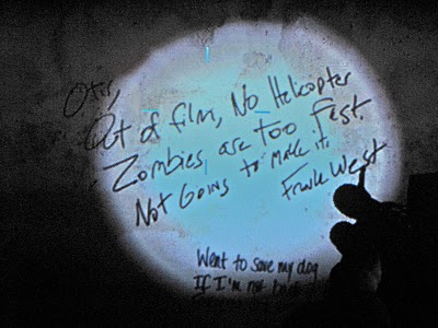
When designing a 3D environment, one must consider the smaller details. The important factor here is to pay attention to what has been overused and what has been left unexplored. Some overused smaller details do work, as well as contribute to the theme and/or storyline of the game. In Left 4Dead (2008)& Left 4 Dead 2 (2009) there are dozens of messages scattered throughout the game in various locations, some are references to other games, popular culture, literature and finally there others such as messages to loved ones or warnings to other survivors also trapped in the horror of the zombie apocalypse. These are effective examples of smaller details because it is original, it allows the player to feel more involved in the game and it creates a more effective horror atmosphere because it makes the player feel like there has been so many people like the characters they control, that have written these messages on the wall and failed to survive, evoking feelings of anxiety and fear in the player.
These scribblings on the wall are a reference to the Capcom title Dead Rising (2006), another zombie apocalypse-themed game highlighting two central characters Frank West - a bold photojournalist investigating the government activity surrounding the outbreak stricken Colorado town of Willamette, and Otis - the janitor whom informs you of other survivors and various findings on the security cameras via radio contact. The text reads, 'Otis, Out of film, No Helicopter. Zombies are too fast. Not Going to make it. Frank West.'
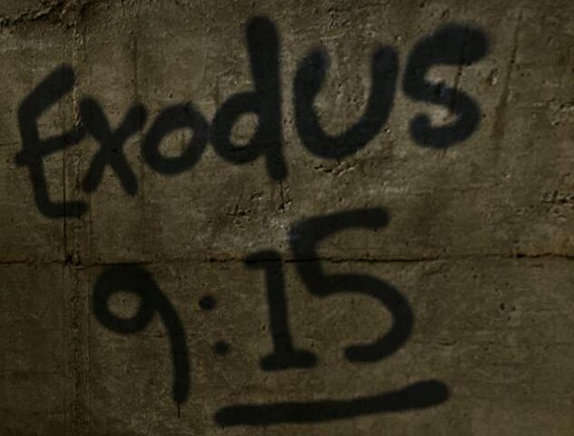
A bible verse marked on the wall in order to highlight as well as link the religious perspective with the zombie outbreak of the storyline which reads, 'For by now I could have stretched out my hand and struck you and your
people with a plague that would have wiped you off the earth.'
Print screen and cropped from: http://www.youtube.com/watch?v=mGFhyIW2gQE
The text directly in the light of the players flash-light reads, 'John I'm safe I got out and I am travelling with good people. They are
immune too we are going to find a super market and fortify it. We will
hide until the army comes. I love you. XOXO Sharon'
This could be a possible reference to Stephen King's book The Mist (1980) in which a number of survivors are lost in a never ending mist-like fog covering everything around them, leading them to find shelter in the local supermarket to try and remain hidden from the various creatures/monsters that appear out of the never ending cloud.
What relevance does this research serve towards the development of my project and horror?
The relevance of this research is to understand the importance of smaller details in environments and how this can be used to provoke human reactions. The relevance this has to horror is understanding that the addition of smaller details creates a greater sense of realism to the environment and therefore, a more effective horror atmosphere. When developing my 3D environment this will help me focus more time and attention on smaller details to ensure more realism and a greater horror driven atmosphere.
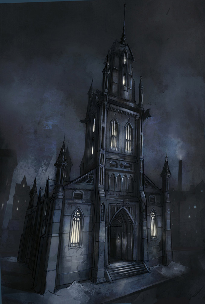
In order to pave a developing road for my final project, I must first take into account the variety of designs for buildings, focusing on shape and the style in which they are constructed. Here I have elected Batman: Arkham City (2011) as my first example. This game is not classed as horror, nor is it scary however, the building designs and atmosphere of the game are something to be recognised. Some of the buildings in this game use a medieval style of design, focusing on spires, spiked fences, gargoyle perches and tall windows. This blends with the atmosphere surrounding the character of Batman, inspiring terror and fear in the hearts of his enemies - what better way to do this than link the fear created by the presence of Gotham City's dark knight with the environmental aesthetics.
Other areas of Arkham City continue to promote this old fashioned and/or
historical theme. This is achieved by using three-dimensional shapes
and linking them together, creating an industrial and rustic aesthetic. A
large number of the buildings in Arkham City appear badly constructed
or modified, suggesting that the criminal inhabitants of the city have
tried to transform the city into a vision of their own. Three gangs rule
the streets of Arkham City, controlling and guarding their own
territory or 'turf'. With each gang comes a different theme for example,
Oswald Cobblepot (a.k.a Penguin) takes control of the museum and
transforms it into a winter palace of doom; frozen museum exhibits,
hostages transformed into ice cubes and even a shark in the now flooded
central hall, stalking the player below a sheet of thin ice. This
compliments the initial aesthetic and design of Arkham City because it
takes a large selection of buildings with a clearly
outdated/old-fashioned design style and adds a more modern/up-to-date
style of design on top.
What relevance does this research have towards the development of my project and horror?
The relevance of this research is to gain more knowledge on two areas, the shape in which buildings are constructed to create a more effective atmosphere and to develop an understanding of themes because I have not yet decided a theme for my 3D environment thus, research on this topic will help me narrow down my decision and encourage me to look for examples in other genres, not just in horror. If I research themes in only horror titles, my finished 3D environment will not look very original or imaginative.
I have decided that my 3D horror environment will be an interior setting. I have not yet decided on the country to base my horror environment in however, I feel choosing a setting will help make the decision for the location easier. I have an initial idea for the interior setting - a prison
Why the change? This choice has been made because I feel that my technical skills are much more benefited within an interior setting. I have had little or no experience on exterior settings and in hindsight, my work would be of a lesser quality based on time scaling and technical skills. I have worked on interior settings in previous years and feel much more confident in my quality in my deliverables based on this change. This new direction is also because I feel my project would benefit from a more creative approach that would also help boost the direction and initial aim of my project.
Why a prison? The idea was random but I liked the concept of a location deemed inescapable, secure and loaded with dangerous prisoners. The idea that nobody is safe, not even the prisoners seemed like a great premisetherefore, I thought it would be a great start towardsvisually developing an ideaof what I want my interior setting to be and what I want it to look like. I don't know if this will definitely be the interior setting for my project, but I feel I have to try some ideas out in order to narrow down what I'mcomfortable with designing, what I think is best for my project and how I will make the setting work within the genre of horror.
Following the feedback from my proposal I arranged another meeting with Brian Robinson. Brian had already gone over my feedback before our meeting so getting him up to speed was not needed. The main problems with my first draft was the misunderstanding of structure, the absence of research questions and the misinterpretation of each section of the proposal as a whole.
To help me understand the structure of my proposal more efficiently, he suggested I question my area of study to a greater degree, leaving no stone unturned and to challenge every topic; why was lighting important in horror, how does colour inspire emotions and moods or what examples in film and video games are relevant to my area of study?
The next step was to take these questions and choose which ones would help break down the aims and objectives of my project, focusing on topic relevance and resources that would highlight these research questions. At first I was struggling to understand Brian's direction, telling him that I needed examples. Brian took out a blank piece of paper and asked me to choose an area of study relevant to my project. At random I chose lighting, to which he then he asked me to think of a research question, to which I responded, why is lighting relevant in promoting horror? Brian then asked me is there something I can add onto this question to reach an appropriate or definitive point, to which I added, why is lighting relevant in promoting horror and does the addition of colour make said lighting more effective?
Brian was happy that I was understanding his direction, to question the initial research questions themselves. The next step was to link these research questions to topic related resources in order to boost the effectiveness of these research questions, as well as to ensure that I was not straying off point at random tangents and instead, just answering the questions, plain and simple. With the structure and absence of research questions sorted, understanding each section of the project proposal was all that remained. The introduction was easier to understand now that the research questions were to be included in my next draft. Brian said that I should set a starting point for my literature review by highlighting the research questions and the relevance of these research questions, followed by the literature review itself which was to simply tackle each research question, link said questions to necessary resources and move onto the next research question, the key being trying to get each question to link, to flow together.
Moving onto the methodology, Brian noted that instead of detailing every step in which I would carry out my project, that I should highlight only the key steps, detailing the relevance of each method and how I would carry these out. This was not a problem as it was only a matter of separating important methods from the lesser-important. The conclusion was simplified in my mind instantly when Brian said that I just needed to sum up what I had done in almost bullet point form, I have done this, I have done that and then finally summing this paragraph up with the relevance of this research piece and any impacts or effects it may have economically, academically, scientifically, etc.
The abstract was tricky as I had too many theories and methodologies thus, confusing me to a great degree. Brian suggested I think of the abstract as a means to setting the scene, a summary, a short description and use this to almost sell or promote my proposal from an outside perspective.
This meeting was very helpful to me because it helped me tackle my second draft with greater ease and gave me a much needed confidence boost as I felt a little disheartened by the amount of feedback I received highlighting all of my careless errors. To take a step forward, I told myself to use my first draft of the proposal as a guide to understand where I had gone wrong and to take what I had learned from my meeting with Brian and use it as a means to correct my mistakes.
The initial feedback I received for the first draft of my research proposal was vast and very detailed. Lynn Parker was very helpful in highlighting my errors as well as give me direction and/or suggestion to rectify certain errors. In all honesty I was very confident in my first draft however, upon reading all the feedback I received, I then realised my over-confidence was greatly misplaced. Here I have bullet pointed the most commonly mentioned errors within my proposal feedback:
Opinion-based comments - no evidence to support claims
Loose ends - topic related questions and points not fully answered or supported
Grammar - constant incorrect use of the semi-colon
Structure - misunderstanding the sections of the proposal
These problems were overwhelming at first glance, thankfully Lynn told me to not freak out, to read over my feedback and arrange a meeting with Brian Robinson so that he could help me understand where I had gone wrong and what I had to do in order to fix these errors.
Before I started the first draft of my project proposal I needed to get things in perspective. I contacted Brian Robinson and arranged a meeting as soon as possible in order to halt my worries and eliminate my problems/concerns for the project proposal. I started off by explaining the direction of my proposal, my aims and objectives and finally the literature I had already referenced. I then went onto explain my worries which were; what does each section of the proposal require (a blunt and more simple translation), were there any areas of my study that I had neglected and what (if any) tips could he give me for the proposal as a whole?
Tackling the first issue, Brian broke down each section of the proposal in words I could understand both vocally and physically. With the sections of the project proposal more clear, we then moved onto the areas of my particular field of study that I had not yet explored or neglected. Brian took into account that I had already referenced important areas of study relevant to my project such as notorious directors of the horror genre, lighting techniques in television and the sub genre of science-fiction horror. Brian suggested I look into film theory and cinematography in order to break down and truly understand the medium of cinema, as well as to help rationalise and highlight the key elements within the genre of horror.
I then made my way to the library, picked up eight new books and started compiling more references for my project proposal.
Brian was very helpful during this meeting, however due to others in the same seat as me panicking about the project proposal, I only got so much of Brian's time as he had a laundry list of others to see.
For critique week I presented my developed project and ideas to Lynn Parker, Ryan Locke and Brian Robinson. The points of personal development were made clear to the lecturers; new aims and objectives, literature research, blog development, mood boards for project location, understanding of colour terminology, film and game research (in relation to horror), 3D drawings and animated lighting tests. My development was met with great praise, primarily on my choice of Brazil for the location of my project for my 3D environment. All three lecturers made the point that as I had chosen Brazil, that I should research the country extensively; colour, culture, tradition, folklore and horror films from Brazil. Secondly, Lynn pointed out that in the past four weeks, yes it was good that I had started my 3D drawings, but due to my mass amount of research, the practical side has been somewhat neglected and that I should try and balance all tasks at once in order to get the best possible results out of my project. Finally it was made very clear to me by both Ryan and Lynn that when presenting my work it should be professional and recommend avoid using personal expressive pictures in the future. I thought it went really well as I now have another point of development for my project - In terms of development, balance is my primary concern - it is clear that I have been neglecting the practical side of things and hope to be more constructive in my day-by-day productivity. I hope to learn everything I can on the country before I start anything practical in order to ensure my work is accurate and top quality. In the future I now know that I should try to be more professional than expressive in my presentations and make sure that is reflected in my next one.