Showing posts with label Pre-Production Portfolio. Show all posts

Friday, 18 January 2013

Lighting in horror - rotating lights

Personally, I have always liked how rotating lights can inspire ffelings of panic within an atmosphere. When I see flashing lights in my day to day setting, it usually denotes one of two things; fire alarm or emergency services. Rotating lights create a sense of urgency or emergency, hence why there are used by the emergency services and fire alarms. In my experience, rotating lights usually indicate that something is about to explode or self destruct, the bottom line being that something bad is about to happen.
http://images2.fanpop.com/images/photos/8200000/Aliens-Poster-alien-aliens-8225375-991-1500.jpg

Aliens (1986) uses rotating lights very well to create inspire feelings of panic. Below is a scene from the film in which our central characters Ripley (Sigourney Weaver) and Newt (Carrie Henn) are making their escape from the belly of the Alien nest to try and reach their ship on the upper levels for extraction before the facility explodes. The first two and a half minutes of this video display this scene. Apologies for the quality of the video as this is the only clip I could find with this scene.


The rotating lights in this scene are amber, creating a sense of urgency within the alert. Amber is used for traffic lights and is known for giving feelings of warmth and calmness. In this scene, feelings of warmth are contrasted because amber has been used here as an obvious colour, to highlight the urgency behind this alarm, to encourage those still within range of the imminent blast to evacuate and reach a safe distance. Once outside the nest, they reach the extraction point, but there is no ship there waiting to pick them up. To make things worse, the Alien queen has made her way to the same level using the same service elevators. This evokes panic in the audience because the mother-of-all aliens is going to kill them and they have no means of escape. The flashing lights adds to these feeling of panic because again, there is still a sense of urgency to escape before the facility explodes. 


This encouraged me to do my own rotating lights test, using this film scene as inspiration.


Design stages
This was one of my most challenging and proudest tests to-date, unfortunately, I only saved progress three times so there aren't many differences in terms of content for each file, so it skips a lot of the important design steps I took.

  1. I started by making the shape of the room using the square tool
  2. Next, I created the shape of the shutters and the space for the loading area using the insert edge loop tool
  3. After that, I extruded the shape of the door backwards slightly to give it a sense of depth
  4. Next, I took a sphere, halved it and flipped it upside down, keeping the flat side closest to the ceiling
  5. Then, I duplicated the light mesh two more times to add more lights to the scene
  6. I added a touch of transparency to the light meshes to create the aesthetic of glass material
  7. Using red coloured spotlights, I keyed the centre light in a clockwise rotation and the left and right lights in a counter-clockwise rotation
  8. I added a volume light to each light-shaped mesh to ensure that there was on the ceiling as well as the directions in which the spotlights were facing.
  9.  Using the create 3D container tool, I added some fog to create a more ominous atmosphere 
  10. I animated the fog to give it some movement by manipulating and keying the translation settings.
  11. With the two texture files I had found online (locations submitted in my deliverables) I textured the shutters and the loading area.
  12. Next, I animated the shutters by opening it halfway and keying it in on the timeline from start to finish.
  13. Batch render
  14. I loaded the batch render into Adobe Premiere Pro.
  15. Finally, I adjusted the frame size settings and exported the rendered sequence into AVI form.

What relevance does this test provide towards the development of my project and horror?
Horror is used to inspire fear. Fear can be inspired using particular lighting techniques, in this case rotating lights. With this lighting test, I will now be able to locate other lighting techniques that evoke feelings/emotions/moods such as panic and use them to develop a higher quality of lighting within my 3D environment, as well as more effective horror atmosphere.

Lighting in horror - first person perspective

I have always been fascinated when first person perspective lighting is used in horror because it is one of horror's most effective weapons. Torchlight construes the view of the holder, making the surrounding environment harder to see. This perspective is used a means to set up startling moments for the audience, as well as to keep focus on a particular object or person.

Grave Encounters (2011) uses this technique very effectively. Locked in a haunted mental asylum, the audience is given a mixture of perspectives from the character's cameras, using night-vision and the torches as a means of light because the building has been abandoned for years and has no power.

http://cf2.imgobject.com/t/p/original/9krmo5DmLg5w6Z95siswq8ecuQq.jpg
Entering a supposedly empty room, they come across what look like a patient. The audience does not know what else could be in the room because their field of vision is limited, keeping the focus on the unknown woman. With all the attention on the unknown woman, feelings of anticipation are evoked because the audience does not know what is coming next.


https://blogger.googleusercontent.com/img/b/R29vZ2xl/AVvXsEiyaG7dPdIcmvldmoYn8maaNXTq2Y8SJ2WJKvGF38rIHyAXTDu5HXqRuBtWGsNEsIQZ9-Ndjg_K33SCgDQ3hLZPmcxLmRGCYXvCMioTERGwqJAuAAG_j-EfWHlIjpjQuCHpIqHpyAkF-Tfx/s1600/graveencounters1.jpg
The woman turns, appearing normal...


http://thewolfmancometh.files.wordpress.com/2012/11/grave-encounters-movie-ghost-screaming.jpg
...and suddenly, her for changes as she lets out a tremendous bone chilling roar, evoking feelings of surprise in the audience.


Below I have constructed my own first person lighting test displaying lighting from a first person perspective.


The design process was simple. I placed the wooden barrel prop(s) downloaded from creativecrash.com in a thin corridor. Next, I placed a spotlight in the scene, moving it around the room and keying it accordingly. To add more quality to the piece and create a more dark atmosphere, I added some fog to the spotlight in order to highlight the outline of the spotlight's direction. Finally, I added a camera and followed the path of the light to symbolise human presence, darting the light and camera quickly into the corner to visualise feelings of fear and anxiety within the torch holder.


What relevance does this test provide towards the development of my project and horror?
The relevance of this test serves purpose to both the development of my project and horror because once my project is finished I will be making a 3D tour, displaying everything my environment has to offer. Using this perspective lighting method for my 3D tour, I can create a more effective and atmospheric sense of anticipation within my environment by selecting objects or lights and manipulating them to create elements of surprise or shock.

Thursday, 17 January 2013

Colour research - neutral colours

Continuing my research in colour, I decided to move onto neutral colours. Below I have again, coloured a roof-less room with colours I feel are neutral in aesthetic. To make the colours stand out I have used metallic barrels downloaded from creativecrash.com.

Barrel prop & textures downloaded from: https://www.box.com/s/opepo3bhaeh18b6ljdxt

Barrel prop & textures downloaded from: https://www.box.com/s/opepo3bhaeh18b6ljdxt

Barrel prop & textures downloaded from: https://www.box.com/s/opepo3bhaeh18b6ljdxt


White
White, to me is the centre of all neutrality. It evokes feelings of insecurity me whenever I wear this colour, always making me wonder if there is a stain on it that I can't see. White is the colour I see when people get into arguments and I am caught in the middle, which puts me in a frustrated mood. This colour also puts me in a lazy mood as white is also a colour of cleanliness; cleaning the bathroom, mopping the floor and doing the dishes. 

http://commonsenseatheism.com/wp-content/uploads/2009/05/calvin_arguing.png


http://sales.surplussales.co.uk/116-160-large/ted-baker-plain-white-t-shirt.jpg

http://easytipsandtricks.com/wp-content/uploads/2012/10/cleaning-bathroom1.jpg


Beige
This colour makes me feel bored and sometimes depressed. It is a colour that when sometimes gazed at makes me feel sleepy. Above all it puts me in a judgemental mood as I like to use this colour to describe people that bore me or don't want to take part in sociable activities thus, making them boring or 'beige people'. This also inspires feelings of humour as it reminds me of one of Billy Connolly's jokes during a live stand-up performance.

http://www.chiltonhealth.org/images/Medical%20Services/Sleep%20Health/Sleeping%20at%20Desk.jpg

http://beingsakin.files.wordpress.com/2011/07/fightclub.jpg

http://i3.ytimg.com/vi/fycDDG0QyQ0/mqdefault.jpg


Grey
This colour inspires dull thoughts. It makes me think of everyday things such as roads, pavements, brick and mortar and stairs. Whenever I see this colour it puts me in a more rational frame of mind, encouraging me to rationalise my stresses, my worries and my thoughts. It also evokes thoughts of an industrial nature such as factories and building sites.

http://s0.geograph.org.uk/photos/79/05/790582_f7b6b79f.jpg

http://www.rural-roads.co.uk/minor_road.jpg

http://images.wikia.com/powerlisting/images/d/d7/Factory.jpg


  • What relevance does this have for the development of my project and horror?
Neutral colours can be used to promote darker colours and in turn, depict horror. Horror uses colours such as grey and white for setting choice therefore, a greater understanding of these colours can help me promote a more atmospheric 3D environment.

Colour research - calming colours

The next stage of my colour research is calming colours.Below I have coloured a roof-less room in with colours I think promote calmness, using barrels downloaded from creativecrash.com to help the colours stand out.


Barrel prop downloaded from: http://3dmodel.domawe.com/2012/03/wooden-barrel-free-3d-model-1.html

Blue
Blue helps promotes a relaxed mood, when I think of blue I think of cool flowing waters, having a shower, going swimming, all of which I enjoy. It also makes me think about the weather, and happy thoughts about maybe travelling to other countries where the skies and the waters are both a purest blue. I have been known to react emotionally to blue, if I'm feeling bad it sort of makes me feel worse. 


http://f0.bcbits.com/z/15/19/151981035-1.jpg
http://salestores.com/stores/images/images_747/ARIEL702.jpg
http://www.safety4sea.com/images/media/test/Fiji_islands.jpg


Green
Green, to me suggests four things. First of all, green makes me think of nature; trees, plant-life and the green lawns of suburban homes. Green also inspires feelings of fear as it is a very common colour for reptiles. Reptiles are not at the top of my list of fears but thinking of lizards, snakes and poisonous frogs makes my skin crawl. The next thought inspired by the colour green is the sudden impulsive urge and desire for chewing gum. Green has always been associated with spearmint gum in my mind, the colour promotes a craving for this product. Feelings of anxiety are evoked in the last last example as green also makes me think of going to the doctors or the dentists, any place of health, which makes me feel nervous as I will most likely have caught a bug and about to be told some bad news or have someone jamming a needle into my gums.


http://www.salemdental.net/editor/assets/Salem%20Dental%2006.jpg

https://blogger.googleusercontent.com/img/b/R29vZ2xl/AVvXsEhrx27qmW6oliIU25ViZjRMwsED1y6T-oW5kIY_L0_UykqY_huc_MUIaqH65j1Fpq5YuljFw7-eeiGSs8W7C7RnqH6nbOmyHZFM7UhgQQSEAQbAEQaPm2wHcx3gwkEptzy1drIrwl0P9Vg/s1600/Red-eyed+Tree+Frog.jpg

http://www.whitegadget.com/attachments/pc-wallpapers/16215d1222951905-nature-photos-wallpapers-images-beautiful-pictures-nature-444-photos.jpg

http://images.mysupermarket.co.uk/Products_1000/62/016062.jpg


What relevance does this have to the development of my project and horror?
The relevance of this colour research is to be able to take these relaxing/calming colours and again, find what colours contrast with these emotions/feelings/moods such as panic, fear and anxiety, to gain a greater understanding of how colours used in horror evoke such contrasting emotions/feelings/moods.After this it will be a matter of practising how to portray this in my 3D environment in order to develop a more successful horror atmosphere.
Wednesday, 16 January 2013

Colour research - bright colours

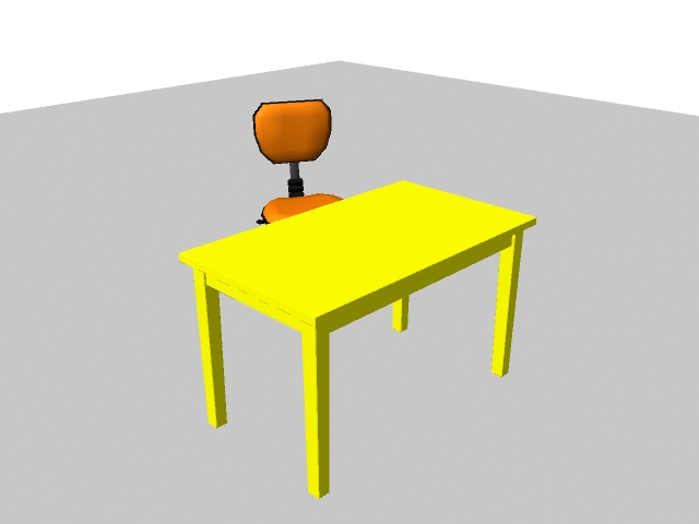
Colours can be suggestive as well as well as symbolic. Below I have provided a colour test using two props textured with bright colours in order to highlight what moods, feeling or emotions these colours personally evoke in me.


Rig locations - Chair - http://www.creativecrash.com/maya/downloads/character-rigs/c/office-chair-rig. Table - Old Table - http://www.creativecrash.com/downloads/3d-models/furnishing/furniture/table/c/old-table

Rig locations - Chair - http://www.creativecrash.com/maya/downloads/character-rigs/c/office-chair-rig. Table - Old Table - http://www.creativecrash.com/downloads/3d-models/furnishing/furniture/table/c/old-table


In this scene I have downloaded two furniture rigs from creativecrash.com, and applied bright colours. Here I will elaborate on the colour choices, explaining evoked emotions, feelings or moods.

Yellow
Personally, this colour inspires feelings of happiness, warmth and a sense of brightness in my day. I feel that yellow is more alluring as well as bright. I base this on the fact that yellow is used for the background colour of signs in everyday life to catch our attention such as traffic lights, product advertisements and hazardous warnings. This colour is used because it is very alluring and contrasts with dark colours thus, making it easier for the human eye to notice.

https://blogger.googleusercontent.com/img/b/R29vZ2xl/AVvXsEj1sCPXN3e49W6DtEGZMvWJoRNcMVnF81o01nKV4OnMyYSo2JVImxL6z2Y1s4dtvrYYAEpBQ3x2s5h-LZ4oABpZ3v0IKITtwMaQyx-g6wJLKwGS5nT6L7lwIwR2OsXmPJLi8td-ZoHzzT4R/s1600/warning_symbols.jpg
http://www.shahrulazmi.com/blog/wp-content/uploads/Yellow-pages-Billboard-advertisements.jpg


Orange
When looking at this colour, I have feelings of warmth and security and at the same time happiness. This colour also inspires energetic and bubbly moods, giving me the urge to go faster if I'm working or go for a run when I'm bored. When I'm alone, this colour makes me think of home, a place of safety, security and warmth. Finally, I think this colour is effective for advertisements and products because whenever I see orange used in advertisements or products it tempts me to pursue it further, perhaps even buy said product because of that warmth I feel inside.

http://grafisia.com/assets/inspiration/hejz/fanta-orange.jpg


http://files.coloribus.com/files/adsarchive/part_1527/15277855/file/orangina-drink-icon-bottle-drop-600-38870.jpg


https://blogger.googleusercontent.com/img/b/R29vZ2xl/AVvXsEg-UIa5XnzBAvTlEG_9DrfLxXRKFmabNWHzAolXyigrkc682AsRo65Z-QHN3-RcFEL_8VAxVlOnDy0yrAZeJH2QBAU7sIW22A8xia0o6_VP7w7z7dnLtCRQ6Eo1zCpSZqZHC8jKZ73vkzc/s1600/Cheetos_Ad_1.jpg


What relevance does this research have towards the development of my project and horror?
 The relevance of this research is to discover what feelings, emotions or moods are evoked by certain colours so that I can use these learnings in order to break down what colours are used to evoke certain moods, emotions and feelings in horror. Horror uses colours that inspire negative emotions therefore, it is a matter of researching colours that contrast with those used in this test and then developing an understanding of how to portray them successfully in my 3D environment.

Friday, 11 January 2013

Interior setting research - props


Ensuring that no stone is unturned in terms of detail, I have drawn up a series of designs for the beds within the holding cells of my prison environment. I began by setting out necessary dimensions for the bed designs, focusing on both height, width and depth. This was to ensure that all the designs were the same size and precise as possible. Each drawing was crafted by manipulating shapes and lines to form an individual and unique design, making sure that repeating the exact same design pattern was avoided.

Some of the designs do share similarities but are not exact replicas. I constructed each design by studying the previous one and looking for ways to manipulate or alter the shapes, thickness and lengths of the base, legs and rear. Taking into account the skills I had developed in high school for graphic communication, I transferred the measurements form the side view on the left over to the right in order to create the perspective from the rear, again maintaining high precision. The purpose of these concept designs is to make the physical design process of this project easier and quicker to create in Maya. The next stage of the concept process will be to create a series of floor plans, displaying the layout to each floor of the prison.


What relevance do these drawing serve towards the development of my project and horror?
When creating any 3D environment, regardless of the genre or theme, one must consider all aspects of the design process and the importance of props. Props can be used to scare, not just for adding something to the aesthetic. As I am to portray the genre of horror within my 3D environment, I have to make sure that I cover every physical element included in my completed piece. Props can also be used to my advantage in depicting horror because even beds can hold some relevance in any environment, perhaps to hold bodies, signs of a struggle with decayed blood, as a barricade for a last stand. Just because a prop is not scary does not mean it is not relevant.

Tuesday, 8 January 2013

Interior setting research - prisons

In order to create a successful 3D horror environment within a prison, I have to first understand what emotions/feelings/moods are inspired within this setting. To reinforce this research, I have created a floor-plan of a prison cell to understand how such human reactions are evoked.


I have kept the design simple to promote the prison aesthetic. In this holding cell there is a bed, a toilet, two lights beside the entrance and the door to the cell. I wanted to create a sense of isolation with my drawing, so giving the prisoner little or nothing to do but stare at the floor and reflect on his/her crimes would ensure this. Isolation can cause numerous emotional and physical responses, and with horror as guidance, I considered how this can be made to improve the atmosphere of my 3D horror environment.

http://minnesota.publicradio.org/collections/special/columns/state-of-the-arts/content_images/JailCell_lores.jpg

Firstly, I looked for examples of prison cells in modern day society that screamed isolation and showed potential for aesthetic inspiration within the genre of horror. Here we have an very dull grey enclosed space with a contrasting bright yellow bunk bed, with only a window to stare out of when inside the cell and a toilet in the corner for when nature calls. The colour scheme in this photo is what grasped my attention. The walls are grey, the floor is grey and even the toilet is a metallic form of grey - this makes the room look as dark and depressing as possible to eliminate any element of taste and/or enjoyment for the inhabitant(s) of the cell, reminding us that prison is a punishment, not a holiday, a place in its own rights that is designed to break down the criminal(s) and make them realise what they have done to deserve residence in such a place and thus, promoting themes of isolation and loneliness to a greater value.

The yellow of the bed deliberately contrasts with the rest of the room which could mean one of two things. The first possibility being that the colour choice takes the role of a reminder that sleep is the prisoner(s) only remaining luxury within the environment he or she has ended up in and that the littlest things such as sleep should be cherished for what they are. The second possible explanation of the colour choice of yellow is that as the prisoners are normally dressed in bright colours, the beds have been coloured the same so that the guards can easily identify the location of the prisoner(s) within his or her cell. By creating a dull, colourless background on a canvass, the remaining elements of the piece stand out in contrast to the background thus, making them easier to identify and locate.


http://whatgives365.files.wordpress.com/2010/10/prison-cell.png

This is a common American prison cell, containing only a bunk bed, a toilet and a set of shelves. This example depicts themes of loneliness and isolation to a certain degree, but does not capture it fully. The cell doorway and door itself are barred, allowing prisoners to interact with those around them without actually walking around outside thus, enabling the enable to interact vocally, which detracts from any element of isolation or loneliness. As a colour choice, white is a tone and yes, does carry a reminder that this is a prison and this is the consequence for your crimes. Most American prisons require the convicted to wear orange, red, blue or yellow which is effective here because it contrasts with the tonal background of the cell therefore, making the prisoner(s) easier to detect and/or locate.


  • What relevance does this research provide for the development of my project and horror?
Prisons inspire feelings and emotions such as loneliness and isolation therefore, I have to understand how these human reactions are evoked in reality in order to gain an understanding of how to depict this in a horror setting. Horror inspires fear in people and as such, makes individuals unsteady in the presence of their own company with nobody around them to cling on to. Loneliness and isolation harmonises with the central theme of horror, which is to scare, to cause fear, which in turn heightens the atmospheric tension created by horror.

Wednesday, 2 January 2013

Interior setting research - isolation and decay (continued)

In this post I have continued from my previous post by attempting to portray feelings of isolation via signs of decay. Using my concept drawings as inspiration, I have created a sci-fi themed prison door and displayed signs of decay with rust.

Design process
To begin, I used a series of rectangles to create the shape of the doorway and the door. I then cut the shapes in half for later duplication. I made sure to enter lines in the door so that I could mould shapes and grooves into it to promote the sci-fi aesthetic.

 After that, I moulded flat grooves and shapes into door by adding more lines to the ones I had previously put in so that I could extrude them into the door. I then went onto transforming the closing side of the door into a shape that could be complimented when duplicated. I made sure to bevel my edges in order to remove some of the sharpness of the lines in the door.

Next, I duplicated the finished door mesh as well as the doorway to get a complete shape. Finally, I manipulated the closing side of the opposite door, allowing the doors to join when brought together. As an extra level of detail, I made sure that some of the bevelled edges on each door were drawn back in order to give a more three-dimensional and in turn, sci-fi aesthetic.


To complete my 3D model, I then had to texture it and add rust in order to project signs of decay. Using a darkened grey for the base of the metal doors, I complimented the primary colour with a darkened maroon/brown to display rust. As rust cannot form out of nothingness, I took into account the influences of rust i.e. air moisture, water and salt. As there would be no salt present in the corridors of any prison, this leaves only water and moisture in the air. The rust located in the bottom corners of the doors I have depicted as a result of water, whereas the rust I placed higher up the doors is depicted as a result of air moisture. In order to decide where the rust would go I had to be realistic, focusing on the key points of the door, which are where the door joins and locks and the extruded shapes and grooves within the doors design, as well as the upper corner of the door where air moisture would gather.


What relevance does this test provide towards the development of my project and horror?
As explained in my previous post, smaller details are important in promoting realism within an environment therefore, understanding how the smaller details evoke particular reactions or emotions/feelings/moods is necessary into creating a more realistic and effective horror atmosphere within my 3D environment.

Tuesday, 1 January 2013

Interior setting research - isolation and decay

For my interior prison setting, I would like to depict horror through visual signs of decay which evoke feelings of isolation. I have always been fascinated by doors in both film and video games that promote feelings of isolation through decay. The primary source of inspiration for these concept drawings was Fallout 3 (2008). Fallout 3 is set in a post nuclear Washington D.C. called 'the capital wasteland' in which the player must fight for survival amongst the raiders and mutated creatures that inhabit it. The city has several different areas in which the player can explore, spanning from the outskirts to the centre of the city.
http://fallout3.nexusmods.com/mods/images/1340-2-1229771084.jpg

To keep the residents of the Washington D.C area safe, the government constructed a series of underground vaults to protect the citizens from the imminent threat of nuclear blasts and fallout. Following the destruction of the capital, the vaults were supposed to remain closed however, some inhabitants of the vaults escaped and/or broke out to explore the capital wasteland, leaving their underground homes abandoned or unprotected. The doors within the vaults look just like this only without the rust and decay.

This door is an example of conditions inside an abandoned vault, exposed to air moisture, water-based moisture and other radiated substances or hosts. What I like about these doors is the simplicity in the design as well as the shape, combining three-dimensional cylindrical, rectangular and square shapes. The door uses these shape combinations to separate the patterns welded into the doors and the colours depicting rust and decay over time. The low value browns and greys absorb some of the light in order to compliment the tints of orange and yellow mixed with slightly higher valued browns thus, reflecting some light off the door, adding a touch of realism to the aesthetic. This resource is useful to my research because it reminds me of the importance of realism in one's works to promote a more effective horror-driven atmosphere.

Underneath the city lies the remains of the Washington D.C metro, infested with radiated creatures and scavengers whom have claimed certain stations for their own. The relevance of this example is to understand the functionality of doors based in a futuristic setting. When interacting with a door like this during game-play, the welded shapes on the right and left rotate forty-five degrees onto the sides of the door frame and the centre lowers into the floor. For a game based in the year 2277, props such as the doors capture the futuristic element perfectly because it maintains the aesthetic of a decayed entranceway of the past combined with the futuristic element of automated technology. Before interacting with the door, the shapes welded into the prop are completely symmetrical. Cut in three slices, the middle being the largest piece, this helps me understand the manner in which the door is designed and how it links to the door's functionality. This example is important to the development of my project because it will help me understand the relationship between shape as well as functionality when designing the doors and other props for my horror environment.

http://guides.gamepressure.com/fallout3/gfx/word/893934406.jpg
 
http://www.youtube.com/watch?v=kFX2n6U8wxc
(02:03 - 02:05)


Below I have created a series of concept drawings inspired by the above works as a visual aid for the second part of this research which is to depict how feelings of isolation are evoked through signs of days. Paying close attention to the shapes of the door and the manor in which they would possibly function, I managed to keep each concept different from the last. I would like the door in my 3D test to be of a metallic substance therefore, I made sure that each concept left spacing or grooves in their shape in order to place signs of decay.


What relevance does this research provide towards the development of my project and horror?
The relevance of this research is to be able to successfully evoke feelings of isolation via signs of decay. Horror makes us feel isolated and anxious, like we are not alone causing us to look over our shoulders. Signs of decay tell us that someone or something has been here a long time which creates a sense of mystery in the atmosphere. To promote realism in my atmosphere, I must pay close attention to smaller details such as decay and ask myself what feelings these smaller details evoke and how can I use this to promote a more successful horror atmosphere in my 3D environment.