Showing posts with label Personal Development Portfolio. Show all posts

Sunday, 12 May 2013

Personal development portfolio (summary) - submission piece


Personal Development Portfolio
Murray MacNab
1002839

Semester one
To create a context, I will be reporting on each of my individual actions/pieces which contributed to overcoming each skill/knowledge gap. The initial aim of my honours project was to investigate the influence of lighting, shadows and colour had towards the genre of horror in video games and film. I set out an appropriate and thorough plan in order to produce results. My plan was to gather a collective understanding of lighting in professional practices, atmospheric design and projection, colour research and selection and finally, location/setting research. 

Commencing the first phase of my plan, I looked towards John Boud's 'Lighting Design In Buildings' (1973) wherein I learned about lighting theory and lighting terminology. With the necessary props from creativecrash.com, I created a scene and experimented with new technical lighting elements I had never used before in order to overcome the skill gap of conveying shadowless lighting. Using examples from the introduction level in Dead Space (2008), I created and animated a light fixture to produce flickering/flashing effects. This was the first time I had ever animated lighting before and developing this skill was a tremendous personal step forward in terms of my technical capabilities. 

Focusing on coloured lighting, I began experimenting with multiple coloured spotlights and projected shadows. From this, I enhanced my knowledge and skills within coloured lighting, shadow colouring, lighting placement, colour selections and shadow depth. Using Dead Space again, I looked at blood patterns to develop my knowledge in colour depiction and selection, as well as the placement of interior elements (specifically blood) to create or influence the depiction/projection of a horror atmosphere. Creating a horror scene using and focusing on these elements, I further developed skill and knowledge gaps on how to depict/create incandescent lighting, blood spatter patterns and most importantly, how colours can be used to evoke particular feelings, thoughts and emotions. When looking at interior settings, I thought it relevant to study decay and deterioration as recommended by course lecturer Lynn Parker. Doing so, I produced a 3D scene which portrayed rust, thus, improving knowledge and skill gaps including; bump mapping, colour patterns, monochromatic tones and realism.

Breaking down multiple referenced images of modern-day prison interiors, I further enhanced my knowledge of atmospheric projection, themes and the use of colour to evoke specific emotions, feelings and thoughts. Using the examples provided at buildinternet.com, I looked at promotional movie posters of horror movies throughout history to gain a better understanding of how particular themes and the genre of horror are projected through colour palette selections. Freddy vs Jason (2003) was the next example I used to develop my knowledge on how colour influences moods. I felt that I needed to learn more about lighting in professional practices, therefore, I detoured from my plan for a moment to investigate mise-en-scène. Looking at  'Film Art: An Introduction' (2012) by Bordwell & Thompson, I learned about three-point lighting, low-key lighting and high-key lighting.

I chose three countries at random, one of which would be used for my final piece; Japan, Switzerland and Brazil. I did not know a lot about these countries, specifically their influences on the world of horror and cultural traditions. For each possible setting/location I researched the influence and existence of horror, specifically in films and video games, as well as cultural events/traditions. I needed to display advanced knowledge and understanding of evocative lighting, as well as secondary elements which contribute towards the horror atmosphere. Influenced by one of the late sequences featured in Aliens (1986) I created a horror scene, learning how to evoke horror and panic by using rotating lights and atmospheric fog which I had learned how to create from multiple tutorial videos on youtube.com.

Semester two:
My project plan was not set in stone from the beginning of this semester, it did however, progress and develop as my project evolved. Using examples from a mixture of horror films, I created a personal horror film criteria which helped me understand how I, personally, break down horror films. Doing so enabled me to simplify my project aim by focusing specifically on Japanese directed horror films. I realised I had to analyse my own works as well as others to a professional standard, therefore, a formal analysis structure was needed. Using a structure recommended to me by my supervisor Brian Robinson, I overcame my lack of knowledge into the formal analysis process which I learned was highly necessary to make appropriate and professional judgement on any works I might be analysing.

After the pitch presentation it was recommended that I outline a specific target audience for my honours project, an area of knowledge which was empty. Outlining a target audience I learned about relevant influential factors such as gender, age and recreational activities. By creating a scene for my personal horror interpretation I got to practice the formal analysis process which pushed me towards further identification of the unique characteristics of Japanese directed horror such as; colour, lighting, composition and setting. Planning this also pushed my organizational and documentation skills, focusing on important elements such as my design process for practical examples and critical abilities/focuses when analysing my own works. I was still struggling to understand the requirements of the end of year showcase, therefore, I looked towards examples of exhibited works in other universities, focusing on colour selection and layout. After reading the feedback I had received from semester one, I realised I had to be more thorough and critical in both design and analysis, using as much inspirational sources for my works to further better and develop my knowledge and skills.

Comparing examples of Japanese and American horror films, I came to an understanding of the differences between characteristics and codes & conventions by learning about symbolic codes, technical codes and conventions. To gain a better understanding of the unique characteristics of Japanese directed horror, I looked at several critically acclaimed Japanese directed horror titles, gaining a developed understanding of the relevance of critical acclaim, cultural differences and visual elements relevant towards projecting a successful horror atmosphere. Still confused about some of the characteristic differences, I compared several stills form American & Japanese directed horror, identifying new lighting techniques, colour selections and compositional factors, thus, eliminating the knowledge gap. Looking up case study templates online for my second objective helped me understand how to construct a professional case study and how to build conclusive results based on my findings which can be used to develop my project. My sketching skills were dull and in need of tuning, therefore, to develop my personal horror interpretation, I decided to develop my digital painting skills.

Using feedback from others and purchased software tutorials, I constructed a series of designs for my personal horror interpretation which has dramatically evolved and improved my technical capabilities within photoshop. The showcase demanded a professional standard of presentation, therefore, I needed to understand how one may achieve this. I went to the McManus galleries in Dundee wherein I learned about materials, colour choices, monochromatic tones, layouts and labelling. I wanted to heighten my knowledge on visual components in Japanese directed horror, therefore, I investigated four remakes/interpretations of Japanese directed horror films to better understand American directing styles, visual components and Japanese characteristic adherence. I still needed to know more about the end of year showcase, primarily how to present my expositional work, therefore, I acquired some examples of previous years' showcase layouts, enabling me to develop my own space, create my own business cards, posters and personal statement.

I feel that I have followed my development plan successfully, although straying from the intended path from time to time, every knowledge and skill gap I felt that I needed to overcome or fulfil has been met and used to further better and develop my honours project.

Sunday, 5 May 2013

Exposition research (part IV) - layout

What?
In this post I will be outlining my showcase layout, focusing specifically on materials, layout and colour.

Why?
To give a rough understanding of how I will be presenting my selected works, what colours I will be selecting and what materials I will be using.

Layouts
Below I have highlighted my original design/layout presented in the infrastructure form as well as a rough idea of my layout for the showcase.

***NOTE***
I use the word materials to describe actual materials, as in glass, card, paper, etc. I realise that the honours handbook uses 'materials' in a different context, therefore, I would just like to clear this up.

Original layout
This was the original design for my showcase layout, admittedly, it was very off but the principal design is still something I wish to follow. Initially, I thought that each student was allocated both walls, however, I was corrected by the lecturers and was soon back on track. I still want to include a table in order to present my sketchbooks, however, the rest of it needs adjusting.

Final layout (1st draft)
This is the layout I would prefer to use because it is both functional and professional. I wanted to show off the stages of my honours project. therefore, I placed three A3 sheets below the main project poster. I initially tried to set the poster as A1 in size, however, it did not leave much room for the rest of my arranged setup. The personal statement will lie to the right hand side of the A3 project development sheets and my business cards will be underneath it. In the bottom right corner I will have a small table set up with my sketchbooks on top of it to further display the development of my project. I feel a less-is-more approach makes this arrangement more professional and tidy in appearance.

Materials 
The materials I will be using will most likely consist of printing paper for my selected works & project poster and card will be used to frame all of my selected pieces, including the personal statement and the project poster. The holder I will be using will most likely be plastic or metallic, depending on where I can find one. I have selected card as my choice of framing material because it is basic, presents a tidy aesthetic and maintains a professional standard within my showcase layout.

Colours 
My colour selections will be primarily consist of greys, blacks and white in order to highlight my identified knowledge of saturation and a heightened grey-scale in Japanese directed horror films. 
Using Adobe's Kuler, I have identified a full tonal range which I would like to use for my materials, font colour and project poster. This colour selection also matches the colours used for my business cards which features a white to black tonal range. Despite the fact that some of my research, concept and final work feature different saturated colour values/patterns, I feel this tonal range will help maintain a professional aesthetic within my showcase layout.

Next steps
  • Business cards
  • Project poster
  • Select final pieces for showcase
  • 3 x stages of project development (A3)

Thursday, 2 May 2013

Exposition research (part III) - previous years

What?
In this blog post I will be detailing the works of various student's from last years' honours project showcase.

Why?
To understand the limitations of my design possibilities based on; colour, layout, space and materials, ensuring that my displayed works are of the highest professional standard.

This is an example of a simple layout for exhibiting ones' favoured works. Although this is simple and considered stylish in the art world, I feel this layout is very lazy. The hanging piece in the centre does blend with the rest of the blank space, however, it does not display any materials, colours or completed works, making this piece somewhat boring overall. On a positive note, the designer of this showcase exhibit was considerate enough to provide leaflets and business cards for those whom took interest in his/her works.

 This layout is very well done because it shows a developed work process. Listing the three central stages of development, this layout shows progress as well as a means of structure towards achieving the main objective/aim of this project. Although sticking to the same tone (white), this exhibit blends the displayed pieces of work together in both a neat and professional manor. Personally, the lack of colour would be the only flaw to this showcase layout because colour is a really effective method/tool in making displayed objects more approachable and alluring to any passers-by. There is plenty of information for those whom approach this showcase as everything is very well detailed and labelled as well as business cards and leaflets for those whom wish to learn more about the creator/designer.

This image shows the complete shared space allocated to each participating student in the honours project showcase. Both students whom have displayed their works in this piece have made very good use of  their allocated space, providing various materials, using different and attractive colour selections as well as leaving behind necessary contact information such as leaflets and business cards. The student on the left has used a much more colourful and functional layout than the student on the right because the orientation of the items on the right do not follow a specific pattern, making his/her works look somewhat disorganised.

Conclusion:
  • Space - I have to be wary of how I will be presenting my completed works, how many of my completed pieces I will be displaying and most importantly, how will my allocated space appear to those exhibiting/visiting.
  • Colour - the manor in which my works are displayed will also be influenced by that of colour, therefore, I must ensure my colour selections/patterns are not overwhelming to the eye, but instead, visually inviting/welcoming to those attending the end of year showcase.
  • Materials - adding background mounting or framing would definitely make my selected pieces appear more professional and neat, as well as making them stand out in a much more alluring fashion, however, I must make sure my material selections do not detract or interrupt the flow of my desired layout, otherwise my works will appear disorganised and somewhat careless. 
  • Layout - the most important factor of my layout is orientation. If I present a display pattern that shows compete disorganisation in terms of orientation, my works will look messy and also somewhat lazy. There is nothing wrong with having more than one orientation, however, the manor in which these various orientated works are displayed can make my allocated space appear less or more professional.

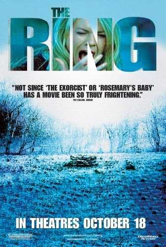
Horror film remakes/interpretations - The Ring (2002)

This is the forth and final instalment of my research into Japanese horror film remakes/interpretations. As mentioned in my past three posts, I have already reviewed and researched four critically acclaimed Japanese directed horror films; Ringu (1998), Chakushin Ari (a.k.a One Missed Call) (2003), Ju-on The Grudge (2002) and Dark Water (2002), all of which have remakes/interpretations, therefore, I have decided to watch and review these remakes/interpretations and draw comparison-based results, highlighting (if any) identified Japanese horror characteristics. In order to thoroughly research this interpretation/remake I will first be summarising the plot, noting relevant differences (if any), after that I will be looking for any characteristics I have previously identified in my honours project thus far, then I will discover whether this remake/interpretation is higher in critical acclaim than the original and finally, I will be drawing conclusive results based on my findings.

Plot Summary:
http://www.impawards.com/2002/posters/ring_ver3.jpg
An investigative journalist by the name of Rachel Keller follows a story about a cursed videotape, supposedly responsible for killing her niece as well as several of her friends. Those who watch the contents of this videotape (after receiving a phone call) have exactly seven days to live. After Rachel's son watches the footage on the cursed tape, she must now race against time to find out the history behind the contests on the video and hopefully, a solution to rid both her and her child of the wretched curse.

This remake/interpretation, was not that bad. Although not directly following the narrative path of Hideo Nakata's 1998 original, this film did very little to disappoint, bringing fresh and imaginative additions to the plot, answered some interesting narrative points not explored in the original and still ended up with the same conclusion, however, there were still a number of flaws and interesting factors I feel have to be brought forth about this remake/interpretation.

  • Insects - insects were persistently used to symbolise death in this film, subtly placed to develop the narrative.
  • Length - like many remakes before and after it, this remake interpretation took a staggering hour and fifty minutes to reach a conclusive point, making me loose interest as well as enthusiasm after a certain point
  •  Blue - the film had a massive overuse of a blue scope, everything had a sort of blue-ish appearance to it, however, these colour values were saturated well showing some indication of a grey-scale.
  • Character involvement - certain character roles in this remake/interpretation were developed to a greater degree, unlike some in the 1998 original such as; the murdered girl, her father and the investigative reporters son, making the story structure as a whole feel more convincing and thorough.
  • Performance - the acting in this remake/interpretation was very convincing and nowhere near as rusty or dull as the 1998 original, particularly the role of the deceased girl's father, performed beautifully by Brian Cox.
Japanese Characteristics:

https://blogger.googleusercontent.com/img/b/R29vZ2xl/AVvXsEj-dF7fGJnc7Vn5Y9Lvjmw-BDDWiFqKaIRvQrRdUpqMKI-j5XqcCq7yMT4vTP5snaTRYDocUt9xQ_O33SjgZnJNUAYlCjRARXNhFipX_gauz_jQb9Q5Htp1vsc32sVvNTmY2GVNrHo4ESU/s1600/(2002)+The+Ring+Opt+3.png
  • Setting - this remake/interpretation drifted from time to time when focusing on the setting. Key areas such as the cabin in the woods, the island and the journalistic facilities were all present in this film, however, there are several other locations relevant to particular plot points in this remake/interpretation that are not in the original.
  • Colour - this remake/interpretation did fantastic in terms of colour because there were barely any high value colours noticeable/present and there was constant saturation, although not directly grey, this remake/interpretation did very well to adhere to the colour used in Japanese directed horror.
  • Lighting - three point lighting was constantly used in this remake/interpenetration as well as few uses of high contrast lighting, following the unique characteristics of Japanese horror and showing great adherence as well as influence to the 1998 original.
  • Composition - this compositional value of this remake/interpretation was not half bad. The shapes in this remake/interpretation were non-conflicting and the depth of field rarely strayed from an infinite field of vision, therefore, following the characteristics of Japanese directed horror. The scaling was realistic and camera work, although using some of the favoured American long distance and establishing shots/distances, this remake/interpretation made some use of the higher and lower camera heights, the side camera angle and close distance shots, thus, adhering to the unique characteristics of Japanese directed horror.
Critical acclaim:
http://cineawesome.com/wp-content/uploads/2011/11/152m3qg9858786.png
Although this remake/interpretation was not as highly critically acclaimed as the 1998 original, it did a lot better in terms of judgement and feedback than any of the previous remakes/interpretations which I have investigated, "The Ring is an atmospheric piece of filmmaking however, partly thanks to some beautiful, moody cinematography (by Bojan Bazelli). Essentially, it hybridises a studied Japanese tone of telling supernatural horror stories with that of the US, as represented in the films of M Night Shyamalan" (Etherington, 2011)

Despite this positive feedback, this remake interpretation did have its own fair share of negative comments, "by the time "The Ring" gets around to delivering its big surprise payoff, it's too little--too late. The horror feels likes it's already over when another character dies without putting up a fight or even running for the shear joy of providing an appropriate chase scene. The audience is even spared the sight of his supposedly gruesome corpse because, either the special effects make-up team couldn't get it right, or because the filmmakers ran out of money. Either way the movie is a dog from start to finish, with enough genre inconsistencies and plot holes to make it a textbook example of borrowing from too many divergent horror films to get anything right" (Smithey, 2009)

However, the positive feedback proves to be more dominant with reviewers, seeing this remake/interpretation flawed but still a success, "as a concept, it's flawed. As a remake, it's good. As modern horror, it's a firecracker up the genre's ass. Make sure you take a date - this is so spooky you can pull the 'yawning arm over shoulder' move and get away with it." (Dinning, 2006)


Conclusion:
http://www.darkhorizons.com/assets/0011/7355/ring_article.jpg?1272385543
Director Gore Verbinski did very well in visualising his interpretation of Hideo Nakata's 1998 original, making interesting adjustments as well as adhering to the majority of unique characteristics of Japanese horror. Although it was not regraded as highly in terms of critical acclaim, this remake/interpretation did much better in depicting that of its original source than any of the four remakes/interpretations which I have investigated. Although not a newly developed characteristic of Japanese horror, this remake/interpretation has shown me that saturation can remain in the colours displayed to the audience, however, changing the lower valued grey to anther colour does not detract from the overall aesthetic depicted in Japanese directed horror.

References:
http://www.film4.com/reviews/2002/the-ring
http://www.colesmithey.com/capsules/2009/01/the-ring.html
http://www.empireonline.com/reviews/ReviewComplete.asp?FID=8750

Wednesday, 1 May 2013

Horror film remakes/interpretations - The Grudge (2004)

This is the third out of four Japanese horror film remakes/interpretations. As mentioned in my previous two posts, I have already reviewed and researched four critically acclaimed Japanese directed horror films; Ringu (1998), Chakushin Ari (a.k.a One Missed Call) (2003), Ju-on The Grudge (2002) and Dark Water (2002), all of which have remakes/interpretations, therefore, I have decided to watch and review these remakes/interpretations and draw comparison-based results, highlighting (if any) identified Japanese horror characteristics. In order to thoroughly research this interpretation/remake I will first be summarising the plot, noting relevant differences (if any), after that I will be looking for any characteristics I have previously identified in my honours project thus far, then I will discover whether this remake/interpretation is higher in critical acclaim than the original and finally, I will be drawing conclusive results based on my findings.

Plot Summary
http://downloadfreemovies.org/wp-content/uploads/2004/11/The-Grudge-2004.jpg
An American nurse by the name of Karen Davis moves to Tokyo with her boyfriend. After a fellow employee does not not appear for work, Karen is assigned to look after a woman with an apparent sleeping disorder, wherein she experiences a collection of strange unexplainable events. Karen soon discovers that the house belonging to this woman she is caring for is haunted by the deceased hosts of  the previous occupants, killed in rage, now lingering the hallways of the cursed home, stalking and killing anyone whom dares to enter.

Never before in my life have I seen a film remade by its original creator. Takashi Shimizu directed both the 2002 original and the 2004 remake, the only difference being that the remake was produced by Sam Raimi, director of The Evil Dead (1981) franchise. There were significant differences in comparison to the original version, all of which made this film very unsuccessful in terms of what the original version achieved. 

  •  Violence - this remake/interpretation had so much more gratuitous visual content, two events in particular; a character committing suicide in the first few minutes and the absent employee walking around her office building without her lower jaw.
  •  Predictability - like the previous remake/interpretation I investigated, this film was littered with predictable moments, driven of course by the audio and camera perspectives.
  • Obviousness - this remake/interpretation was too obvious in its approach towards unveiling the appearance of the cursed beings, showing them constantly and at an earlier point in the film.
  • Confusion - the events of the original were simpler and easier to understand how the curse came to be, however, in this remake/interpretation the events within the narrative time-line were random in nature, making it very difficult to keep track of what was going on
  • Shocks - shocking and suddenly frightening moments were high in volume within this remake/interpretation, leaving no room for the intended frightening imagery of the beings inside the cursed home.
Japanese characteristics:

http://www.movpins.com/big/MV5BMTQ0MjU5OTA1NV5BMl5BanBnXkFtZTcwNzk0ODcyMw/still-of-bill-pullman-and-sarah-michelle-gellar-in-the-grudge.jpg
  • Setting - this remake/interpretation did very well to follow the setting. Although this film was enriched with many American actors, the location was still fixed to that of the 2002 original.
  • Colour - this remake/interpretation did not do very well in terms of colour because high value colours were displayed more than low value colours, strangely failing to maintain colours depicted in Japanese directed horror considering the director was Japanese and the fact that he directed the 2002 original. Saturation was present now and again in this remake/interpretation, however, it was not displayed enough to truly capture the overall heightened grey-scale of the 2002 original, as well as other Japanese directed horror films.
  • Lighting  - Contrast lighting and three point lighting are both favoured lighting techniques of Japanese directed horror, however, in this remake/interpretation only three point lighting was visually evident, appearing primarily during close ups of characters. High and low key lighting were the favoured lighting techniques in this film, displaying little brightness during the day time sequences and too much illumination during the evening sequences.
  • Composition - Like the previous two remakes/interpretations I have investigated, this remake/interpretation was not much different in terms of compositional value. The scaling of each frame and the objects/characters in each shot was one of few redeeming elements of the composition in this remake/interpretation. The shapes in this remake/interpretation followed the characteristics of Japanese directed horror by acting in a non-conflicting fashion. The depth of field in this film/remake failed to remain consistent, forever changing and leading focus towards too many places at once. The camera-work in this remake/interpretation was another element of the composition which failed to meet the identified characteristics of Japanese directed horror because lower and higher camera heights were barely used, as well as the preferred side angle used in Japanese directed horror.
Critical acclaim:
http://blogs.dailyrecord.co.uk/tvandfilm/2009/11/19/thegrudge.jpg
Still bewildered why a director would remake his own film, I discovered that yet again, like the previous two remakes/interpretations I have investigated, this film was met with less critical acclaim and feedback than the original version, "The Grudge doesn't even work as a travelogue of Japanese spiritual beliefs, and it very well could have. By having a bunch of Americans in the cast led by the callow Gellar, the movie could have taken the opportunity to educate us ignorant gaijin about, say, Shinto, or the noble history of spirits in religion and art. Instead, the story might as well be set in Cleveland, and it adds the weird subtext of Americans being terrified by damp-haired Japanese women. At least 'The Ring' took what was universally eerie about 'Ringu' and Americanized it; 'The Grudge' just cannibalizes itself, exploiting Japanese spirituality for a few Saturday-night shocks to make teenagers shriek and giggle." (Gonsalves, 2007)

This negative feedback continues, one of the central arguments being that another over-elaborated Americanized remake is not needed, "Indeed, the biggest problem with the film is that, like many American remakes (Wicker Park is one recent example), feels it has to explain too much. We get a helpful little ghost re-enactment of the whole story. Horror movies are much more horrifying when they leave the explanation to that part of our imagination where our own deepest fears lie, so each of us can feel personally unsettled right where we live." (Minow, 2005)

The key point here, which I personally agree with, is that this film has been remade too many times and by the same director no less, "Shimizu shouldn't get too much credit for creating such a well-paced movie -- it's the third time he's made "The Grudge" in two years, with a Japanese version called "Ju-on" and its sequel released in 2003. If that sounds like the pedigree of "The Ring," it's no coincidence. "The Grudge" has the same producer as "The Ring" and uses a similar combination of the undead and technology, with mysterious voices on telephones, freaky little kids in a lot of gray makeup -- and yes, a videotape does make its way into the plot" (Hartlaub, 2004)

Conclusion:
http://qameleoni.files.wordpress.com/2010/12/2004_the_grudge_009.jpg
This remake/interpretation was completely unnecessary, pardon me for reiterating the same point but I have never seen a director ruin their own creation. The plot, the Americanized clichés and the over-elaboration of the plot are all key elements as to why this film was such a failure, not to mention the lack of horror in the atmosphere besides a few shocking moments here and there. Finally, to clarify, I have identified no Japanese directed horror characteristics in this remake/interpretation.

References:
http://www.efilmcritic.com/review.php?movie=11076&reviewer=416
http://www.commonsensemedia.org/movie-reviews/the-grudge
http://www.sfgate.com/movies/article/Mindless-killing-weakens-Grudge-2679870.php

Tuesday, 30 April 2013

Personal horror interpretation - 2D (design no.8)

This is my second of a two part piece and the last digital painting for my personal horror interpretation. To recap, using the night and day transitions (designs five and six) I have tried to create a visual story in efforts to project the atmosphere of Japanese directed horror, alongside my regular methodology in which I highlight the design process, make a formal analysis and build conclusive results based on my findings. Again, to avoid repeating myself, any factors that remain unchanged within the summary will be labelled 'see design five'.

What story are you trying to tell in this first piece?
In attempts to capture the atmosphere of Japanese directed horror, I have inserted a supernatural being into this scene, continuing the visual story from design seven which follows the struggle and brutal murder of a young girl in this cabin and now her spirit lingers inside the cabin, unleashing vengeance upon those whom enter it. For further information on this vengeful and culture-based Japanese spirit/ghost, refer to my case study on Ringu (1998).

Design process
To create a before and after, I duplicated the blood patterns from design seven.

I placed the outline for the supernatural being in the centre of the scene, using blurry brush strokes to make the being appear more faded. 

To make the atmosphere more more mysterious, I moved the supernatural being to the left and added some clouds to the night sky.

To ensure realism is captured successfully, I created a projected shadow on the floor for the supernatural being.

Acknowledging the reflective and bouncing nature of the projected light source, I realised the supernatural being required a dull back shadow. To make sure the scaling was correct, I made the supernatural being taller.

Finally, I put a light fade on the supernatural being and inserted a reflective back shadow behind the ghost/spirit. I also made sure the scenes matched in terms of background content by adding in the grass layers from design number six.

Formal analysis:

Summary:
Monochromatic colours - see design five

Depth of field - see design five

The lighting is directional and is clearly seen on the floor, side of the window and cracks in the walls & door frame. Three point lighting is displayed using key, fill and back lights.

Camera - see design five

Low and high value colours are present within the greens of the grass, browns on the walls, floor, window and door as well as the dark blue of the night sky, the grey of the clouds and finally, the black and white of the supernatural being.


Lines - see design five

Shape - see design five


The scale of this piece is realistic because there are no disproportionate areas and the supernatural being is of appropriate height and width.

Analysis:
The dark blue sky and dark green grass in the background are used to bring out the foreground via contrasting colours. The monochromatic colour patterns on the walls, door, floor and window are used to represent the time of day and the moonlight projections. An isolated atmosphere is captured using a supernatural and cultural folklore based entity. Darkness is also highlighted through the use of dark shades of grey for clouds in the night sky.

Interpretation:
The aim of this piece is to capture the unique characteristics of Japanese directed horror. The state of the cabin promotes themes of abandonment, deterioration and laziness. Feelings of anxiety and fear are evoked through the supernatural presence on the left hand side of this piece. Themes of despair and horror are evoked via the projected shadows coming from the supernatural being because it is not alive yet it casts a shadow as if it were alive, leading one to believe that there is little or no chance of survival.

Judgement:
The criteria I will be using to judge this piece are colour, lighting and composition. Low value colours are captured by browns on the walls, door, floor and window, as well as the dark blue of the night sky and the deep black of the supernatural being's hair, thus, adhering to the unique characteristics of Japanese directed horror. Saturated and monochromatic colours are clear in this piece, favouring a heightened grey-scale and low value colour patterns, therefore, following the unique characteristics of Japanese directed horror.

A non-fixed mixture of lines (angular and straight), realistic scaling, non-conflicting shapes, a lower camera height, set at a side angle and placed at a close distance are present in this scene, therefore, the compositional values in this piece follow the unique characteristics of Japanese directed horror.

The lighting in this scene displays three point lighting because the monochromatic colours highlight the key, fill and back lights, therefore, adhering to one of the preferred lighting techniques captured within the already identified unique characteristics of Japanese directed horror.

In conclusion, this piece is by far my best 2D personal horror interpretation piece because the lighting, colours and composition follow the unique characteristics of Japanese directed horror more than any of my other designs, as well as capturing a clear visual story based on Japanese cultural folklore. As this is my last design, I must now take what I have learned from making these digital paintings and apply them to my final 3D personal horror interpretation.

Personal horror interpretation - 2D (design no.7)

This is the first part of two designs and the final digital paintings for my personal horror interpretation. Using the night and day transitions (designs five and six) I have tried to create a visual story in efforts to project the atmosphere of Japanese directed horror, alongside my regular methodology in which I highlight the design process, make a formal analysis and build conclusive results based on my findings. Again, to avoid repeating myself, any factors that remain unchanged within the summary will be labelled 'see design six'.

What story are you trying to tell in this first piece?
In attempts to capture the atmosphere of Japanese directed horror, I have inserted signs/indication of a violent struggle into the scene, highlighting the fact that whomever previously lived in this cabin was brutally murdered and the body has been buried beneath the floor boards.

Design process
 Using design six, I added signs of violence by indicating a struggle and the death of someone via the blood patterns on the wall.

 To further develop realism as well as a sense of atmosphere I painted some clouds in the sky.

Finally, I realised that over time the blood on the walls would drip down and pool, therefore, I painted some puddle-like shapes on the floor below the spatter patterns on the walls.


Formal analysis:

Summary:
Monochromatic colours - see design six

Depth of field - see design six

Lighting - see design six

Camera - see design six 

 Low and high value colours are present within the browns on the walls, floor, window and door as well as the blue gradient of the sky, the blood on the door, walls and floor and finally, the green grass in the background.

Lines - see design six

Shapes - see design six
 
Scale - see design six

Analysis:
The monochromatic colour patterns on the floor, walls, door and window are used to capture the time daytime the light projected from the sun. The blue sky and green in the background are used to bring out the foreground through contrasting colours. Realism is promoted via the colour gradient used for the sky because the high and low value blues were extracted from real life examples/pictures. An isolated atmosphere is captured using lack of human presence and blood spatter patterns on the walls and floor. Violence is captured using monochromatic tones of red on the walls and floor.

Interpretation:
The aim of this piece is to capture the unique characteristics of Japanese directed horror. Themes of deterioration, laziness and abandonment are captured via the horrible conditions of the cabin and the lack of human presence. Summer/spring is projected using sunlight and high value colours. Feelings of safety and warmth are evoked by the high value colours and bright atmosphere, however, feelings of anxiety and fear are evoked through the blood on the walls and floor and the unknown location of this cabin. Themes of hope are evoked through the bright projections of light beaming through the window and cracks in the wall, however, themes of hopelessness are projected by means of contrast because of the blood on the floor and walls.

Judgement:
The criteria I will be using to judge this piece are lighting, colour and composition. The composition in this piece follows the unique characteristics of Japanese horror very well by using realistic scaling, non-conflicting shapes, a non-fixed mixture of lines (angular and straight), a lower camera height, set at a side angle and placed at a close distance.

These low value colours are captured by browns on the walls and door. There are monochromatic and saturated tones as well as low value colours present in this piece alongside the addition of monochromatic red blood spatter patterns, however, high value colours remain superior in this scene, although they do not fully subtract themes of isolation from the atmosphere, therefore, this piece somewhat follows unique characteristics of Japanese directed horror better than that of design six.

The lighting in this scene displays some indication of three point lighting because the monochromatic browns for the wood of the cabin and projected lighting on the floor show key, fill and back lighting, therefore, adhering to one of the preferred lighting techniques captured within the already identified characteristics of Japanese directed horror

In conclusion, this piece is a marginal improvement from design six because one of the preferred lighting techniques of Japanese directed horror is identified, a visual story is drawn form the blood spatter patterns on the walls and blood pools on the floor, the clouds in the sky add realism to this scene and finally, the addition of blood on the walls and floor evokes feelings of fear to a certain degree. The second and final piece (design eight) should further capture a Japanese directed horror atmosphere by adding some reference to Japanese folklore/culture.

Next steps
  • Visual activity/story in night-time setting
  • Further Japanese horror reference(s)
  • Japanese folklore/culture


Personal horror interpretation - 2D (design no.6)

This is the sixth 2D design for my personal horror interpretation. This is the second of my two part drawing piece focusing on light and dark settings using the same drawing. Below, I will be outlining the design process, formally analysing the finished piece, looking for any errors and finally setting myself some relevant and productive next steps. As this piece contains similar visual elements as the original night-time design, I will be labelling these stages in the summary as 'see design five' to avoid repeating myself.

Design process
Using design number five, I removed the saturation in order to alter the colours and the brightness.

To start the daytime version, I changed the colour gradient in the background using both values of blue from a real life image of the sky.

In order to adapt to the daylight, I changed the monochromatic values of the cabin walls, floor, window and door.

Ensuring that the projected light (the sun) was bouncing off the surfaces, I made sure all the 3D outlines in the wall cracks and the door/window frames were of a higher value..

Finally, I changed the shadows to a higher value of brown to display the projected light from the sun and added some grass in the background to give the piece a sense of atmosphere and location.


Formal analysis:

Summary:
Monochromatic colour patterns are present in this scene on the doors, walls, grass, sky (background), floor and window.

Depth of field - see design five

Lighting - see design five

Camera - see design five

Low and high value colours are present within the browns on the walls, floor, window and door as well as the blue gradient of the sky and the green grass in the background.

Lines - see design five

 Shapes - see design five

Scale - see design five

Analysis:
The green grass and the blue sky in the background are used to compliment the foreground by means of colour contrast. The monochromatic colour patterns on the walls, floor, window and door are used to capture the time of day and the light projected from the sun (light source). An isolated atmosphere is highlighted by the lack of characters or human presence. Realism is captured in the colour gradient of the sky because the higher and lower values of blue are extracted from real life examples.

Interpretation:
The aim of this piece is to capture the unique characteristics of Japanese directed horror. A summer/spring atmosphere is projected by the sunlight and high value colours. Feelings of warmth and happiness are evoked by the high value colours and bright atmosphere, however, feelings of uncertainty and anxiety are evoked through the unknown location of this cabin. Themes of abandonment, laziness and isolation are captured by the terrible conditioning of the cabin and the lack of human presence. Themes of hope are evoked through the bright projections of light beaming through the window and cracks in the wall

Judgement:
The criteria I will be using to judge this piece are setting, composition and colour. There are saturated monochromatic tones as well as low value colours, however, the primary flow of colour in this piece consists of high value colours but does not fully detract from the isolated atmosphere, therefore, this piece somewhat follows the unique characteristics of Japanese directed horror. These low value colours are captured by browns on the walls and door.

The composition in this piece follows the unique characteristics of Japanese horror to a successful degree with a non-fixed mixture of lines (angular and straight), realistic scaling, non-conflicting shapes, a lower camera height, set at a side angle and placed at a close distance.

The setting in this piece conveys an isolated atmosphere, however, the intended setting and atmosphere found in Japanese directed horror is only somewhat present here because the high value colours and lack of activity removes any scary or fear evoked feelings/themes from this piece

In conclusion, this piece is a large improvement from design five (the night-time version) because it adds more to the atmosphere, the monochromatic colour patterns are more accurate and the colour gradient of the sky in the background is more accurate, therefore, adding more realism to this piece. The negative here is lack of activity; no blood, lack of darkened/low value colour patterns, no supernatural presence and no feelings of fear evoked or highlighted. The night-time piece (design five) did not feature some of the corrected or additional elements in design six.

Next steps
  • Visual activity/story
  • Design elements in design six to be featured in designs 7 & 8
  • Japanese horror reference