Showing posts with label Digital Sketchbook (3D). Show all posts

Monday, 13 May 2013

Personal horror interpretation (3D) - Japanese directed horror characteristic identification

What?
Below I have placed some renders of my completed 3D personal horror interpretation.

Why?
The central aim of this project was to identify the unique characteristics of Japanese directed horror and the third objective of this project is was to visually convey these characteristics. Looking for these characteristics and elaborating on my discoveries, I will then draw conclusive results on whether or not I have achieved in successfully portraying the unique characteristics of Japanese directed horror.

Characteristic identification

  • Setting - the setting of this horror environment follows those which are found within Japanese directed horror films, which are primarily interior-based. Like Japanese directed horror, an isolation atmosphere is projected by carefully planning the position and location of props, as well as a lack of human presence and character involvement. 
  •  Colour - saturating the materials to present a heightened grey-scale, this horror environment follows the appropriate colour selections depicted in Japanese directed horror, specifically low value, monochromatic colour patterns. These colours are depicted in the wood on the walls, the boarded up entrances, the framed paintings and the metallic objects such as the table in the killing room and the cooker in the kitchen.

  •  Lighting - this horror environment portrays the preferred lighting techniques of Japanese directed horror very successfully, using volume lights to create three point lighting and spotlights to create effective high contrasting lighting. The acceptance of realism in this environment allows the lighting to show reflectivity by bouncing off of surrounding surfaces and/or props. The atmosphere of the living room is somewhat lessened with more than one light source, creating a little too much illumination, removing dark areas of the room and conflicting the intended lighting technique.

  • Composition -  props within this environment are scaled to realistic standard, taking human proportions into consideration as well as space. and straightforward. Ambiguous changes in proportions are not present and seemingly unused. The lines used in these renders are angular in nature, as well as placing the camera at a raised or lowered height and set at a side angle, thus, strongly displaying the compositional values of Japanese directed horror. Shapes in this horror environment are non-conflicting in nature, highlighting the infinite depth of field which displays no blurring or lack of focus, therefore, further adhering to the compositional values of Japanese directed horror.
 Conclusion
This horror environment has followed the unique characteristics of Japanese directed horror very well, using preferred lighting techniques, effective and realistic compositional values, appropriate colour selections and patterns and finally an atmosphere which successfully conveys a visual story as well as project an isolated atmosphere. If I had more time on this environment I may have tweaked a few of the texture choices such as the floor panelling and the kitchen cupboards, however, I feel that I this does not detract from what I have accomplished, not to mention that this, personally, has to be the best piece of 3D work I have created.

Personal horror interpretation (3D) - lighting

What?
Below I have outlined the lights I have placed in my 3D personal horror interpretation and the reason(s) for my lighting choices.

Why?
Portraying certain lighting techniques allows me to round off my visual story, capture the intended horror atmosphere and adhere to the lighting choices depicted within Japanese directed horror.

Hanging light bulbs:
Focusing on the light bulb props, I surrounded the bulb with low level volume lights to convey lighting bouncing off of the surrounding surfaces and the projected illumination. Using a singular large volume light, I scaled it to the size of the room, leaving enough surfaces with different levels of lighting intensity to convey the first of Japanese directed horror lighting - three point lighting. Initially, I was going to use multiple spotlights, however, this created a glare and removed a lot of projected shadows.


Lamps:
Conveying high contrasting lighting using the lamps was easier than I thought. After applying depth map shadows, it was a simple matter of placing two separate spotlights pointing up and down, using a fairly high intensities and widely spread cone angles. The lampshade did not appear illuminated, therefore, I used a few low intensity volume lights and placed them around the lamp shade mesh.


Reflective lighting
A small touch of detail I made sure not to overlook was the manor in which lights reflect and/or bounce off surrounding surfaces. I placed widely spread, low intensity volume lights towards the doorways of each section/room of the cabin to ensure light was appropriately and realistically bouncing off the surrounding surfaces and floor.

Personal horror interpretation (3D) - textures

What?
Below I have outlined the texture choices I have made for my 3D personal horror interpretation and the reason(s) for my texture choices.

Why?
Selecting relevant textures allows me to paint a visual story, capture realism, eliminate unnecessary props/objects and help arrange where I shall be placing the lights.

Textures
First of all, I textured the walls, the floors and the windows. Initially the floors were darker, however, I realised that this would make the smaller details less visible when I added the lights. The windows did nothing to provide a visual story, therefore I boarded them up using a texture which displays large planks of wood, suggesting that this cabin has been abandoned and is supposedly abandoned, thus, enhancing the visual story. I also did this to both entrances as it would not make sense if I just boarded up the windows and made the doors accessible. Adhering to the theme of deterioration, I marked/manipulated the textures for the walls, window, desk and stool to make it look that they had been treated badly and have been in use for a very extensive period of time.

Using a simple cotton texture I created the rug on the floor, showing signs of wear to blend/match the rest of the furniture. To make this room seem less cluttered, I removed the couch. The portraits on the walls were enhanced using bump maps to portray realistic materials.

The cabinet was textured using a mixture of wooden materials, complimented by the coloured lampshade and framed photograph sitting on top of it. To further convey a sense of age and deterioration within these props. I added a black and white photo to the small frame on top of the cabinet, making one ask, who is this person, how long has he/she been here and why are they here?

The kitchen, as I planned, conveys a sense of rust and abandonment with the horribly conditioned wooden cabinets and the rusty, old metallic cooker which has not been cleaned or replaced. The fridge was harder to show signs of deterioration because appropriate textures were difficult to find. I used a bump mapped pvc texture to convey the materials of the fridge as I did not want to steal the intended focus away from the cooker.

The bedroom was one of my favourite rooms to texture because I prefer working on a variety of materials instead of one specific type. The bed frame was textured using the same materials for the desk in the living room. The mattress was textured using an old linen mattress texture, on top of which I added some stains and signs of wear and tear. The pillow was textured using an old cotton sequence, patched with blotchy stains and mouldy-like spots. The chest of drawers was textured using an altered version of the materials used for the kitchen cabinets.

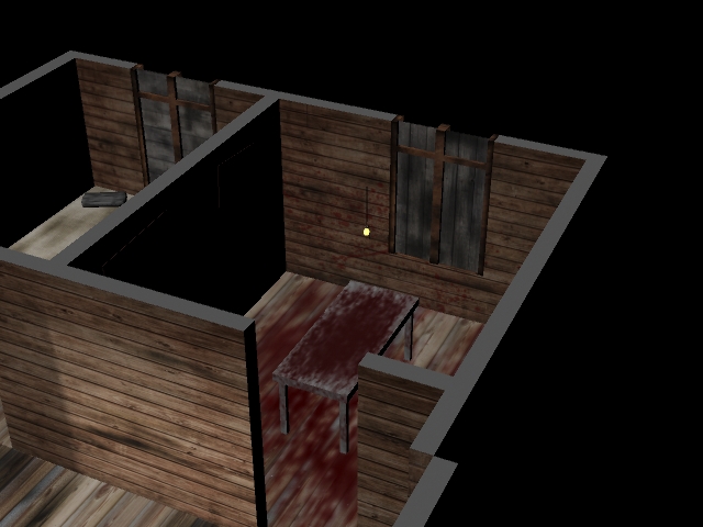
Finally, to properly depict the appropriately entitled 'killing room', I used my talented and passion fuelled abilities to create blood spatter patterns. On the table I wanted to make it thick and heavy so I used a custom brush to make splotches and puddles of blood. To visually depict the graphic nature of this room and the deeds performed within, I splashed the blood onto the walls surrounding the table as well as on the table legs to depict the dripping of blood from the table top.

Personal horror interpretation (3D) - props

What?
Below I have outlined the props I have selected for my 3D personal horror interpretation and the reason(s) for my design choices.

Why?
Selecting appropriately themed and quantified props will enable me to enhance the horror atmosphere and the visual story I am am trying to portray in my 3D personal horror interpretation.

Prop selection

To prevent confusion, I will be using this picture from my previous 3D sketchbook post to clarify which room is which.

After analysing the referenced images in my previous 3D sketchbook post, focusing specifically on examples from Evil Dead 2 (1987), I was now ready to start designing and arranging my props. In the living room I wanted to create the impression that the owner of this cabin does not have a lot of possessions, that he/she is a person of little means, adhering to the my intended projection of deterioration and neglect. I placed a lamp, a desk, a stool, a couch and a number of framed artworks on the walls. I will most likely be removing the couch as I feel it does not blend with the rest of the objects in the room. To create a sense of scale and space, I placed a flat plane in the centre of the room which, when textured, will be a rug.

The study has been transformed into a 'killing room' to enhance and produce a more clear visual story from this horror scene. I have placed a table in the killing room which victims are tied to and murdered, with a small side table for implements used to perform the killings. I really want to make this room as simple and well planned as can be, therefore, I will be removing the small table in the corner to keep the focus on the table in the centre of the room.

I wanted the kitchen to be simple, dark and rusty, therefore, I made the props visually depict this. A fridge, a cooker and a set of cabinets, this room screams simplicity, which I intend to convey further when texturing, showing deteriorated wood and rusty metal. This room was already full hence why I did not add any paintings to the walls.

I wanted to make the owner of this shed to appear like a vagrant, with few, badly conditioned possessions and materials. A wooden bed frame, a thin uncomfortable looking mattress and a single pillow makes this setting appear more lonely, evoking feelings of isolation and abandonment. Again, to add more background detail, I threw in a another framed painting on the wall.

Finally, I added some character to the hallway by placing a cabinet with a lamp and framed family photograph to further paint a visual story and heighten the intended themes of abandonment and isolation. I have placed only four lights in this scene, however, I may alter this when I come to lighting the scene.


Wednesday, 24 April 2013

Personal horror interpretation (3D) - basic structure

Carrying on from my previous post, I have now completed the basic structure of the cabin for my personal horror interpretation. Below I will be outlining the progress thus far on my 3D horror scene and presenting details for the next stage of my personal horror interpretation.

Design Process:
Using the template I had selected, I raised the walls to a slightly higher point, adjusting both the width of the rooms and the outer walls. In order to separate the rooms from each other and help the scene gain a sense of space, the next element which needed to be completed was the doors.

 Ensuring the polygon count was kept to a minimum, I created the doorways to separate the rooms. As my model is based on the cabin from Evil Dead 2 (1987), I looked towards the referenced images in my previous 3D sketchbook post and used them to make appropriate placements for the doorways. Once the doors were in place I hid them to create more space for the next stage of the basic structure.

 After the doors were constructed and hidden, I decided to do the windows. Again, using the floor plans and referenced images from my previous post, I placed the windows accordingly, providing the cabin interior with enough exterior light sources and not overwhelming it with clutter. Again, once I had finished constructing all the windows, I hid them from the scene to make sure I have plenty of space for the next stage of my personal horror interpretation.

Next development stage:
In my next digital sketchbook blog post for my personal horror interpretation (3D), I will be constructing all the props using images from both relevant media sources (horror films) and real life examples, focusing on prop choices, placements and materials to ensure realism is maintained within my works as much as possible.

Tuesday, 2 April 2013

Personal horror interpretation (3D) - layout

What?
Below I have outlined several templates in 3D for my personal horror interpretation, along with highlights indicating each room of these interior options.

Why?
Selecting the correct template will enable me to plan out what each room will contain, where I will position any props and plan ahead towards selecting relevant textures.

Inspiration - What?
http://alternativemagazine.files.wordpress.com/2009/10/evil-dead2-poster.jpg?w=500
The central source of inspiration for this research comes from Evil Dead 2 (1987). The story features a couple located within a cabin in the woods being chased by an evil presence manifested by reading an ancient book known as the Necronomicon (a.k.a the book of the dead).

Inspiration - Why?
https://blogger.googleusercontent.com/img/b/R29vZ2xl/AVvXsEiR1g2scH00Mmn7Z5w_lhIEKM3Bz7jH0qXACn7EHpqhdOXWvTDhh2zvAKE13U30fAWcvqwKFejj1eI0424CG-1E2o24NlIWii3BmO5cUOZZSBDGfJcsp1IThXDeDxwvUyNdLXKjDI-mAPob/s1600/evildead2_ashrecorder.JPG
The plot to this film captures the overall direction of my personal horror interpretation, the elements and the unique Japanese horror characteristics which surround it. As a cabin in the woods, this setting escapes the cultural design elements found in Japanese horror films, however, it captures a realistic deteriorated interior setting very effectively.

Inspiration - templates
http://www.bookofthedead.ws/website/images/ed2_photo_26.jpg
http://www.bookofthedead.ws/website/images/ed2_photo_25.jpg
http://fc06.deviantart.net/fs71/i/2011/106/a/6/the_evil_dead_2_cabin_by_morsoth-d9zwyr.jpg
What factors/elements have you recognised in this inspirational template?
The template of the cabin in Evil Dead 2 is simple, abandoned and consists of five areas; a living room, two bedrooms, a toilet/bathroom and a kitchen. Excluding the windows, there are two points of entry, however, the windows leave the cabin rather exposed. The interior is not overwhelmed with props nor do they conflict with the template of the cabin. Some interesting design choices include the stuffed deer head above the fireplace, the passageway which circles around the bathroom and the service hatch leading from the kitchen to the living room. The lighting is random, varying in sources such as a fireplace, a pull-chain lighting and lamps.

Why are these factors/elements relevant towards selecting my 3D interior template?
The unique choice of props can add an element of realism to my interior. Careful planning will help me recognise spacing, prop selection and positioning and the location of the lights I choose. The non-fixed lighting will enable me to mix props with lighting fixtures. Less rooms will lead to less clutter and a more balanced composition.

Templates
Template #1:
Pros: 
  • Hallway is long - more suspense
  • Living room could be linked to kitchen
Cons:
  • Entryways hard to place
  • Too many doors would be present

Template #2:
Pros: 
  • Similar to Evil Dead 2 - referencing
  • Entryways placed easily
  • Spacious
Cons:
  • Oversized living room
  • Too many windows

Template #3:
Pros: 
  • Spacious living room
  • Room connectivity 
  • Less props
Cons:
  • More lights in living room
  • Odd shaped kitchen

Template #4:
Pros: 
  • Spacious living room
  • Room connectivity 
  • Less props
Cons:
  • More lights in living room
  • Odd shaped kitchen


Template #5:
Pros: 
  • Realistic room scaling
  • Spacious
Cons:
  • Oversized hallway
  • Tiny bathroom

Decision:
Template #2

Why?
This template is based on/inspired by the Evil Dead 2, which I feel will be more successful because the inspiration is a horror film, Japanese characteristics can be placed and manipulated easily, textures can be identified easier as well as colours and finally, it will create an even more clear comparison between Japanese and American directed horror films (in terms of characteristics).