In this blog post I will be detailing the works of various student's from last years' honours project showcase.
Why?
To understand the limitations of my design possibilities based on; colour, layout, space and materials, ensuring that my displayed works are of the highest professional standard.
This is an example of a simple layout for exhibiting ones' favoured works. Although this is simple and considered stylish in the art world, I feel this layout is very lazy. The hanging piece in the centre does blend with the rest of the blank space, however, it does not display any materials, colours or completed works, making this piece somewhat boring overall. On a positive note, the designer of this showcase exhibit was considerate enough to provide leaflets and business cards for those whom took interest in his/her works.
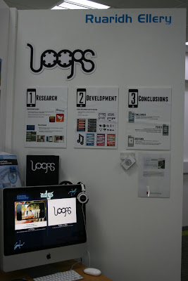
This layout is very well done because it shows a developed work process. Listing the three central stages of development, this layout shows progress as well as a means of structure towards achieving the main objective/aim of this project. Although sticking to the same tone (white), this exhibit blends the displayed pieces of work together in both a neat and professional manor. Personally, the lack of colour would be the only flaw to this showcase layout because colour is a really effective method/tool in making displayed objects more approachable and alluring to any passers-by. There is plenty of information for those whom approach this showcase as everything is very well detailed and labelled as well as business cards and leaflets for those whom wish to learn more about the creator/designer.
This image shows the complete shared space allocated to each participating student in the honours project showcase. Both students whom have displayed their works in this piece have made very good use of their allocated space, providing various materials, using different and attractive colour selections as well as leaving behind necessary contact information such as leaflets and business cards. The student on the left has used a much more colourful and functional layout than the student on the right because the orientation of the items on the right do not follow a specific pattern, making his/her works look somewhat disorganised.
Conclusion:
- Space - I have to be wary of how I will be presenting my completed works, how many of my completed pieces I will be displaying and most importantly, how will my allocated space appear to those exhibiting/visiting.
- Colour - the manor in which my works are displayed will also be influenced by that of colour, therefore, I must ensure my colour selections/patterns are not overwhelming to the eye, but instead, visually inviting/welcoming to those attending the end of year showcase.
- Materials - adding background mounting or framing would definitely make my selected pieces appear more professional and neat, as well as making them stand out in a much more alluring fashion, however, I must make sure my material selections do not detract or interrupt the flow of my desired layout, otherwise my works will appear disorganised and somewhat careless.
- Layout - the most important factor of my layout is orientation. If I present a display pattern that shows compete disorganisation in terms of orientation, my works will look messy and also somewhat lazy. There is nothing wrong with having more than one orientation, however, the manor in which these various orientated works are displayed can make my allocated space appear less or more professional.


No comments:
Post a Comment