Wednesday, 24 April 2013

Exposition research (part II) - McManus galleries [part 3]

What?
This is the third of a four part research piece focusing on the layouts and display of the works on exhibition at the McManus galleries in the centre of Dundee.
Why?
To gather a greater understanding how one displays a variety of works, using different materials, colours, labelling and arrangements/layouts.

Below, I have uploaded some of the images I took on my visit to the McManus, what colour schemes/patterns have been used, highlighting any positives or negatives and building conclusive results relevant towards the development of showcasing my work at the end of the semester.

Exhibits:
This was the first piece I photographed, featured just as you come through the entrance of the McManus.I was going to categorise this piece with layouts, however, I felt the colour selection here was very well done. Although this pale blue/grey and brown are not fully contrasting colours, the items in the foreground with the brown outline are much more alluring, therefore, drawing all focus from passing visitors. The cream photograph and portrait painting of the man at the top of this piece draw particular attention because the cream stands out from the white of the other photos/drawings and the portrait painting is the only part of this piece that uses both intense low and high value colours/tones/shades such as; red, white, peach (skin colour) and black. The only flaw in this piece, personally, is the lack of colour, I realise that less is more, however, I feel that alluring colours both high and low value tend to draw more attention from others.

This piece was one of my favourites, why, the colour. The red of the background enables the paintings/photos/text in the foreground to stand out more. The white text including the header, quotations and descriptions contrast with the red of the backgrounds and the colours of paintings/pictures on the right hand side. The negative here is not the colour scheme but the picture/painting selection. The two highest paintings/pictures on the this exhibited piece do more to blend with the background rather than stand out, which is why the lowest painting/picture is more visible because the colours contrast, thus, drawing more attention from passing visitors.

This piece was bursting with colours so my camera was at the ready instantly. The blue helps the central item of this exhibited piece (the dark orange painting on the left) stand out because they are directly contrasting colours. The framed item below the main piece blends with the background colour because it is not as important and is not intended to draw focus. The two white item on the right also contrast with blue background, however, they are smaller in scale and are considered secondary. This piece would have intentionally appeared to have gone for a particular colour scheme, contrasting colours, however, the dark and harmonising items below the main piece interrupt this style and thus, making this exhibited piece as a whole somewhat disorganised in terms of colour.

Conclusion:
This study/research focusing on colour selection/patterns/schemes has really helped me understand that if colours are not chose appropriately, my pieces might not stand out and therefore, failing to draw attention towards my work from visitors during the end of semester showcase. Contrasting colours is one of my favoured colour patterns/schemes, however, I would not like to rule out other styles because I am still in the process of designing my showcase layout.

Personal horror interpretation (3D) - basic structure

Carrying on from my previous post, I have now completed the basic structure of the cabin for my personal horror interpretation. Below I will be outlining the progress thus far on my 3D horror scene and presenting details for the next stage of my personal horror interpretation.

Design Process:
Using the template I had selected, I raised the walls to a slightly higher point, adjusting both the width of the rooms and the outer walls. In order to separate the rooms from each other and help the scene gain a sense of space, the next element which needed to be completed was the doors.

 Ensuring the polygon count was kept to a minimum, I created the doorways to separate the rooms. As my model is based on the cabin from Evil Dead 2 (1987), I looked towards the referenced images in my previous 3D sketchbook post and used them to make appropriate placements for the doorways. Once the doors were in place I hid them to create more space for the next stage of the basic structure.

 After the doors were constructed and hidden, I decided to do the windows. Again, using the floor plans and referenced images from my previous post, I placed the windows accordingly, providing the cabin interior with enough exterior light sources and not overwhelming it with clutter. Again, once I had finished constructing all the windows, I hid them from the scene to make sure I have plenty of space for the next stage of my personal horror interpretation.

Next development stage:
In my next digital sketchbook blog post for my personal horror interpretation (3D), I will be constructing all the props using images from both relevant media sources (horror films) and real life examples, focusing on prop choices, placements and materials to ensure realism is maintained within my works as much as possible.

Tuesday, 23 April 2013

Personal horror interpretation - 2D (design no.5)

This post captures the fifth 2D design for my personal horror interpretation. This is one of a two part drawing piece which will be focusing on light and dark settings using the same drawing. Below, I will be outlining the design process, formally analysing the finished piece, looking for any errors and finally setting myself some relevant and productive next steps.

Design process
Again, using the three point perspective grid, I constructed the basic outline of the deteriorated cabin interior.

In order to make this piece easier to fill in, I added as much of the highlights as early as possible.

Using the lasso tool, I did a basic colouring of the walls.

Performing the same action, next, I filled in the door, the doorway, the floor and the outline of the window.

Next, I eliminated all the white spots from the background and foreground and filled in the door handle.

Adding dark blue to the background, I wanted to project the night sky to capture any missed spots and to work on the monochromatic tones of the wooden materials of the floor, the walls and the door.

Next, I altered the colours of the door handle and the window frame to make them stand out more.

To portray the lighting coming from the central light source (the moon), I added some brighter patches in the floor projected from the cracks/holes in the walls.

Using a heightened grey-scale, I coloured in the door using a more saturated colour.

Changing my mind, I wanted to maintain a monochromatic colour scheme, so I changed the door, the door handle and the ground back to brown.

 Finally, I increased the darkness and brightened the moonlight projections to display the high and low values more clearly.

Formal analysis:

Summary:
Monochromatic colour patterns are present in this scene on the door, window, walls and floor. 

As there is no blurring, the depth of field is infinite.

The lighting is directional and is clearly seen on the floor, side of the window and cracks in the walls & door frame. 

The camera is set at a lower height, placed at a side angle and at a close distance.

Low and high value colours are present within the browns on the walls, floor, window and door as well as the dark blue of the night sky in the background.

The lines in this piece adheres to no specific pattern because there are both straight and angular lines.

Shapes in this piece are triangular, square and rectangular in nature and are non-conflicting.

The scale of this piece is much more realistic than my previous piece, showing little or no disproportionate areas.

Analysis:
The dark shaded browns of the walls, door and the window in the background are used to separate the light from the dark areas of the room. Monochromatic colour patterns are present in this piece, captured within the brown of the walls, floor, window and door, thus, further conveying the light and dark areas of this scene. Like the previous piece, the atmosphere is effectively boosted by the lack of any human presence. The dark blue is used to represent the night sky, confirming the time of day in which the scene is set.

Interpretation:
The aim of this piece is to capture the unique characteristics of Japanese directed horror. Feelings of uncertainty and anxiety are evoked through the lack of clarity as to where this cabin is located. Like the previous piece, themes of abandonment, separation and isolation are evoked through the lack of human presence and the deteriorated state of the cabin interior. Themes of darkness are highlighted by the monochromatic and dark shaded colours in this scene.

Judgement:
The criteria I will be using to judge this piece are lighting, composition and colour. Firstly, the composition of this piece follows the unique characteristics of Japanese horror to a successful degree using a mixture of lines (both angular and straight), non-conflicting shapes, realistic scaling, a lower camera height, placed at close distance and set at a side angle.

The lighting is directional and uses small patches to depict the pool of light projected through the cracks in the walls, door frame and window. The downside here is the lack of adherence to the characteristics of Japanese directed horror because the favoured light techniques of Japanese horror are three-point lighting and high contrasting.

There are monochromatic tones, low value colours and plenty of saturation, therefore, in terms of colour, this piece adheres strongly to that of the unique characteristics of Japanese directed horror.
These low value colours are captured by browns of the walls, window, doorway and door and the dark blue of background/night sky.

In conclusion, this piece adheres to a very high amount of the characteristics of Japanese directed horror films. lighting appears to be the only remaining flaw visually that appears to still be present, therefore, lighting will be my main objective of study in my next piece.

Next steps
  • Japanese directed horror lighting techniques
  • More background detail
  • Visual gratuity (minor)
  • Japanese folklore

Monday, 22 April 2013

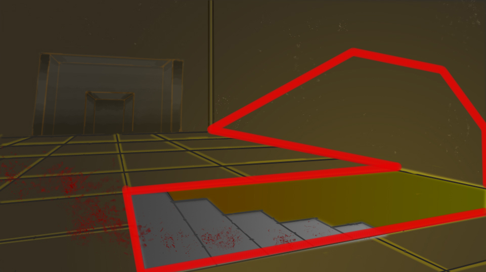
Personal horror interpretation - 2D (design no.4)

This post captures the forth 2D design for my personal horror interpretation. Below, I will be outlining the design process, formally analysing the finished piece, looking for any errors and finally setting myself some relevant and productive next steps.

Design process

Using the three point perspective template that came with one of my software tutorial packs, I constructed the basic outline for the floor and the fireplace.

Using a darker shade of brown and a florescent-like orange, I highlighted the floor tiles and the fireplace.

Ensuring this piece told a visual story, I constructed the basic outline for a cellar entrance. Realising that the light would come from the cellar, I created some reflective light bouncing off the surrounding floor tiles.

Ensuring the entire room adhered to this light source, I used tonal greys to create a gradient on the fireplace.

Realising the light would project around the room at a greater intensity, I increased the brightness of the light on the floor tiles and the fireplace.

Filling in the back walls, I took a step back and lowered the intensity of the reflective highlights on the floor tiles. To help great understand the lighting, I added in another colour gradient to portray the light coming from the cellar.

In order to adhere to the characteristics of Japanese horror, I added a heightened greyscale by increasing the saturation.

To add a sense of realism, I created a colour gradient of the cellar stairs using tones/shades of grey and shades/tones of yellow and orange to depict the cellar light. 

 Adding the final touches, I lowered the brightness and added some blood using a scattered spray paint brush and a variety of custom brushes I had acquired online.

Formal analysis:

Summary:
Monochromatic colour values are present in the browns of the walls and the floor tiles, as well as the greys of the fireplace and stairs. The lighting coming from the cellar also shares monochromatic colours to a minor degree.

With no blurring evident, there is an infinite depth of field.

The lighting is directional, projecting in a vertical direction and spreading as well as bouncing all over the room.

The camera is close range, set at a side angle and placed at a lower height

This piece uses a mixture of low and high value colour patterns including; greys, yellows, oranges, browns and reds.

In this piece, the lines are both angular and straight, highlighting no deliberate or fixed pattern/scheme.

Shapes in this piece are rectangular and square in nature and do not conflict.

The overall scale of this piece is realistic to a certain degree, however, I do feel the fireplace is a little too small.

Analysis:
The shaded dark browns of the background are used to distinguish the light from the dark areas of the room. Monochromatic colour patterns are also used for the floor tiles and the walls in order to further project segments of light and dark inside the room, using higher values for the light coming from the cellar and lower values for the dark/shadows in the background and the fireplace. The setting is developed by lack of human presence, as well as the trail of blood because it creates the impression that this location is isolated, thus allowing whoever has done this to continue with what they are doing uninterrupted.

Interpretation:
The aim of this piece is to capture the unique characteristics of Japanese directed horror. Other than the entrance to the cellar, there is no clear indication of entry or exit points, evoking feelings of and anxiety. Themes of abandonment, separation and isolation are evoked via the lack of human presence. Minor themes of violence are captured in this piece through the red blood on the floor. Themes of darkness are also captured via the dark shadows projected in the background and the fireplace. With no answer or indication what lies below in the cellar, themes of uncertainty are evoked. Themes of deterioration and neglect are brought forth via the signs of wear and tear on the walls.

Judgement:
The criteria I will be using to judge this piece are composition, setting and colour. This setting does project an isolated atmosphere, however, Japanese horror evokes relevant feelings of anxiety and uncertainty using folklore or supernatural beings, therefore, a ghost like presence or figure in the background would add more to the projected atmosphere and to this piece as a whole. 

Taking composition into consideration, this piece adheres to the unique characteristics of Japanese horror by using somewhat realistic scaling, angular lines, non-conflicting shapes and the camera is placed at a lower height, set a side angle and a close distance. Scaling would be the only element of composition that requires closer attention

Displaying monochromatic patterns, the colours in this scene are both low and high in value through the browns of the walls and the floor tiles, the greys of the fireplace and the oranges & yellows of the light coming from the cellar, therefore, adhering to the lower value and darkened colour patterns displayed in Japanese directed horror films.

In conclusion, this piece adheres to a larger amount of the characteristics of Japanese directed horror films in comparison to the previous piece I made. Evoking feelings of fear and the atmosphere of horror to a greater degree, more work is needed to be done to fully capture the projected atmosphere of horror.

Next steps
  • Realistic scaling
  • More background detail
  • Japanese folklore

Friday, 19 April 2013

Exposition research (part II) - McManus galleries [part 2]

What?
This is the second of my four part research piece investigating the works on exhibition at the McManus galleries of Dundee. This part will be focusing on labelling exhibited works.
Why?
To gather information on how I will be labelling and presenting the works I have selected for the end of year showcase.

Below, I have uploaded some of the images I captured on my visit to the McManus, how the exhibited pieces have been labelled, focusing on any necessary positives or negatives and building conclusive results based on these findings.

 Exhibits:
These labels are simple, vertically superior and professional in appearance. This form of labelling is efficient for saving space and non-distracting in terms of focus.

 This form of labelling is simple, horizontal based and neat in presentation. This brings much more of a professional touch, however, it does take up more space intended for central exhibited pieces.

This form of labelling is similar to the first, however, it uses contrasting colours and alternating text sizes to convey a professional standard to whomever may view it.


Conclusion:
Understanding labels will enable me to highlight my own exhibited works to the highest professional standard, taking into account space, colour, font and text size to ensure those observing my honours project will have full clarity and no difficulty when viewing my completed pieces.

Thursday, 18 April 2013

Exposition research (part II) - McManus galleries [part 1]

What?
This is a four part research piece focusing on the layouts and display of the works on exhibition at the McManus galleries in the centre of Dundee.
Why?
To gather a greater understanding how one displays a variety of works, using different materials, colours, labelling and arrangements/layouts.

Below, I have uploaded some of the images I took on my visit to the McManus, what materials have been used, highlighting any positives or negatives and building conclusive results relevant towards the development of showcasing my work at the end of the semester.

Exhibits:

This piece uses metal, clay and glass and stone/granite for the lower displays, providing an overall modern look on a series of older looking pieces. The cloth material behind the sea shell in the top right corner aids in the direction of drawing focus because it contrasts with materials and colours in the background. The glass presents the objects on display with much more grace because they do no steal any attention and direct viewers attention towards the exhibits. The downside to this piece is the randomness of the materials, making the whole piece somewhat disorientated and disorganised.

The stone materials in this piece blend very well with the colours in the background and contrast with those in the foreground, enabling this piece to become more balanced and not overpowering in appearance. The negative however, lies in the top right corner of this exhibited piece because the use of metallic materials clash with those in the foreground and create an imbalance with the intended projection/theme of this piece.

There are a large variety of materials in this piece and the the fascinating element here is that it is not visually overpowering. The paper materials compliment the wooden materials of the carriage being dragged by the alluring marble horse in the foreground. Colour plays an important part in this piece, however, the simplicity and equal balance of the materials help this exhibit blend and prevent the featured objects from conflicting. The only down side to this exhibited piece is the glass materials in the right hand side of the foreground because it adds unnecessary reflections and draws focus from the horse and carriage in the foreground.

Conclusion:
This has helped me understand that different materials are needed to display my works. Using conflicting materials can cause distractions as well as disorientation within my showcased pieces and in turn, may give my honours project somewhat of a less professional aesthetic.

Tuesday, 16 April 2013

Case studies - findings and identified characteristics

Introduction:
Below are the conclusive results from my two case studies; A Nightmare On Elm Street (1984) and Ringu (1998). In this post, I will be comparing the findings for each objective and highlighting any unique characteristics of Japanese directed horror which have been identified in these case studies. 

Plot:
http://bhorrorblog.files.wordpress.com/2012/04/a-nightmare-on-elm-street_blood.jpg
In Wes Craven's A Nightmare On Elm Street, the plot is highly detailed and structured, using events from the directors past as a means of inspiration. The negative factors to A Nightmare On Elm Street are that the film does not provide the full back story to Freddy Krueger's character, how Freddy acquired his supernatural powers and how Elm Street ties in with the history of the franchise, all of which is not fully explained to the audience until later films of the franchise.

http://www.screentrek.com/images/ringu31.jpg
Although it is structured in a peculiar manor, Hideo Nakata's Ringu (1998) uses cultural influences and suspense to progress the narrative. The ending is the only negative factor of this title because it ends on cliffhanger, leaving the audience feeling somewhat unsatisfied and full of unanswered questions.

Folklore:
http://gonewiththetwins.com/pages/80s/screenshots/nightmareonelmstreet/006.jpg
Wes Craven has confirmed that most of his inspirational sources for A Nightmare On Elm Street were based on real life occurrences/events. There are many interpretations, cultural beliefs and religious views which detail encounters/experiences with demonic beings/forces, however, there is no definitive relationship between the two.

http://img58.imageshack.us/img58/6484/clipboard038ej.png
Using strong folklore, cultural influence and important factors such as Onryƍ, Shinto, Kami and Yurei, Hideo Nakata creates very effective and memorable horror imagery in Ringu. Not considered a complete negative, lack of imaginative sources beyond folklore would be the only down side to Ringu.

Real life:
http://www.visualsoc.net/wp-content/uploads/2010/05/Craven_16_08_KelseyR.png-540x300.png
Inspiring an act of violence in which Jason Moore almost killed his close friend using a personal crafted version of Freddy Krueger's knifed glove in Wes Craven's A Nightmare On Elm Street, highlighting the fact that Western directed horror films may inspire acts of violence in the real world.

http://u.jimdo.com/www55/o/s6f2fa22eac8b8e7d/img/i0305f0a703a756de/1289005127/std/sadako-from-ring.jpg
Ringu is already heavily influenced by cultural folklore, however, central plot devices such as the cursed videotape are based on urban legend, failing to inspire any positive or negative events/acts.

Remakes:
http://www.scene-stealers.com/wp-content/uploads/2010/04/a-nightmare-on-elm-street-13-4-10-kc.jpg
Following the case study investigating A Nightmare On Elm Street, it was brought forth that the 2010 remake of Wes Craven's original was lacking in both glamour and imagination, as well as the fact that the 2010 remake of this film was not only critically unsuccessful, the original director and creator of the franchise (Wes Craven) had no say in its production. This case study also helped identify the fact that Western directed remakes/interpretations of Eastern directed titles generally fall short in terms of critical acclaim and feedback, as well as successfully portraying horror itself.

http://lostpic.net/images/a196be893642478228b4b32d358c1d0c.png
The second case study following Hideo Nakata's did nothing more than solidify this point because the 2002 American directed remake of the 1998 Japanese directed original did not match up in terms of review and critical feedback/response, highlighting the fact that Western directors cannot seem to project Japanese horror successfully.


Identified Characteristics:
  • Plot - Japanese directed horror films are constructed using an unpredictable story structure, primarily leaving the audience with a cliff hanger ending and developing the narrative using cultural folklore.
  • Folklore - Japanese directed horror films favour cultural folklore, driving the narrative and characters featured in the title using religious, supernatural and mythological sources.
  • Real life - Japanese directed horror films have not appeared to inspire any acts of violence or noticeable/alluring human acts/events. 
  • Remakes - Japanese directed horror films are much more critically acclaimed that Western interpretations/remakes and Eastern directors are more focused on creating cultural/regional-based works, rather than reinterpreting the works of others from different areas of the globe.