Design process
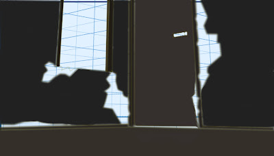
Again, using the three point perspective grid, I constructed the basic outline of the deteriorated cabin interior.
In order to make this piece easier to fill in, I added as much of the highlights as early as possible.
Using the lasso tool, I did a basic colouring of the walls.
Performing the same action, next, I filled in the door, the doorway, the floor and the outline of the window.
Next, I eliminated all the white spots from the background and foreground and filled in the door handle.
Adding dark blue to the background, I wanted to project the night sky to capture any missed spots and to work on the monochromatic tones of the wooden materials of the floor, the walls and the door.
Next, I altered the colours of the door handle and the window frame to make them stand out more.
To portray the lighting coming from the central light source (the moon), I added some brighter patches in the floor projected from the cracks/holes in the walls.
Using a heightened grey-scale, I coloured in the door using a more saturated colour.
Changing my mind, I wanted to maintain a monochromatic colour scheme, so I changed the door, the door handle and the ground back to brown.
Finally, I increased the darkness and brightened the moonlight projections to display the high and low values more clearly.
Formal analysis:
Summary:
Summary:
Monochromatic colour patterns are present in this scene on the door, window, walls and floor.
As there is no blurring, the depth of field is infinite.
The lighting is directional and is clearly seen on the floor, side of the window and cracks in the walls & door frame.
The camera is set at a lower height, placed at a side angle and at a close distance.
Low and high value colours are present within the browns on the walls, floor, window and door as well as the dark blue of the night sky in the background.
The lines in this piece adheres to no specific pattern because there are both straight and angular lines.
Shapes in this piece are triangular, square and rectangular in nature and are non-conflicting.
The scale of this piece is much more realistic than my previous piece, showing little or no disproportionate areas.
Analysis:
The dark shaded browns of the walls, door and the window in the background are used to separate the light
from the dark areas of the room. Monochromatic colour patterns
are present in this piece, captured within the brown of the walls, floor, window and door, thus, further conveying the light and dark areas of this scene. Like the previous piece, the atmosphere is effectively boosted by the lack of any human presence. The dark blue is used to represent the night sky, confirming the time of day in which the scene is set.
Interpretation:
The
aim of this piece is to
capture the unique characteristics of Japanese directed horror. Feelings of uncertainty and anxiety are evoked through the lack of clarity as to where this cabin is located. Like the previous piece, themes of abandonment,
separation and isolation are evoked through the lack of human presence and the deteriorated state of the cabin interior.
Themes of darkness are highlighted by the monochromatic and dark shaded colours in this scene.
Judgement:
The
criteria I will be using to
judge this
piece are lighting, composition and colour. Firstly, the
composition of this piece follows the unique
characteristics of Japanese horror to a successful degree using a mixture of lines (both angular and straight), non-conflicting shapes, realistic scaling, a
lower camera height, placed at close distance and set at a side angle.
The lighting is directional and uses small patches to depict the pool of light projected through the cracks in the walls, door frame and window. The downside here is the lack of adherence to the characteristics of Japanese directed horror because the favoured light techniques of Japanese horror are three-point lighting and high contrasting.
There are monochromatic tones, low value colours and plenty of saturation, therefore, in terms of colour, this piece adheres strongly to that of the unique characteristics of Japanese directed horror.
These low value colours are captured by browns of the walls, window, doorway and door and the dark blue of background/night sky.
In
conclusion, this piece
adheres to a very high amount of the characteristics of Japanese directed
horror films. lighting appears to be the only remaining flaw visually that appears to still be present, therefore, lighting will be my main objective of study in my next piece.
Next steps
- Japanese directed horror lighting techniques
- More background detail
- Visual gratuity (minor)
- Japanese folklore


No comments:
Post a Comment