Design Process
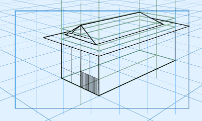
Using a two point perspective grid from a tutorial package I had purchased online, I created the basic shape of a traditional Japanese home.
Unhappy with the camera angle and the precise nature of drawing, I changed the angle of my drawings perspective as well as the height.
After completing the basic shape, I began to fill it in using monochromatic patterns of grey.
After filling in the complete piece, I took a step back and planned my next move.
To make this piece simple, I kept it grey and did not add anything in the foreground or background. I also removed the grey from the windows to project the aesthetic of glass.
Removing the background grid, I began to touch up the piece, looking for any errors.
Reducing any colour confliction, I touched up the lines to make the piece somewhat more precise and neat.
Summary:
Monochromatic colour patterns are clear in this piece as I only used one single tonal value (grey).
There is no blurring in this piece, hence there is an infinite depth of field.
This was a tonal piece and displays no lighting.
The close range camera is placed lower height looking upwards and is set at a side angle.
The colours are tonal and fairly high in terms of value.
Lines in this piece are angular and straight.
Shapes featured in this piece include; rectangles, triangles and squares.
This scale of this piece is unrealistic because certain elements of the Japanese home are somewhat disproportionate.
The monochromatic tones are used to represent darkness. The blank background is used to create an highlight the object in the foreground. White is used to represent glass materials.
Interpretation:
The aim of this piece is to capture the unique characteristics of Japanese directed horror. Excluding neutrality, there are no thoughts, feelings or moods evoked in this piece.
Judgement:
This is my second piece and as such, a context needs to presented to explain this design. This piece was created to experiment with shapes and tones, however, I failed to include background and foreground details, colours or horror itself due to time constraints, if anything this was more of a practice piece, however, it is relevant in displaying the development of my work. The criteria I will be using to judge this piece are colour and composition. The colours in this scene are non-existent and are purely tonal. Japanese horror films adhere to dark and low value colour patterns using a heightened grey-scale to add more saturation, therefore, it does not adhere to the characteristics of Japanese horror which I have identified thus far. As far as composition goes, besides smaller proportional errors, scale, shapes and lines are one of the few redeeming elements which come close to successfully projecting a Japanese horror environment. Placed at a lower height, set at a side angle and an infinite depth of field are the other characteristics identified in this piece which adhere to the characteristics of Japanese horror.
In conclusion this piece adheres to some of the characteristics of Japanese horror, however, like the previous piece, fear and horror are not evoked or projected. This piece simply does not include the key ingredients needed to project a successful Japanese horror environment, however, it has helped me develop a greater understanding in perspective drawing, size, scale, proportions and colour.
Next steps
- Darker colours - COLOURS NOT TONES !
- Realistic proportions
- Horror atmosphere
- Background and foreground development


No comments:
Post a Comment