Saturday, 10 November 2012
Critique week - personal reflection
For critique week I presented my developed project and ideas to Lynn Parker, Ryan Locke and Brian Robinson. The points of personal development were made clear to the lecturers; new aims and objectives, literature research, blog development, mood boards for project location, understanding of colour terminology, film and game research (in relation to horror), 3D drawings and animated lighting tests. My development was met with great praise, primarily on my choice of Brazil for the location of my project for my 3D environment. All three lecturers made the point that as I had chosen Brazil, that I should research the country extensively; colour, culture, tradition, folklore and horror films from Brazil. Secondly, Lynn pointed out that in the past four weeks, yes it was good that I had started my 3D drawings, but due to my mass amount of research, the practical side has been somewhat neglected and that I should try and balance all tasks at once in order to get the best possible results out of my project. Finally it was made very clear to me by both Ryan and Lynn that when presenting my work it should be professional and recommend avoid using personal expressive pictures in the future. I thought it went really well as I now have another point of development for my project - In terms of development, balance is my primary concern - it is clear that I have been neglecting the practical side of things and hope to be more constructive in my day-by-day productivity. I hope to learn everything I can on the country before I start anything practical in order to ensure my work is accurate and top quality. In the future I now know that I should try to be more professional than expressive in my presentations and make sure that is reflected in my next one.

Thursday, 25 October 2012
Colour in horror - blood and atmosphere
In horror, we can can usually count on one component - blood. Violence and gore is not featured in every horror themed video game or film, but it can be used to create a successful horror atmosphere. Dead Space (2008) shows several examples of how to create a successful horror atmosphere using blood. I have played two thirds of the game so I can provide my own thoughts and feelings as feedback and evaluation. Below I have selected sections of the game where I noticed effective uses of blood to create atmosphere.
Using these sources as inspiration, I decided to depict my own horror scene using blood to depict a successful horror atmosphere.
The Design Process


Using my previously learned skills in shadowless lighting, I manipulated the incandescence for the lighting on the door, ensuring the tone of blue stood out from the primary colour of the door. I then moved onto the most important factor - the blood. Using a downloaded brush pack from an online source (it was free!), I created blood spatter patters on the door using the pre-set brush shapes and using a transparent eraser to manipulate and create my own patterns of blood. This scene depicts a kill at close range in front of the door therefore, it was important to maintain a sense of realism by making sure my blood patterns were not repeated and that there was not a ridiculous quantity of blood used.
A final touch was needed, so I placed a hand print on the screen. To avoid a common portrayal of blood on surfaces, I decided not to smear the hand print in a particular direction as I have seen far too many times before in films and video games and did not want to create that which has been done already to maintain a sense of originality in my works. I decided not to add any environmental lighting as I feel it would draw focus away from the lights on the door, making the contrasting effects of the colour selections much less effective.


What relevance does this test have towards the development of my project and horror?
The relevance of this test is to develop my understanding of the effectiveness of blood in a horror scene and how it creates a successful atmosphere. The red of the blood evokes certain feelings/moods/emotions therefore, studying other colours used in horror will help me understand how other feelings/emotions/moods are inspire and thus, use these colours to depict a more successful horror atmosphere within my 3D environment. This test also helped me develop my texturing skills, as I have never experimented with blood before.
 | ||
| http://www.gogaminggiant.com/wp-content/uploads/2009/10/16.jpg |
Having just encountered the unknown alien race known as the necromorph and ran to a safe location to avoid a very gruesome death, I was presented with my first weapon. Having a rough visual idea of what the necromorph look like, I noticed a message on the board in front of me reading 'cut off their limbs'. The first time I saw this message, feelings of anxiety and fear began to manifest themselves because I was now worried what I was coming up against, can the enemy re-grow their limbs and is that eventually going to be my blood on the wall?
The dark shade of red used for the blood suggests decay, which means whoever wrote this message has been dead for quite some time, making me think the necromorph race has probably taken over the ship by now, which again raised feelings of fear and anxiety.
The dark shade of red used for the blood suggests decay, which means whoever wrote this message has been dead for quite some time, making me think the necromorph race has probably taken over the ship by now, which again raised feelings of fear and anxiety.
 |
| http://metavideogame.files.wordpress.com/2008/12/concept_desolate_hallway_download_021208.jpg |
Moving through the corridors of the Ishimura, I came across this doorway. Moving from a darker shade of red to a brighter tonal red, the decay rate flows from old to new, telling me that whatever or whomever has died, it was not that long ago. This evokes feelings of uncertainty and puts me in a hesitant mood because my mind is telling me there is something through that doorway and it is not friendly again, inspiring feelings of fear and anxiety.
Continuing along the hallways there were dead bodies everywhere, blood splashed all over the floor and walls, guts spilled out on the stairs and limbs on the corpses missing. With the blood everywhere my feelings of anxiety and fear were raising every second. The effective use of blood here was the quantity, the more blood I saw the more worried I became. This use of blood creates atmosphere successfully here because the colour red evokes the most passionate of our emotions and feelings rage, love and stress however, here it promotes fear. Fear, like rage and love are some of our most unsteady feelings and emotions, the slightest harassment of these can tip us over the edge and can sometimes be hard to steady out our reactions and thoughts. For example, If I was to watch three or four paranormal-based horror films late I night, I will be constantly looking over my shoulder because the more that I watch, the more fearful I become which in turn, carries on until I head to bed for the evening or go to the toilet, the feeling of fear is still there because the images of blood, scary moments and horror characters are still in my head and will not vanish until at least the next morning.
 |
| http://memberfiles.freewebs.com/01/26/63792601/photos/Dead-space-/dead_space4.jpg |
Using these sources as inspiration, I decided to depict my own horror scene using blood to depict a successful horror atmosphere.
The Design Process

I started by creating a square shaped door, using the sci-fi theme of Dead Space for the design style of my door. Next, I extruded a 't' shape in the door to depict the blue neon lights. After that I divided the door up into sections so I could later create a pattern in the door. Finally, extruded one of the squares on the left hand side to depict a password access screen.

Next I corrected the 't' shape of the door light so that it was one whole shape. After this I started to search for a screen-shot of a password screen online. Through trial and error, I kept searching until I found an image that blended with the rest of the colours on my door.

To complete my door I created grooves in the door by doubling the sectioned lines of my door and shaped them accordingly. Finally, I unwrapped the door and performed the texturing in Adobe Photoshop.
Using my previously learned skills in shadowless lighting, I manipulated the incandescence for the lighting on the door, ensuring the tone of blue stood out from the primary colour of the door. I then moved onto the most important factor - the blood. Using a downloaded brush pack from an online source (it was free!), I created blood spatter patters on the door using the pre-set brush shapes and using a transparent eraser to manipulate and create my own patterns of blood. This scene depicts a kill at close range in front of the door therefore, it was important to maintain a sense of realism by making sure my blood patterns were not repeated and that there was not a ridiculous quantity of blood used.
A final touch was needed, so I placed a hand print on the screen. To avoid a common portrayal of blood on surfaces, I decided not to smear the hand print in a particular direction as I have seen far too many times before in films and video games and did not want to create that which has been done already to maintain a sense of originality in my works. I decided not to add any environmental lighting as I feel it would draw focus away from the lights on the door, making the contrasting effects of the colour selections much less effective.


What relevance does this test have towards the development of my project and horror?
The relevance of this test is to develop my understanding of the effectiveness of blood in a horror scene and how it creates a successful atmosphere. The red of the blood evokes certain feelings/moods/emotions therefore, studying other colours used in horror will help me understand how other feelings/emotions/moods are inspire and thus, use these colours to depict a more successful horror atmosphere within my 3D environment. This test also helped me develop my texturing skills, as I have never experimented with blood before.
Lighting in horror (continued) - sunrise and coloured lighting
In order to continue my research of horror in daylight, I have constructed my own sunrise. Before I continue with this post I regret to inform that I have lost the files for this scene therefore, I cannot show each developing stage of this lighting test. I did however, manage to recover the screen-shots I took of the finished scene and have provided them below to support my research.
To start, I had to create a scene for my lighting test. Using a series of duplicated rectangles and a roof using the create tool, I made a basic hallway. Next I needed some props. Using creativecrash.com I located a wooden barrel prop and placed them in my scene accordingly so that any placed lights would effectively project shadows. After that, I started placing my lights in the scene to portray a sunrise. Firstly, I created a series of spotlights set in dark tones of red and magenta, setting them at ground level facing/aiming towards the rear of the barrel props. I then went onto slightly adjust the ambient colour of each light in order to add a light tone to the projected colours. The final step was the shadows. Using dark blues for the magenta coloured spotlights to add a degree of depth, I then added harmonising dark tones of yellow to the dark red spotlights in order to create a slight transparency in the shadows projected by the barrel props.
To start, I had to create a scene for my lighting test. Using a series of duplicated rectangles and a roof using the create tool, I made a basic hallway. Next I needed some props. Using creativecrash.com I located a wooden barrel prop and placed them in my scene accordingly so that any placed lights would effectively project shadows. After that, I started placing my lights in the scene to portray a sunrise. Firstly, I created a series of spotlights set in dark tones of red and magenta, setting them at ground level facing/aiming towards the rear of the barrel props. I then went onto slightly adjust the ambient colour of each light in order to add a light tone to the projected colours. The final step was the shadows. Using dark blues for the magenta coloured spotlights to add a degree of depth, I then added harmonising dark tones of yellow to the dark red spotlights in order to create a slight transparency in the shadows projected by the barrel props.
 |
| Barrel prop downloaded from: http://3dmodel.domawe.com/2012/03/wooden-barrel-free-3d-model-1.html |
 |
| Barrel prop downloaded from: http://3dmodel.domawe.com/2012/03/wooden-barrel-free-3d-model-1.html |
 |
| Barrel prop downloaded from: http://3dmodel.domawe.com/2012/03/wooden-barrel-free-3d-model-1.html |
What relevance does this lighting test have towards the development of my project and horror?
The relevance of this lighting test is to experiment with coloured lighting in a daytime setting in order to successfully portray horror in both contrasting times of day as I have not yet decided if my 3D environment will be set in the daytime or night-time. This has significant relevance to the development of my project because it helps improve my technical skills, and knowledge in colour selections and shadow depth.
Lighting in horror - daylight
Continuing my study in the horror genre, I thought, yes I've touched on horror in darkened settings, but have I tried to depict the atmosphere of horror in the daytime?
When thinking of horror in the light of day two titles from the horror genre came to mind. The first example that sprang to mind was Paranormal Activity 3 (2011) - an invisible demon stalks a family of 4, and unlike its predecessors which focused on promoting a horror atmosphere in the evening, this one is shot in both day-time and night-time.
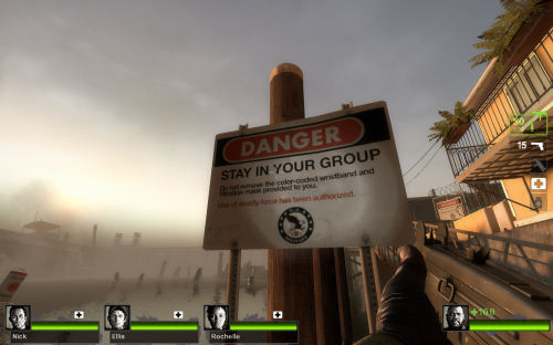
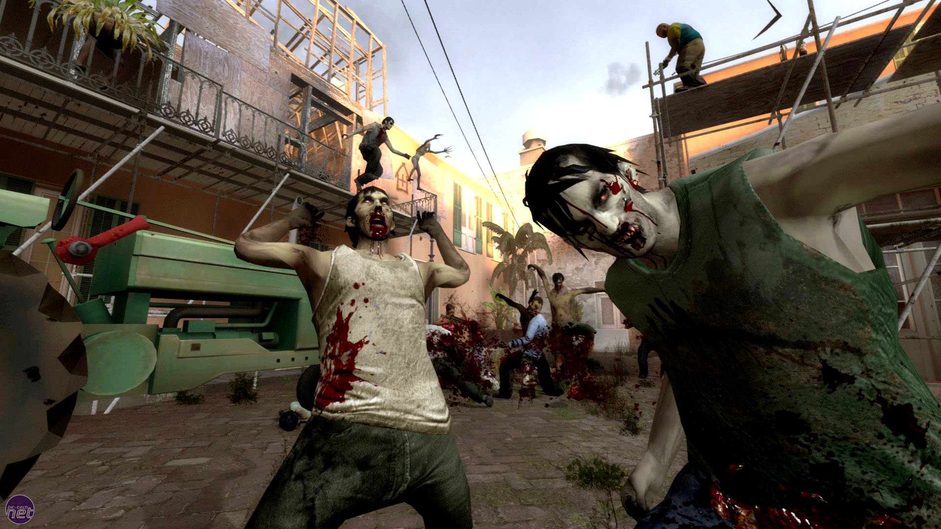
The second example that came to mind when I thought of horror in daylight was Left 4 Dead 2 (2009)
During the stand-off against the horde in the third chapter of the level, I saw a great deal of colour value; the sunlight reflecting the bright colours of some surrounding buildings giving a higher value, whilst the scaffolding and construction equipment seemed to absorb the light and create lower colour value. Again, this creates a visual sense of darkness within the light of day which maintains the atmosphere of horror.
What relevance does this research provide for the development of my project and horror?
The relevance of this research is so I can identify and elaborate on the lighting, colours and shadows in a daylight setting. This will help expand options for my project as I have not yet decided whether I will be doing my 3D environment in a day-time or night-time setting. This research will also help me with any future colour tests because the recognition of colours and how they evoke moods, feelings and emotions will be very important for the successful portrayal of horror in my 3D environment.
When thinking of horror in the light of day two titles from the horror genre came to mind. The first example that sprang to mind was Paranormal Activity 3 (2011) - an invisible demon stalks a family of 4, and unlike its predecessors which focused on promoting a horror atmosphere in the evening, this one is shot in both day-time and night-time.
As the character in this title (Toby) is invisible it already creates a sense of mystery for the audience, adding feelings of anticipation, keeping the viewers in a constant anxious state, wondering when the invisible demon will strike next. Running upstairs chasing her younger sibling, the eldest daughter Katie bumps into thin air. Looking up in terror, the audience cannot see what she has bumped into. The only indication of a supernatural presence is a dark shadow on the floor. Suddenly, she is lifted off the floor by her hair, evoking feelings of fear as well as a physical reaction in the audience.
The second example that came to mind when I thought of horror in daylight was Left 4 Dead 2 (2009)
 | ||||
| http://ohitsblog.com/wp-content/uploads/2009/06/left-4-dead-2-the-parish-new-characters.jpg |
 | ||||
| http://www.co-optimus.com/images/upload/image/2009/left4dead2%202009-10-28%2022-20-53-54.jpg |
Using subtle hints of red, orange and yellow for the sun mixed with dark shades of blue in the background and grey and brown for the lighting on the buildings in the foreground, this evokes feelings of warmth and happiness as the nightmare is almost over. The lower tones of white for the flash-light create minor shadows, thus maintaining the element of darkness even in the daytime.
 | ||
| http://images.bit-tech.net/content_images/2009/07/left-4-dead-2-hands-on-preview/left_4_dead_2_3.jpg |
What relevance does this research provide for the development of my project and horror?
The relevance of this research is so I can identify and elaborate on the lighting, colours and shadows in a daylight setting. This will help expand options for my project as I have not yet decided whether I will be doing my 3D environment in a day-time or night-time setting. This research will also help me with any future colour tests because the recognition of colours and how they evoke moods, feelings and emotions will be very important for the successful portrayal of horror in my 3D environment.
Wednesday, 24 October 2012
Choosing a setting - Japan

Using images from numerous sites, I have designed the final of my three mood boards in order to narrow down my decision for the location of my 3D environment.
- Why this country?
- Are there any examples of horror in media that influenced this decision?
- Is there anything unique to this setting in terms of lighting, shadows and colour?
- Are there any technical issues that can generate for this choice of setting?
Tuesday, 23 October 2012
Lighting test - flashing lights
Flashing lights are used in horror to create tension and anxiety, which makes a horror atmosphere more effective. Using Dead Space (2008) as a means of inspiration I have created a lighting test demonstrating a single flashing light in a dark room.
At the beginning of Dead Space the player has a moment of panic as the main character Isaac and his team are suddenly attacked and the player must run through a series of hallways to evade these unknown hostile creatures (necromorphs). I found a video walkthrough online to visually display this section of the game in order to highlight this test. The moment in which this happens is at 07:24. Beware that this video contains some strong language.
After hours and hours of searching online for answers to this dilemma, it became clear the solution to my problem involved nothing more than a right click. It was a very simple fix but I felt like I had just wasted a lot of time for such an easy solution. The solution was to right click on the intensity of each light and hit 'set key' instead of using the manual keyboard short-cut. With this technical error solved, I then continued keying the intensity of each volume light to a specific pattern until I had the lighting effect I desired. Once this was finished I conducted a batch render so that I could load the complete piece into Adobe Premiere Pro. With the completed piece rendered and loaded into the necessary video editing software, I brought all the rendered frames into one full piece and exported it. Below is the finished lighting test.
What relevance does this test have to the development of my project and horror?
This lighting test helps me understand how to promote horror with animated lighting because flashing lights evoke feelings of uncertainty, panic and anxiety thus, creating a more effective atmosphere. In Dead Space this lighting technique made me feel like there was something watching me or something bad was about to happen, creating a very high tensioned atmosphere, successfully inspiring feelings of fear and terror which is the central aim of the horror genre.
Choosing a setting - Brazil

Like the other mood-boards I started by resourcing several photos from different sites in order to capture inspiration as one of three possible locations for my 3D environment to be located. Here, I have selected Brazil as the second of my three selected locations because I feel this country is bursting with colours and has great potential for conversion to horror.
- Why this country?
- Are there any examples of horror in media that influenced this decision?
I have put some research into the Brazilian horror scene and was unable to recognise any major titles, except from a 2006 title called Turistas a.k.a Paradise Lost. This film tells the tale of a group of travellers who end up stranded in a small Brazilian village due to a traffic incident eliminating their source of transportation. This title influenced my decision because it helped aid in displaying a horror setting in an isolated small, isolated location.
- Is there anything unique to this setting in terms of lighting, shadows and colour?
- Are there any technical issues that can generate for this choice of setting?
Subscribe to:
Posts (Atom)