Wednesday, 8 May 2013

Exposition research (part VII) - personal statement

This a quick blog post to outline my personal statement for my layout at the honours project showcase.

I asked my supervisor, Brian Robinson, about how I should construct my personal statement, to which he gave me a bullet pointed outline.

  • Less than two hundred words
  • My name
  • My academic interests 
  • The area of research I am exploring for my project
  • How my honours project has developed me personally.

This is not the final version as I am seeking guidance and correction from a previous honours project student, however, I thought I would outline what I have thus far:


“We make up horrors to help us cope with the real ones.” - Stephen King
 

Hello there, my name is Murray MacNab, forth year computer artist.

3D and 2D environmental design are my key areas of expertise, as well as my most favoured of interests. I take great enthusiasm in conceptual research and the formal analytical process, particularly observing and adapting to the works of professional digital painters and environmental designers (2D or 3D).


The area of research which I have selected to explore is that of the horror genre in the medium of film, specifically Japanese directed horror. I selected this area of research because I have always favoured horror cinema above all other film genres/categories. The specified focus of my project is aimed towards Japanese directed horror because I have always felt that Eastern horror titles are much more successful in portraying a memorable and cultural-based horror atmosphere instead of recycling the same predictable characteristics found in Western directed horror titles.


Creating this honours project has helped develop me personally on so many levels because I feel my technical, observational and analytical skills have been enhanced tenfold to that of any previous academic period and has opened my eyes to several new design techniques, styles and research methods.


Please enjoy my works displayed around you and do not hesitate to ask me about my honours project or anything else.


Enjoy,


Murray Alan MacNab
BA (Hons) Computer Arts

Sunday, 5 May 2013

Exposition research (part VI) - project poster

What?
This post will highlight the favoured aesthetic for my project poster which is to be featured in my layout for the honours project showcase at the end of the semester.

Why?
To display how I will be advertising the entirety of my showcase layout and my honours project.

Design
http://www.avcesar.com/source/software/tmdb/2156/extrait_ringu_1.jpg
I felt that the main poster for my showcase layout had to capture what I am trying to achieve with my honours project, which is to identify the unique characteristics of Japanese directed horror. Using a large close-up of a scene from Hideo Nakata's Ringu (1998), I felt this image would be most appropriate for my project poster because it is a Japanese directed horror film, one of my case studies was directed towards the investigation of this film and finally, because I thought it would blend with the rest of my selected showcase pieces once the image was saturated.

After adding some saturation and lowering the brightness of the image, I placed a suitable font at the base of the image to advertise the title of my project. I love the font used in notepad, however, I did not want it too look so outdated or pixelated, therefore, I selected a slightly neater version of the same font and sized it out accordingly. As my name will be displayed at the top of my allocated space, I did not want to further clutter the poster up by putting my name in with the project title. This is not the final draft but this is the aesthetic I would like to use for my project poster because the image selection looks terrific within my chosen colour/tonal range, it looks simple and professional and it highlights/follows existing elements within my honours project.

Next steps:
  • Select final pieces for showcase
  • 3 x stages of project development

Exposition research (part V) - business cards

What?
In this post I will be outlining the design of my business cards for the honours project showcase at the end of the semester.

Why?
To display how the design and colour selections are to blend in with the rest of my showcase layout.

Front
front
The front of my business card is simple, basic and blends in with the colour range I have selected for the rest of my showcase layout. My intended design style, similar to that of my layout, is simple and functional or less-is-more because I feel that it is unnecessary to overdo or overfill one's identification with shapes or images. As I would like to maintain a professional standard within my works, I felt that my business cards should be treated no differently.

Back
back
I made sure that the back of the business card followed the colour/tonal range I am using for my showcase layout and the front of the card by making the background colour grey, with black and white text and a neat font selection. This design choice is to further my less-is-more aesthetic displayed in my showcase layout. The BA (Hons) Computer Arts text in the top right corner is only temporary for now because I am still uncertain whether to just put 3D environment artist or 2D/3D environment artist (as I am now skilful in both fields). I would like to seek a career in 3D environment design, however, I feel that I should check with the course lecturers first to ensure I am not selling myself too short.

Next steps
  • Project poster
  • Select final pieces for showcase
  • 3 x stages of project development (A3)

Exposition research (part IV) - layout

What?
In this post I will be outlining my showcase layout, focusing specifically on materials, layout and colour.

Why?
To give a rough understanding of how I will be presenting my selected works, what colours I will be selecting and what materials I will be using.

Layouts
Below I have highlighted my original design/layout presented in the infrastructure form as well as a rough idea of my layout for the showcase.

***NOTE***
I use the word materials to describe actual materials, as in glass, card, paper, etc. I realise that the honours handbook uses 'materials' in a different context, therefore, I would just like to clear this up.

Original layout
This was the original design for my showcase layout, admittedly, it was very off but the principal design is still something I wish to follow. Initially, I thought that each student was allocated both walls, however, I was corrected by the lecturers and was soon back on track. I still want to include a table in order to present my sketchbooks, however, the rest of it needs adjusting.

Final layout (1st draft)
This is the layout I would prefer to use because it is both functional and professional. I wanted to show off the stages of my honours project. therefore, I placed three A3 sheets below the main project poster. I initially tried to set the poster as A1 in size, however, it did not leave much room for the rest of my arranged setup. The personal statement will lie to the right hand side of the A3 project development sheets and my business cards will be underneath it. In the bottom right corner I will have a small table set up with my sketchbooks on top of it to further display the development of my project. I feel a less-is-more approach makes this arrangement more professional and tidy in appearance.

Materials 
The materials I will be using will most likely consist of printing paper for my selected works & project poster and card will be used to frame all of my selected pieces, including the personal statement and the project poster. The holder I will be using will most likely be plastic or metallic, depending on where I can find one. I have selected card as my choice of framing material because it is basic, presents a tidy aesthetic and maintains a professional standard within my showcase layout.

Colours 
My colour selections will be primarily consist of greys, blacks and white in order to highlight my identified knowledge of saturation and a heightened grey-scale in Japanese directed horror films. 
Using Adobe's Kuler, I have identified a full tonal range which I would like to use for my materials, font colour and project poster. This colour selection also matches the colours used for my business cards which features a white to black tonal range. Despite the fact that some of my research, concept and final work feature different saturated colour values/patterns, I feel this tonal range will help maintain a professional aesthetic within my showcase layout.

Next steps
  • Business cards
  • Project poster
  • Select final pieces for showcase
  • 3 x stages of project development (A3)

Thursday, 2 May 2013

Exposition research (part III) - previous years

What?
In this blog post I will be detailing the works of various student's from last years' honours project showcase.

Why?
To understand the limitations of my design possibilities based on; colour, layout, space and materials, ensuring that my displayed works are of the highest professional standard.

This is an example of a simple layout for exhibiting ones' favoured works. Although this is simple and considered stylish in the art world, I feel this layout is very lazy. The hanging piece in the centre does blend with the rest of the blank space, however, it does not display any materials, colours or completed works, making this piece somewhat boring overall. On a positive note, the designer of this showcase exhibit was considerate enough to provide leaflets and business cards for those whom took interest in his/her works.

 This layout is very well done because it shows a developed work process. Listing the three central stages of development, this layout shows progress as well as a means of structure towards achieving the main objective/aim of this project. Although sticking to the same tone (white), this exhibit blends the displayed pieces of work together in both a neat and professional manor. Personally, the lack of colour would be the only flaw to this showcase layout because colour is a really effective method/tool in making displayed objects more approachable and alluring to any passers-by. There is plenty of information for those whom approach this showcase as everything is very well detailed and labelled as well as business cards and leaflets for those whom wish to learn more about the creator/designer.

This image shows the complete shared space allocated to each participating student in the honours project showcase. Both students whom have displayed their works in this piece have made very good use of  their allocated space, providing various materials, using different and attractive colour selections as well as leaving behind necessary contact information such as leaflets and business cards. The student on the left has used a much more colourful and functional layout than the student on the right because the orientation of the items on the right do not follow a specific pattern, making his/her works look somewhat disorganised.

Conclusion:
  • Space - I have to be wary of how I will be presenting my completed works, how many of my completed pieces I will be displaying and most importantly, how will my allocated space appear to those exhibiting/visiting.
  • Colour - the manor in which my works are displayed will also be influenced by that of colour, therefore, I must ensure my colour selections/patterns are not overwhelming to the eye, but instead, visually inviting/welcoming to those attending the end of year showcase.
  • Materials - adding background mounting or framing would definitely make my selected pieces appear more professional and neat, as well as making them stand out in a much more alluring fashion, however, I must make sure my material selections do not detract or interrupt the flow of my desired layout, otherwise my works will appear disorganised and somewhat careless. 
  • Layout - the most important factor of my layout is orientation. If I present a display pattern that shows compete disorganisation in terms of orientation, my works will look messy and also somewhat lazy. There is nothing wrong with having more than one orientation, however, the manor in which these various orientated works are displayed can make my allocated space appear less or more professional.

Horror film remakes/interpretations - The Ring (2002)

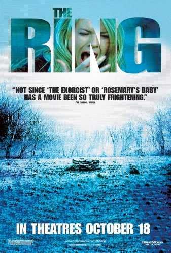
This is the forth and final instalment of my research into Japanese horror film remakes/interpretations. As mentioned in my past three posts, I have already reviewed and researched four critically acclaimed Japanese directed horror films; Ringu (1998), Chakushin Ari (a.k.a One Missed Call) (2003), Ju-on The Grudge (2002) and Dark Water (2002), all of which have remakes/interpretations, therefore, I have decided to watch and review these remakes/interpretations and draw comparison-based results, highlighting (if any) identified Japanese horror characteristics. In order to thoroughly research this interpretation/remake I will first be summarising the plot, noting relevant differences (if any), after that I will be looking for any characteristics I have previously identified in my honours project thus far, then I will discover whether this remake/interpretation is higher in critical acclaim than the original and finally, I will be drawing conclusive results based on my findings.

Plot Summary:
http://www.impawards.com/2002/posters/ring_ver3.jpg
An investigative journalist by the name of Rachel Keller follows a story about a cursed videotape, supposedly responsible for killing her niece as well as several of her friends. Those who watch the contents of this videotape (after receiving a phone call) have exactly seven days to live. After Rachel's son watches the footage on the cursed tape, she must now race against time to find out the history behind the contests on the video and hopefully, a solution to rid both her and her child of the wretched curse.

This remake/interpretation, was not that bad. Although not directly following the narrative path of Hideo Nakata's 1998 original, this film did very little to disappoint, bringing fresh and imaginative additions to the plot, answered some interesting narrative points not explored in the original and still ended up with the same conclusion, however, there were still a number of flaws and interesting factors I feel have to be brought forth about this remake/interpretation.

  • Insects - insects were persistently used to symbolise death in this film, subtly placed to develop the narrative.
  • Length - like many remakes before and after it, this remake interpretation took a staggering hour and fifty minutes to reach a conclusive point, making me loose interest as well as enthusiasm after a certain point
  •  Blue - the film had a massive overuse of a blue scope, everything had a sort of blue-ish appearance to it, however, these colour values were saturated well showing some indication of a grey-scale.
  • Character involvement - certain character roles in this remake/interpretation were developed to a greater degree, unlike some in the 1998 original such as; the murdered girl, her father and the investigative reporters son, making the story structure as a whole feel more convincing and thorough.
  • Performance - the acting in this remake/interpretation was very convincing and nowhere near as rusty or dull as the 1998 original, particularly the role of the deceased girl's father, performed beautifully by Brian Cox.
Japanese Characteristics:

https://blogger.googleusercontent.com/img/b/R29vZ2xl/AVvXsEj-dF7fGJnc7Vn5Y9Lvjmw-BDDWiFqKaIRvQrRdUpqMKI-j5XqcCq7yMT4vTP5snaTRYDocUt9xQ_O33SjgZnJNUAYlCjRARXNhFipX_gauz_jQb9Q5Htp1vsc32sVvNTmY2GVNrHo4ESU/s1600/(2002)+The+Ring+Opt+3.png
  • Setting - this remake/interpretation drifted from time to time when focusing on the setting. Key areas such as the cabin in the woods, the island and the journalistic facilities were all present in this film, however, there are several other locations relevant to particular plot points in this remake/interpretation that are not in the original.
  • Colour - this remake/interpretation did fantastic in terms of colour because there were barely any high value colours noticeable/present and there was constant saturation, although not directly grey, this remake/interpretation did very well to adhere to the colour used in Japanese directed horror.
  • Lighting - three point lighting was constantly used in this remake/interpenetration as well as few uses of high contrast lighting, following the unique characteristics of Japanese horror and showing great adherence as well as influence to the 1998 original.
  • Composition - this compositional value of this remake/interpretation was not half bad. The shapes in this remake/interpretation were non-conflicting and the depth of field rarely strayed from an infinite field of vision, therefore, following the characteristics of Japanese directed horror. The scaling was realistic and camera work, although using some of the favoured American long distance and establishing shots/distances, this remake/interpretation made some use of the higher and lower camera heights, the side camera angle and close distance shots, thus, adhering to the unique characteristics of Japanese directed horror.
Critical acclaim:
http://cineawesome.com/wp-content/uploads/2011/11/152m3qg9858786.png
Although this remake/interpretation was not as highly critically acclaimed as the 1998 original, it did a lot better in terms of judgement and feedback than any of the previous remakes/interpretations which I have investigated, "The Ring is an atmospheric piece of filmmaking however, partly thanks to some beautiful, moody cinematography (by Bojan Bazelli). Essentially, it hybridises a studied Japanese tone of telling supernatural horror stories with that of the US, as represented in the films of M Night Shyamalan" (Etherington, 2011)

Despite this positive feedback, this remake interpretation did have its own fair share of negative comments, "by the time "The Ring" gets around to delivering its big surprise payoff, it's too little--too late. The horror feels likes it's already over when another character dies without putting up a fight or even running for the shear joy of providing an appropriate chase scene. The audience is even spared the sight of his supposedly gruesome corpse because, either the special effects make-up team couldn't get it right, or because the filmmakers ran out of money. Either way the movie is a dog from start to finish, with enough genre inconsistencies and plot holes to make it a textbook example of borrowing from too many divergent horror films to get anything right" (Smithey, 2009)

However, the positive feedback proves to be more dominant with reviewers, seeing this remake/interpretation flawed but still a success, "as a concept, it's flawed. As a remake, it's good. As modern horror, it's a firecracker up the genre's ass. Make sure you take a date - this is so spooky you can pull the 'yawning arm over shoulder' move and get away with it." (Dinning, 2006)


Conclusion:
http://www.darkhorizons.com/assets/0011/7355/ring_article.jpg?1272385543
Director Gore Verbinski did very well in visualising his interpretation of Hideo Nakata's 1998 original, making interesting adjustments as well as adhering to the majority of unique characteristics of Japanese horror. Although it was not regraded as highly in terms of critical acclaim, this remake/interpretation did much better in depicting that of its original source than any of the four remakes/interpretations which I have investigated. Although not a newly developed characteristic of Japanese horror, this remake/interpretation has shown me that saturation can remain in the colours displayed to the audience, however, changing the lower valued grey to anther colour does not detract from the overall aesthetic depicted in Japanese directed horror.

References:
http://www.film4.com/reviews/2002/the-ring
http://www.colesmithey.com/capsules/2009/01/the-ring.html
http://www.empireonline.com/reviews/ReviewComplete.asp?FID=8750

Wednesday, 1 May 2013

Horror film remakes/interpretations - The Grudge (2004)

This is the third out of four Japanese horror film remakes/interpretations. As mentioned in my previous two posts, I have already reviewed and researched four critically acclaimed Japanese directed horror films; Ringu (1998), Chakushin Ari (a.k.a One Missed Call) (2003), Ju-on The Grudge (2002) and Dark Water (2002), all of which have remakes/interpretations, therefore, I have decided to watch and review these remakes/interpretations and draw comparison-based results, highlighting (if any) identified Japanese horror characteristics. In order to thoroughly research this interpretation/remake I will first be summarising the plot, noting relevant differences (if any), after that I will be looking for any characteristics I have previously identified in my honours project thus far, then I will discover whether this remake/interpretation is higher in critical acclaim than the original and finally, I will be drawing conclusive results based on my findings.

Plot Summary
http://downloadfreemovies.org/wp-content/uploads/2004/11/The-Grudge-2004.jpg
An American nurse by the name of Karen Davis moves to Tokyo with her boyfriend. After a fellow employee does not not appear for work, Karen is assigned to look after a woman with an apparent sleeping disorder, wherein she experiences a collection of strange unexplainable events. Karen soon discovers that the house belonging to this woman she is caring for is haunted by the deceased hosts of  the previous occupants, killed in rage, now lingering the hallways of the cursed home, stalking and killing anyone whom dares to enter.

Never before in my life have I seen a film remade by its original creator. Takashi Shimizu directed both the 2002 original and the 2004 remake, the only difference being that the remake was produced by Sam Raimi, director of The Evil Dead (1981) franchise. There were significant differences in comparison to the original version, all of which made this film very unsuccessful in terms of what the original version achieved. 

  •  Violence - this remake/interpretation had so much more gratuitous visual content, two events in particular; a character committing suicide in the first few minutes and the absent employee walking around her office building without her lower jaw.
  •  Predictability - like the previous remake/interpretation I investigated, this film was littered with predictable moments, driven of course by the audio and camera perspectives.
  • Obviousness - this remake/interpretation was too obvious in its approach towards unveiling the appearance of the cursed beings, showing them constantly and at an earlier point in the film.
  • Confusion - the events of the original were simpler and easier to understand how the curse came to be, however, in this remake/interpretation the events within the narrative time-line were random in nature, making it very difficult to keep track of what was going on
  • Shocks - shocking and suddenly frightening moments were high in volume within this remake/interpretation, leaving no room for the intended frightening imagery of the beings inside the cursed home.
Japanese characteristics:

http://www.movpins.com/big/MV5BMTQ0MjU5OTA1NV5BMl5BanBnXkFtZTcwNzk0ODcyMw/still-of-bill-pullman-and-sarah-michelle-gellar-in-the-grudge.jpg
  • Setting - this remake/interpretation did very well to follow the setting. Although this film was enriched with many American actors, the location was still fixed to that of the 2002 original.
  • Colour - this remake/interpretation did not do very well in terms of colour because high value colours were displayed more than low value colours, strangely failing to maintain colours depicted in Japanese directed horror considering the director was Japanese and the fact that he directed the 2002 original. Saturation was present now and again in this remake/interpretation, however, it was not displayed enough to truly capture the overall heightened grey-scale of the 2002 original, as well as other Japanese directed horror films.
  • Lighting  - Contrast lighting and three point lighting are both favoured lighting techniques of Japanese directed horror, however, in this remake/interpretation only three point lighting was visually evident, appearing primarily during close ups of characters. High and low key lighting were the favoured lighting techniques in this film, displaying little brightness during the day time sequences and too much illumination during the evening sequences.
  • Composition - Like the previous two remakes/interpretations I have investigated, this remake/interpretation was not much different in terms of compositional value. The scaling of each frame and the objects/characters in each shot was one of few redeeming elements of the composition in this remake/interpretation. The shapes in this remake/interpretation followed the characteristics of Japanese directed horror by acting in a non-conflicting fashion. The depth of field in this film/remake failed to remain consistent, forever changing and leading focus towards too many places at once. The camera-work in this remake/interpretation was another element of the composition which failed to meet the identified characteristics of Japanese directed horror because lower and higher camera heights were barely used, as well as the preferred side angle used in Japanese directed horror.
Critical acclaim:
http://blogs.dailyrecord.co.uk/tvandfilm/2009/11/19/thegrudge.jpg
Still bewildered why a director would remake his own film, I discovered that yet again, like the previous two remakes/interpretations I have investigated, this film was met with less critical acclaim and feedback than the original version, "The Grudge doesn't even work as a travelogue of Japanese spiritual beliefs, and it very well could have. By having a bunch of Americans in the cast led by the callow Gellar, the movie could have taken the opportunity to educate us ignorant gaijin about, say, Shinto, or the noble history of spirits in religion and art. Instead, the story might as well be set in Cleveland, and it adds the weird subtext of Americans being terrified by damp-haired Japanese women. At least 'The Ring' took what was universally eerie about 'Ringu' and Americanized it; 'The Grudge' just cannibalizes itself, exploiting Japanese spirituality for a few Saturday-night shocks to make teenagers shriek and giggle." (Gonsalves, 2007)

This negative feedback continues, one of the central arguments being that another over-elaborated Americanized remake is not needed, "Indeed, the biggest problem with the film is that, like many American remakes (Wicker Park is one recent example), feels it has to explain too much. We get a helpful little ghost re-enactment of the whole story. Horror movies are much more horrifying when they leave the explanation to that part of our imagination where our own deepest fears lie, so each of us can feel personally unsettled right where we live." (Minow, 2005)

The key point here, which I personally agree with, is that this film has been remade too many times and by the same director no less, "Shimizu shouldn't get too much credit for creating such a well-paced movie -- it's the third time he's made "The Grudge" in two years, with a Japanese version called "Ju-on" and its sequel released in 2003. If that sounds like the pedigree of "The Ring," it's no coincidence. "The Grudge" has the same producer as "The Ring" and uses a similar combination of the undead and technology, with mysterious voices on telephones, freaky little kids in a lot of gray makeup -- and yes, a videotape does make its way into the plot" (Hartlaub, 2004)

Conclusion:
http://qameleoni.files.wordpress.com/2010/12/2004_the_grudge_009.jpg
This remake/interpretation was completely unnecessary, pardon me for reiterating the same point but I have never seen a director ruin their own creation. The plot, the Americanized clichés and the over-elaboration of the plot are all key elements as to why this film was such a failure, not to mention the lack of horror in the atmosphere besides a few shocking moments here and there. Finally, to clarify, I have identified no Japanese directed horror characteristics in this remake/interpretation.

References:
http://www.efilmcritic.com/review.php?movie=11076&reviewer=416
http://www.commonsensemedia.org/movie-reviews/the-grudge
http://www.sfgate.com/movies/article/Mindless-killing-weakens-Grudge-2679870.php