Design process
First of all, I scoured various websites trying to find certain images that would blend within the same piece. Originally, I looked at images from A Nightmare On Elm Street (1984) because I have always been fascinated by the character of Freddy Krueger, however, I could not find several images that blended well, focusing on colour, lighting and shape.
 |
| http://www.psp-themes.net/data/media/4/Freddy%20Krueger.JPG |
 |
| http://fondosdepeliculasdeterror.com/wp-content/uploads/images/e1/freddy-krueger-0.jpg |
 |
| http://i4.photobucket.com/albums/y106/shinemyspine/Jason/rainingjason.jpg |
 |
| http://imagens.kboing.com.br/papeldeparede/4000jason.jpg |
| http://th02.deviantart.net/fs34/PRE/f/2008/308/5/0/ITS_THAT_JASON_VOORHEES_by_DARKNESS_MAN.jpg |
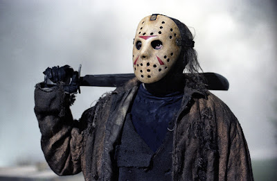
Next, I wanted to include Jason's Mask to add the finishing touch to the collage. Using the same search results I found an appropriate image to combine with my first edited image.
| http://www.foro3d.com/attachments/91502d1232361336-friday-the-13th-2009-jason.jpg |
This image was easier to edit because it had less issues to fix. The dark tones on the mask towards the edges and around the eyes used to create shadows were somewhat distorted, therefore, I added a linear contrast to the curves in order to gain a balance between the shadows and the highlights. After that, I manipulated the levels to make the dark areas/shadows more defined. Finally, I added a hint of brightness as well as a dose of contrast to highlight the smaller details of the mask. The final edited image looked like this:
Description:
The above collage is digital media and was constructed using computer-based software. This collage consists of two images which differ in size and scale.
Shapes in this collage feature rectangles to depict the overall shape of the forest, the trees and circles to depict the hockey mask.
There is no direct relationship between both images as the bottom image is larger than the top image. Lines are vertical as well as horizontal in certain areas of this collage.
The colour scheme primarily consists of tones of cyan, beige, cream and red. White and black are also used in this collage to highlight light and dark areas. The images used in this collage were used for advertisement/promotional purposes for the movie Friday The 13th in 2009.
Analysis:
Using cyan for the fog in the background of the lower image, the artist conveys a sense of calmness which contrasts with Jason's character, a murderous psychopath who evokes feelings of panic, anxiety and fear. A sense of mystery is conveyed by the artist in the upper image as one cannot see what Jason looks like behind the mask, evoking feelings of anxiety and uncertainty. The top image effectively boosts the aesthetic of the lower image by projecting Jason's face clearly for all to see.
Neutral feelings are expressed through the colour selections of Jason's mask as beige and white are considered neutral colours, however, the red shapes on the mask evoke the deepest of human emotions such as rage, love and excitement thus, neutral feelings are contrasted via usage of a provocative colour such as red. There are both dynamic and controlled patterns of rhythm in this collage because there are no definitive patterns or even spacing between the shapes in the lower image, however, the top image is symmetrical, contains even spacing and same sized shapes and is therefore, controlled.
Interpretation:
As an artist, I made sure that my work had some meaning behind the aesthetic. Using the forest as a background for the lower part of the collage, I wanted to create a sense of atmosphere shrouded with feelings of mystery because one cannot see beyond the mist, but one can clearly see Jason in the foreground, begging one to ask the question; where did he come from?
I wanted to create a sense of isolation with this collage, showing Jason in the misty forest, a singular figure amongst the tress, evoking feelings of anxiety and loneliness. Using Jason's iconic hockey mask, I wanted to create a sense of insecurity because Jason, as a child was deformed in appearance, which is why he wears the mask and became the way he did, bullied and tortured by other children at a young age.
Judgement:
The criteria I think are most appropriate for making a judgement about this piece are setting, lighting and composition. The setting relates to the forest in the lower image, creating a sense of isolation successfully. My choice of lighting refers to the darkened eye holes on Jason's mask as well as the bright fog in the background because this creates a mysterious atmosphere. The composition is both dynamic and controlled, which highlights a developed understanding as well as the importance of this aesthetic element which in turn, creates a more dynamic appearance for the collage as a whole. Overall, I think I did well to capture the ideas I was trying to promote through my design choices and that there is a deeper meaning to my work beyond which I first anticipated.
Do I feel confident this skill/knowledge gap been filled and/or rectified successfully?
Yes, I feel confident that I can now successfully analyse my own work as well as others in a formal manor.
What problem(s) were preventing me from overcoming this skill/knowledge gap?
The analysis stage of the formal analysis process because I had not yet explored important artistic criteria such as composition, lines, shapes and scale. Overcoming this stage of the formal analysis enabled me to progress to the interpretation stage with greater ease and also inspired a more clear and detailed judgement.


No comments:
Post a Comment